Juice It Up!, a juice/smoothie/acai concept out of Southern California, recently opened a new flagship store in Costa Mesa, Calif. According to Susan Taylor, president and CEO of the 80-plus unit chain, the flagship’s new design is meant to streamline operations while enhancing the dine-in environment.
This new environment, Taylor says, is calming and relaxing, a place where guests will feel comfortable enjoying their order when operations move into a post-pandemic phase.
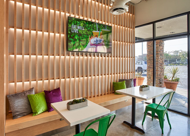
Enhanced seating plays a big role in this new look. It includes maple wood benches paired with cushions in Juice it Up!’s signature purples and greens. These seating areas have been equipped with electrical outlets, inviting guests to stay and charge a phone or laptop.

“Once we get out of the current operating environment, we want folks to come in and enjoy the space. If they choose to stay, it’s in an environment they find comforting,” says Taylor.
In addition to the cushions, this seating area is equipped with a flatscreen that displays the chain’s menu. Specifically, the monitor showcases different smoothies and acai bowls and demonstrates how these are made. “If someone comes in and their favorite is an acai bowl, they can see exactly how that product is made and the functional benefits of it,” says Taylor.
On the opposite wall of this space is another bench seating area. This section features Juice It Up’s brand stamp and tagline, “Live Life Juiced.”
This is a phrase the chain has used for some time, Taylor says, and it resonates with the chain’s fans. In the new design, then, it has been turned into an Instagrammable moment.
“We had over 200 people visit during our friends and family event. As everyone does now, they were documenting their visit on social media. This became a focal point for guests to share their visit.”

With white and light wood tones filling the space, the restaurant’s color palette contributes to the calming look, as well, Taylor notes.
“The maple woods are part of that relaxing feel. So are the white quartz tables and countertops and the clean lines. The whole journey as you go to the POS stations signals [relaxation].”
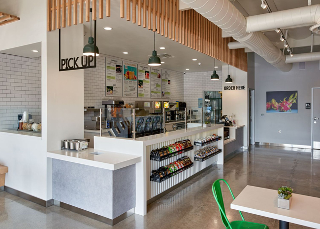
Edits to the POS area also contribute to the new feel. The soffit above the space includes maple slats matching the ones in the seating areas, helping to create a uniform look for the new flagship.

This touch wasn’t the only change to the production area. The new design also features elements that help streamline operations while better showcasing products.
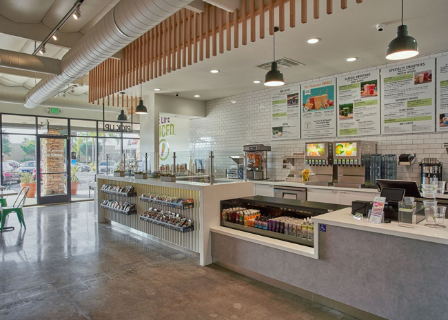
According to Taylor, some legacy locations featured a curved counter. That has been evolved into a straight line, while the acai bar has been moved out of the smoothie/juice production area into its own section. These changes make production of all items easier and increase visibility for guests, Taylor says.
“Everything is open, so if you wanted to watch someone make a juice, you can. You can see that from pretty much every point in the store.”
The counter was also equipped with shelves for items like pita chips and popcorn chips and includes a built-in well cooler holding grab-and-go juices and bottled water.
“The grab-and-go is right there at the POS station rather than having a stand-up reach in behind you. If you've already ordered at the POS, the opportunity to consider those options is limited. Now it is part of the guests’ journey as they move to the POS station,” says Taylor.


