Turning around a concept with a declining store count is never easy.
Though it’s relatively early in its turn around journey, the work put in to revitalize Mooyah Burgers, Shakes & Fries seems to be making a difference.
A few years back, Mooyah was sitting at around 100 stores, always an important benchmark in franchising. Then the count started to fall. According to Tony Darden, who joined Mooyah as president in April 2019, the trouble was linked to overeager franchising, combined with a franchise support system that wasn’t robust enough for the chain’s size. By the start of 2020, Mooyah’s store count stood at 84 stores.
Thanks to several initiatives rolled out in the past year or so, the chain once again finds itself in a growth phase. Even factoring in the impact of the pandemic, Mooyah should open about eight new restaurants in 2020, followed by around 10 in 2021.
This growth can be attributed to a more thorough vetting process for potential franchisees combined with efforts to beef up its franchisee support system, the chain’s leadership says. These efforts include stronger construction oversight and marketing efforts as well as menu innovations, such as the introduction of burgers that cater to different dietary preferences, including vegetarian, paleo, keto and gluten free.
One of the chain’s biggest undertakings was the introduction of a new prototype restaurant, which rolled out earlier this year in Hoover, Alabama. This redesign, the chain says, has a lower buildout cost and promises lower ongoing operational costs than legacy stores while offering an improved experience to diners.
“There were so many improvements made on the operations side to improve the unit-level economics of our restaurants,” says Natalie Liu, Mooyah’s vice president of brand. “We did all this stuff and the prototype was the last but most major thing we needed to address to achieve the explosive growth that we know we’re capable of. Everything was lined up but the look and feel of the restaurant wasn’t quite there.”
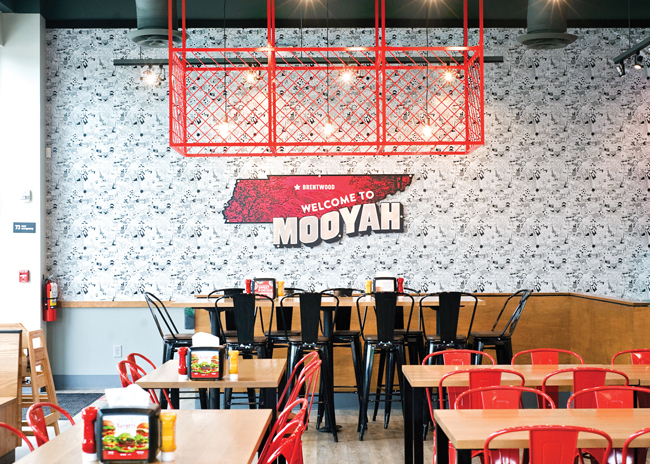 Custom doodle wallpaper and red cage light treatments add a sense of fun to a design otherwise built around a black, white and wood-toned color pallet.
Random Playfulness
Describing Mooyah’s legacy look is difficult, simply because its design hasn’t really been focused until now. Since its founding in 2007, the chain has had three or four different looks, Liu says. As a result, Mooyah didn’t offer the cohesive experience chains typically need in order to thrive.
To develop its new, cohesive look, Mooyah partnered with Livit, a design firm based in Madrid, Spain. Despite the distance, the partnership worked, Liu says. The relationship worked so well, in fact, that Livit has moved from prototype design to handling the layout of all new Mooyah stores.
“We didn’t expect to partner with an international company, but with communications being what they are today, it was very easy to work with them even across the ocean. We had no issues, nothing lost in translation for what we needed,” Liu says.
The new look created by Livit is designed to offer a slightly elevated experience while still being playful and fun. Mooyah, after all, specializes in burgers, fries and shakes. A too-serious space just doesn’t mesh with that type of food.
The chain’s elevated-but-fun look is achieved through a color palette of black, white and wood tones punctuated with bold uses of red.
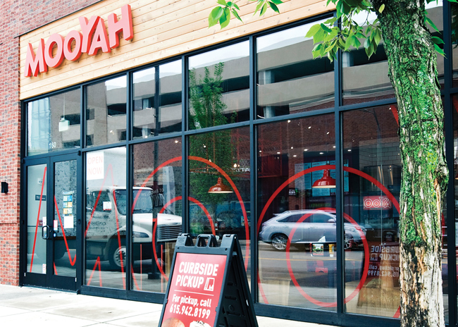
The first of these bold reds can be seen on the restaurant’s exterior, a vinyl window graphic of a portion of the Mooyah’s logo. This, according to Liu, is meant to serve as an instantly recognizable hallmark of the chain. “You want people to see that out of the corner of their eye and know that’s Mooyah. To me, that’s what I look for as I look to build a brand. [I want] to have those things that are icons for Mooyah that we can translate to packaging and other external marketing.”
Where climate and real estate allow, external branding will include outdoor seating. While it won’t be possible at every location, the design is not an afterthought, says Liu. Tables are wood, while chairs are red metal, matching some of the indoor seating; no plastic-on-plastic aesthetics here.
Once guests make their way into the restaurant, they queue alongside a wall that features a custom vinyl wall covering. This is the doodle wall, designed by Mooyah’s Director of Brand Creative Tiffany Myers. Doodles on it include everything from burgers, fries and shakes to soccer balls and panda bears.
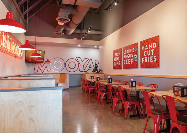 Design elements touting the chain’s quality ingredients help customers understand the chain’s higher price points relative to QSRs.
The wall, Liu says, “is really just the random playfulness of the brand coming to life. People are waiting in the line and are looking over. We wanted it to be a fun discovery experience for them, especially the kids.” The wall has been so well received, she adds, that some of the doodles are being incorporated into Mooyah’s packaging.
Customers scanning the restaurant while in line see other bits of random playfulness in the restaurant. The most eye-catching of these is the neon sign proclaiming Mooyah’s food is “ridiculicious.”
“If you didn’t see some of these touches, if you didn’t see that neon or didn’t see the doodle wall oh, you might think this is a very serious restaurant. It might give off a too-serious vibe. We wanted to bring it down to earth,” says Liu.
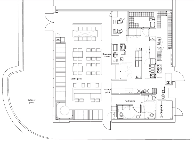
As guests make their way to the POS station, they find another new element. This one is more practical, though: An upright beverage refrigerator filled with everything from bottled soda to flavored water to juice boxes. These offerings have proven popular as the chain’s sales mix has shifted to off-premises, notes Liu.
At the ordering counter, established Mooyah guests will find changes far bigger than a beverage refrigerator. The chain previously had an open kitchen immediately behind the POS station. In the redesign the kitchen has been moved to the back of the house.
This move has two major advantages, says Darden. First, it elevates the restaurant experience. Guests are no longer distracted by the constant beeping of fryers. Second, the move allowed Mooyah’s assembly area to go from a single line to a stacked line, with hot equipment on one side and cold on another. This change allows Mooyah to improve its ticket times while operating its kitchens with fewer staffers during off-peak hours.
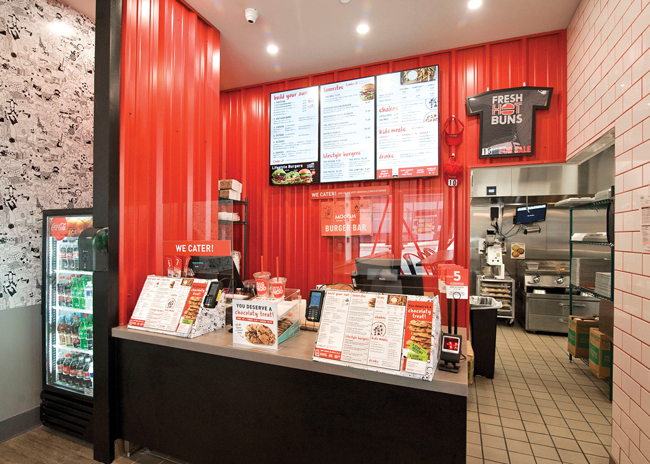 Mooyah moved its kitchen to the back of the house in its redesign. Instead of using a standard wall, the chain added a red corrugated metal wall that adds energy to the space and helps guests spot the POS station.
With the kitchen’s move, the chain did more than close off the area with a standard wall. Instead, it drove home its brand’s signature color with the use of a red metal corrugated wall behind the counter. This element adds a modern feel not just though color but through the unexpected use of materials, Liu says. It also serves as a visual cue for the guests. Their eyes are immediately drawn to that wall, helping them quickly find their way to the ordering station.
After guests place their order, they can fill their drinks from the beverage dispenser. When they do, they see another element new to this design, the Mooyah Oath. Sitting on the beverage station’s back wall, it promises never-frozen beef, hand-cut fries, fresh vegetables and real ice cream shakes.
The oath, which is printed on clear acrylic attached to silver pegs — an upgrade from the vinyl version, which didn’t work against the tile wall — has a fun design, but the message is important to the business, Liu says. “We are not QSR prices because we’re not QSR quality. We want to make sure we are closing the loop on that with guests.”
After ordering their food and getting their drinks, guests have a number of seating options to choose from. Larger parties can select the high-top community tables, located in the middle area of the restaurant. These stand out because of their height but they are made even more special by the lighting treatment overhead: custom red cage fixtures holding LED pendants. These add visual interest to the middle space, which otherwise might be a bit plain.
Also in the middle space are standard-height tables with butcher block tops. These are paired with red metal chairs that have wooden seats. Some of these tables are bolted down but others can be moved. This flexibility, Liu notes, has come in handy during the pandemic, as guests move seating to maintain proper social distancing practices.
The final main seating option are the booths. These seats target families and parties who want to linger a bit longer. “What we try to do is put [the booths] as far away from the point of ordering and the queue line as possible. It’s the quietest place in the restaurant as well as the most private place in the restaurant. We typically try to give it a little more privacy by putting up one of those pony walls and setting it apart a little bit more,” Liu says.
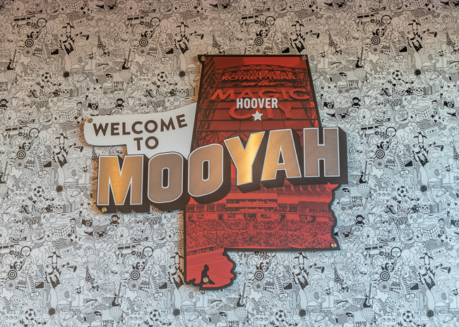 The doodle wall covering at the ordering line provides a little entertainment to guests in the queue and can be an especially welcome distraction for families with children.
COVID Corrections
In light of COVID-19, the chain has made a couple adjustments to its new design but these were mostly minor. The new design includes dedicated shelves for third-party delivery and mobile orders, for instance. After a few months of real-world experience, the chain decided to expand the shelving and move it closer to the POS station.
“We found the shelves really need a guest specialist, that’s what we call our cashiers, to help get the proper orders to people, whether it be a third-party delivery driver or a guest who placed the order,” says Liu.
Meanwhile, the chain stuck with other elements that are almost certainly being reconsidered by operations everywhere.
For a time, Liu says, Mooyah considered changing its beverage station from self-service station in the dining area to an employee-service station located behind the counter. Working with Livit, though, the chain decided to leave the station as is. When the pandemic dust settles, they reasoned, people will be more focused on cleanliness but will likely go back to many of their old dining habits.
The chain also left its community tables in place. Eating elbow to elbow with strangers isn’t appealing during a pandemic, Liu acknowledges, but in those markets where dine-in is allowed, they still are popular with larger parties. “Our restaurants really cater well to families. We still find that [community tables] are relevant.”
Tables and shelves are small potatoes next to other pandemic-inspired initiatives at Mooyah. The acceleration of off-premises dining has led the chain to develop plans for drive-thru and ghost kitchens. Existing and prospective franchisees alike have been asking about these options, Liu says. The company now has feasible models for both, with ghost kitchens a best fit for markets where Mooyah already has a strong presence.
While those initiatives could go live in the next several months, the chain is also working on bringing its new look to legacy restaurants. The goal, says Liu, is to update all existing locations with the new look and feel within the next three years.
The company isn’t going to require full redesigns, though. According to Liu, requiring a six-figure investment like that just doesn’t make sense for its franchise partners.
Instead, Mooyah is focusing on a handful of elements that offer the biggest bang for the franchisee buck. At minimum, franchisees will be asked to upgrade with three core elements: the exterior Mooyah welcome graphic, the doodle vinyl wallcovering and the red chairs. Those are the pieces, says Liu, that deliver.
Ultimately, it’s franchisees that Mooyah needs to keep happy. With a flexible redesign plan, cheaper prototype and streamlined operations, the chain hopes to see the number of happy Mooyah franchisees grow as it continues its turn around efforts.
“The benefit is that it’s an asset-lite model. It gives us the ability to grow at a greater rate,” says Darden. “As long as we bring aboard the right partners we can grow simultaneously across the country as we partner with different owners.”
Project Team
- Headquarters: Plano, Texas
- Concept owner: Gala Corp.
- Concept: Made-to-order burgers, fries and shakes with high-quality ingredients including 100% certified angus beef burgers, hand cut fries, real ice cream shakes and veggies prepped daily
- Segment: Fast casual
- Unit count: 82 with 5 more to open in 2020
- Average check: $20.27
- Location of new prototype: Hoover, Ala.; Brentwood, Tenn; Orlando, Fla.; Guilford, Conn.; New York City Opened: 2007
- Size: 1,800-2,100 square feet
- Real estate: Retail center, end cap preferred
- Design highlights: Custom illustrated black and white Seriously Fun doodled wallpaper provides a whimsical feature wall; LED light of “RIDICULICIOUS” over white brick wall for fun pop of color; dedicated space for to-go and third-party delivery; delivery shelving and waiting bench; grab-and-go beverage fridge; closed kitchen (previous prototype had an open kitchen)
- Build-out time: 10-12 weeks of construction pending reasonable permitting timeframes
Snapshot
- Project lead: Natalie Anderson Liu, Mooyah vice president of brand
- Architect: Cristina Pérez Navarro, Livit
- Kitchen supplier: Chain Link Services
- Interior design: Livit
- Kitchen design: ChainLink & Chris Heiser, Mooyah director of construction and development

