 Meghan Scott
  Molly FormanSix best practices on how to design restaurant restrooms for functionality, aesthetics and those ever-popular bathroom selfies from Molly Forman, RID, Interior Designer and Meghan Scott, Associate, Interior Design at //3877 in Washington, D.C.
Restrooms are often an afterthought when designing a restaurant, but they shouldn’t be. Restaurant bathrooms are a continuation of the experience of the space, whether that be fast, luxury, fun or retro.
Privacy and sightlines are very important in restaurant bathrooms, so we try to avoid seeing things like the back of someone at a urinal reflected in a vanity mirror. These visual noises can be minimized through thoughtful space planning. Finding the perfect balance is very important to the overall vibe of the space.
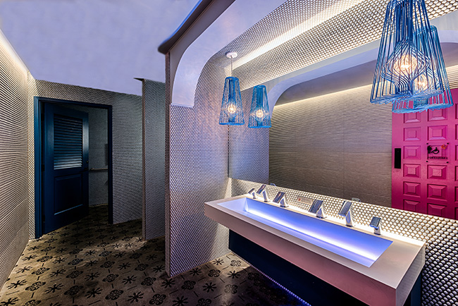
 Mi Vida Restroom; image courtesy of Rey Lopez
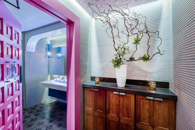
Among our favorite restrooms that we’ve designed are those at Mi Vida, in Washington D.C. The bathroom is an extension of the restaurant, which was designed to recall the vibrant heritage of Mexican culture while celebrating the surrounding views of the Potomac River. In terms of the stand-out feature, the bright fuchsia pink door reiterates the tone of the restaurant experience, and is a continuation of the dramatic, bright pink fin-like panels that line the ceiling of the dining areas. We contrasted the stained concrete floor tile, which features stencils of traditional Mexican motifs, with contemporary wall tiles adorned with organic shapes and striations. This bathroom is fun but relaxed, and the generosity of space mirrors the scale of the restaurant, which is almost 10,000 square feet.
- The Restroom Should Reflect the Restaurant's Segment
The type of restaurant really dictates the type of bathroom — fast casual, casual dining or fine dining. For example, for fast casual, patrons are in and out, often not lingering, so the bathrooms correspond. They’re illuminated with lighting that is slightly more utilitarian, and have surfaces that can often endure a lot more wear and tear, as there are usually many more people using them — customers, workers and even non-diners from local foot traffic.
For casual dining, we try to elevate the experience via lighting, color and texture. These restrooms should be a little larger with finer touchpoints. For fine dining, there are specific amenities that are expected — for example, there are often more mirrors, flattering lighting, and enough space for guests to hang out and fix their hair and makeup. For fine dining restaurants, it’s fundamentally important that the elevated tone of the restaurant continue into the restrooms. - The Restroom Should Stand Out
It’s important to have something memorable in the restroom. This is the space where restaurant guests now take selfies to post on social media — it’s almost a separate, add-on experience for the guest — “Did you see the bathroom?” — and an opportunity for the restaurant to accentuate its brand in a special way. - Lighting Should Strike a Balance
Lighting levels are also very important in the design — you don’t want the lighting too bright or too dim, so finding that perfect balance is very important to the overall vibe of the space. Using a cove light above a vanity that grazes the wall is very effective in providing the appropriate amount of light. It allows us to create dim lighting throughout the rest of the bathroom, and it’s very flattering. Similarly, warm, dim lighting with slightly pink hues makes everyone’s skin tone look healthier. - Flooring Should be Functional
Large-format porcelain tiles or concrete go-to materials work for bathroom flooring. Limiting grout lines and using a medium tone flooring color also help with the maintenance. Durability and cleanability are fundamental considerations we take into account as designers when selecting restroom materials. Within the bathroom, we prioritize the vanity and accent walls as the aesthetic focal point — the floor is typically a tertiary design element. - Avoid Common Mistakes
Polished surfaces that reflect too much light are usually unsuccessful. Cramped restrooms with limited flow, lighting that’s too bright, and an aesthetic that doesn’t align with the overall design concept of the restaurant can all lead to the bathroom experience being off. This also applies to finishes that have not taken into account the necessity of long-term durability. - Consider Space Constraint and Flow of Traffic
Flow is fundamentally important from the beginning of the restroom experience. Designers have to consider the habitual nature of diners. How many restroom stalls will there be? Is there going to be a line? If so, where do people wait? When they are waiting, what will they be looking at? Similarly, is there enough separation between where the sink is and where the toilet fixtures are? Bathroom design needs to consider privacy, so patrons don’t feel they’re stacked on top of each other — a problem which makes a bathroom much less luxurious and enjoyable — so space planning is key.
 Mi Vida Restroom; image courtesy of Rey Lopez


