Giada De Laurentiis is among a number of celebrity chefs and Food Network personalities to move into the fast-casual restaurant sector. Pronto by Giada opened at Ceasar’s Palace in Las Vegas last year. Interior design on the project was handled by starrdesign out of Charlotte, N.C.
“One of the biggest things that Giada and her team and the team at Caesars wanted to offer was really an extension of Giada herself,” says Jeff Cangro, project manager with starrdesign. “They wanted guests to come into the space and feel like they already knew what was going to happen in terms of the experience thanks to her show. A lot of fans will seek out her restaurant, so we wanted it to be very familiar to them but also provide some elements of excitement and fun.”
Matching De Laurentiis’s brand and personality, the restaurant is designed to feel bright and welcoming.
At the same time, much of the design work focused on making Pronto succeed as a business. The designers, Cangro says, were charged with developing an operation that could handle 600 transactions per hour. They achieved this by creating multiple spaces and experiences in the restaurant, each with its own offering and its own opportunity to complete a transaction.

The heart of the restaurant section is the queue line, where customers can see the food on display before they order. This section has been given an elevated feel, with red metal clad equipment, quartz on the counters and around the display case and a herringbone pattern on the back wall.
While this supports the Giada experience, the set-up of this space is designed for volume. “We have a double layered queue line. You can see the food and the menu while you're in line so you can get your order in mind,” Cangro says. “The first register you come to is the order register. You walk along the display cases, see the food being prepped and then there are multiple cash registered that can check you out.”
By separating the ordering from the paying wait times are dramatically reduced, according to Cangro, supporting the operation’s high-volume operational goals.

After paying, guests go to the nearby pickup station to get their food. A structural column in the middle of this station is wrapped in vinyl wall covering with a cork design, which serves as a subtle nod to Pronto’s wine program. The front of the pickup counter, meanwhile, includes custom-made quatrefoil tile in Giada’s signature red.

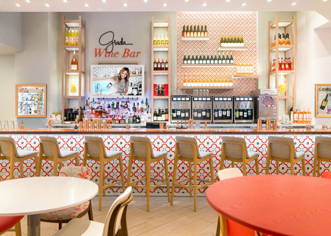
Another prominent spot for the quatrefoil tile is the Pronto’s bar. The pattern shows up in large format on the bar face and small format on the back bar. Wine is again emphasized, this time directly, with displays on metal shelves painted rose gold.
This space, with its refreshing, airy feel, is in many ways the centerpiece of the operation, notes Cangro.
“The bar is on axis with the elevators coming down from the conference space. After a long day of conferences, you come down the escalators and Giada’s bar is right there at the bottom. It’s an opportunity for the people to decompress, maybe continue the conversations they had during the day in a more informal setting.”

In addition to a bar and restaurant section, Pronto also features a retail component, where customers can purchase cookbooks, kitchen tools and even De Laurentiis-inspired clothing.
This isn’t just a space for shopping, though. The designers intentionally brought seating into the retail section.
“We didn’t want it to feel so isolated, so we mixed in chairs and tables. As a customer, you can set the expectation for your dining experience on your own. You’ve got the retail area, bar seating and the general dining area,” says Senior Interior Designer for starrdesign Ashley Jones.

Not only is seating sprinkled throughout Pronto, the chairs and tables themselves vary. Tables differ, with tabletops being either wood or solid surface and bases changing from simple to ornate. The designers also selected four different upholstery patterns to create an eclectic and energetic feel that reflects De Laurentiis’s personality.

“When we were looking for upholstery, we wanted to pull in patterns that felt like something she would have in her house,” says Jones. “It was kind of kismet that the color and the upholstery matched her red almost to a T.”
Images courtesy of starrdesign and Pronto by Giada


