How do top restaurant designers approach their work? What drives them, inspires them and challenges them? And what can others in the industry, who are also working hard to create exciting, experiential, highly functional restaurant designs, learn from their experiences?
We’ve tapped four award-winning pros from across the country for their insights on everything from big-impact trends to sweat-the-detail tactics that help ensure project success. Hats off to Tom Henken of api(+), Chris Mercier of (fer) studio, Michael Poris of McIntosh Poris Associates and Meghan Scott of //3877 for contributing. Collectively, they’ve dished up a smorgasbord of food for thought and sage advice. Dig in!
---photographer-christopher-garofalo.jpg) Fast-casual Chicken Guy was designed by api(+) around Chef Guy Fieri’s celebrity and personality. Image courtesy of Christopher Garofalo
Fast-casual Chicken Guy was designed by api(+) around Chef Guy Fieri’s celebrity and personality. Image courtesy of Christopher Garofalo
Give us your take on a macro trend or two shaping restaurant design today.
Mercier: The biggest thing I see is the move toward “designed casual” dining. A lot of higher-end restaurants and chef-owned operations are trying to casualize themselves a bit, while at the same time QSRs and fast casuals are upping their game with both food and design. They used to be pretty bare-bones experiences, and the segments were pretty clearly defined, but lines are now blurring, and we’re seeing new categories of food, environment and experience. Brands like Chipotle and others are rolling out really nicely designed spaces, and it’s great to see.
Henken: With the broadest brush, the big drivers are what we eat and how we eat it. It’s all about abundant variety and selection and convenience. Delivery and takeout, in particular, have ramped up, and that’s true for everyone from QSRs to fine dining. Those convenience-driven elements affect not only the restaurant environment but also back-of-house design, technology, staffing, etc.
Other big macro forces at work include strong interest in local and farm to table, which has crossed over from menu into design. A lot of clients are looking to source local elements, such as reclaimed materials, and to showcase the work of local artists. And high-profile chefs are venturing pretty far from what led to their success originally to do small, more focused concepts. Finally, and perhaps a little less macro but still growing, is the food hall phenomenon. It is still kind of the Wild West in terms of where it’s headed, and we’re seeing creative twists on the concept.
Scott: I see a few big-impact things on the design side. One is a resurging interest in art deco, in bringing back the glamour and shine of the ’20s and ’30s and Gatsby-inspired aesthetics. A lot of clients are asking for slightly more elevated spaces and moving away from the rustic, industrial look and brass that’s dominated for so long. And, while it may sound a little contradictory, there’s also growing interest in very elegant, clean spaces that focus on architectural aspects versus being just overly decorated. It picks up on the timelessness of the midcentury modern vibe.
Acoustics, too, are getting more attention. With the heavy industrial looks of the past few years, there were a lot of hard surfaces — cold steel, iron and reclaimed wood. But now, whether higher-end restaurants or fast casuals, everyone seems to want better acoustics. They’re more interested in making their spaces comfortable to hang out in.
Poris: Variation and place making are two big drivers for us. There’s a big move in our work, most of which is local to the Detroit area, to really try to make it about this place and to create something unique to Detroit that’s not repeated in any other city. Variation is part of that but variation tied to the place where you are. The Foundation Hotel is a great example. Aparium Hotel Group, who we worked with on that project, calls it a trans-local approach. Each of their hotels and the restaurants within them are brands that are unique and specific to the city that they’re in.
 Tom Henken
Vice President + Director of Design ArchitecturePlus International, api(+), Tampa, Fla.
- Education: University of Cincinnati, BS in Industrial Design
- First design job/project: Designing cheese display islands for a retail grocery chain
- Favorite tool and podcast: GoToMeeting because it has dramatically reduced travel time and the “How I Built This” podcast
- Favorite place to go for creative inspiration: Mountains, oceans and vibrant cities with great architecture
- Restaurant design pet peeve: Failure to understand and pay close attention to lighting color, temperature and brightness
- Advice to young designers: Learn as much as you can about how restaurants work and how they make their money. Always balance creativity with practicality.
Operators seem increasingly focused on creating experiences for restaurant guests. What’s your approach to creating designs that check the experiential box?
Poris: Variation and place making are the answer to experiential design as well, and it’s often rooted in history. Sometimes it’s obvious, but sometimes you have to dig deeper to discover what a building was originally used for or what was on that land before the current building went up. The story is important; it’s what makes for an interesting and authentic experience. The Foundation Hotel building, for instance, is in the old Detroit fire department headquarters, so it was all about bringing the history of the building to bear without getting too cliche. And it was about celebrating not just history but also what’s going on in Detroit today. We left the building pretty much intact, used more than 40 local artisans and craftspeople, and sourced most of the materials and finishes locally.
Another example is Vinsetta Garage. It was one of the first full-service garages along Woodward Avenue in Detroit, and its history drove the restaurant’s concept and the design. It’s all about the cars and hot rods that were fixed there over the years. It’s an amazing place — all about the cars — and going there just feels like a unique Detroit experience.
Mercier: There’s always been a focus on experience, but it’s being interpreted a bit differently now, and expectations are changing. In the past, it was like, “This is fancy food, and we make fancy restaurants.” It was more straightforward. Now, particularly in chef-driven operations, there’s a huge focus on tying the entire experience to the chef’s personality and his or her vision for the food, preparations, ingredients and service style. As designers, we need to find ways to create environments that help to tell that story and bring that experience full circle. The way that the food is being crafted needs to be reflected in the way the restaurant is crafted. Our process starts with sitting down with the chef and making sure we understand his or her vision because that’s what we’re trying to capture in the design as well.
Scott: Experience absolutely is increasingly important, particularly in this social media-driven age. In the beginning of the design process, I always pick the client’s brain and try to figure out what the concept is and what they’re trying to create. I try to focus on what those Instagram-worthy moments might be as they can be a springboard for building very immersive experiences.
At Mi Vida Restaurante in Washington, D.C., for instance, everything flowed from a Tree of Life feature. We designed the space along with the client, Michael Reginbogin at KNEAD Hospitality + Design, and one of the first things he said he wanted was a big Tree of Life. He wanted it to appear to be growing right out of the floor and for guests to feel like they were in an upscale hacienda. We talked through how we could pull that conceptual thread throughout the restaurant. Ultimately, it ended up providing color, texture and pop that ties back to the symbolism of the tree and is central to the Mi Vida experience.
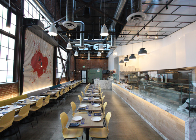 In Los Angeles, (fer) Studio's design for Sixth+Mill Pizzeria resulted in a space that captures old-world tradition in fresh, contemporary ways. Image courtesy of (fer) studio
Henken: Our work is broad based, and we’ve been coming to terms with “experience” for the past six or seven years. When retailers saw that Amazon was their biggest competitor, they realized that in a grocery store environment, experience matters more. So we’ve been working to drive experience into the shopping part of this equation. And now with Grubhub and Uber Eats, there’s a compelling reason to make the restaurant experience worth putting a decent shirt on and going there for. Even restaurants like McDonald’s are investing a lot in product development and packaging technologies to ensure that delivered food is as good as in-store food. If that’s the case, then the environmental experience has to drive visits to the restaurant.
Designing in flexibility and multiple options for different types of experiences in a single location is also increasingly important. GrillSmith’s new design, for instance, is an open environment where we used furnishings to differentiate individual experience areas. There’s an entire banquette that looks like a gigantic button-tufted couch that creates a group seating. There’s a taller section of tables that are around the bar that kind of feel like you’re in the bar but you get a little bit more of your own space. There are curved booths that offer a little more privacy. So it’s an environment surrounded by multiple experience places, but it’s all connected for people watching and seeing the food and drinks come out.
On the opposite end of the spectrum, we’ve just finished designing a fast-casual restaurant called Chicken Guy for Food Network star Guy Fieri, in partnership with Earl Enterprises. That’s a smaller, more intimate experience. It’s all about one product prepared in a variety of ways and is an immersive brand experience created around Fieri’s celebrity and personality.
 Meghan Scott
Interior Designer, Studio //3877, Washington, D.C.
- Education: Savannah College of Art and Design, BFA Fashion Design; The George Washington University, MFA Interior Architecture and Design
- First design job/project: Assisting a boutique swimwear designer and hanging out at the pool to showcase our designs
- Favorite app: Instagram
- Favorite place to go for creative inspiration: Travel to anywhere beyond what I see day to day. It’s both inspiring and restorative.
- Restaurant design pet peeves: Bad acoustics and poor mixing of lighting colors and temperatures
- Advice to young designers: Build your own toolbox. Ask questions, study and explore on your own time so when you’re in the office, you’re ready to contribute.
What’s changed most about how you approach restaurant design today compared with 5 or 10 years ago?
Mercier: We rely a lot more on technology in the early phases of design and focus in more sharply on operations, flow and functionality before aesthetics. Restaurants and kitchens today are so much more sophisticated and operationally advanced, and the bar on food prep has been raised so high. Chefs want to offer much more authentic experiences, which impacts kitchen layouts and equipment needs. We also have many more open kitchens to work with.
There’s more collaboration today, too, between operator, consultant, chef, designer and architect, before getting to what the aesthetics of a place might be. That’s critical to getting the level of efficiency required to be competitive today. And code compliance is a bigger issue. Here in California, it seems every two or three years, we have new or revised codes to comply with. That makes it tough because a lot of stuff that was OK for one unit suddenly isn’t OK for the next.
Henken: The industry overall is more competitive, but specific to design, there is less emphasis on decoration and more on integrating a brand and a differentiated experience. Clients are also more aware of demographics, trends and what’s going on in the marketplace. Thanks to the internet, there’s so much information readily available, people are savvier and expectations just keep rising.
Technology, too, has changed how we communicate design as well as the environment that we’re designing. It’s increasingly integrated both front and back of house. And with takeout and delivery growing so fast, footprints are starting to change. There are a lot of restaurants out there now that probably could have built smaller dining areas. In the past, we designed a restaurant and kitchen to serve the number of tables out front and the number of turns anticipated. Now, when you have so many more orders being picked up or staged for delivery, you have to change your approach. And you have to work harder to ensure that the experience for on-site and off-premise diners is equally good.
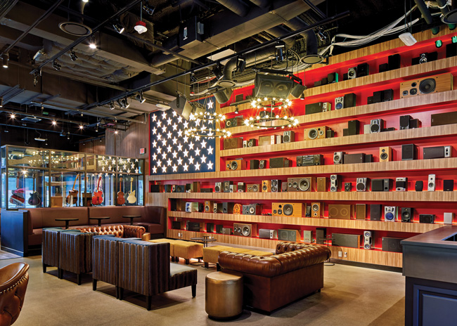 At Kid Rock’s Made in Detroit, McIntosh Poris Associates created an immersive experience that celebrates Rock’s Detroit roots and his love of country. Image courtesy of Jason Keen
Poris: Ten years ago, we weren’t thinking as much about what the experience should be and about making things unique as we were about creating really cool designs — something you might see in a glossy magazine spread but that could just as well be in Amsterdam or London as in Detroit. The big change is our focus on making each project unique, so that it couldn’t be just anywhere but has a specific and thoughtful connection to place.
Technology, of course, is another big change. Designers can do things like incorporate giant digital images and wall art, for instance. It’s pretty amazing, but it’s also a little overwhelming and, I think, is something that you shouldn’t do just because you can. The tools may be changing, but the fundamentals of design and concept development still matter. Digital experiences can feel sterile and generic and don’t work for a lot of concepts.
Scott: One area that’s changing fast is tech-related. We’re challenged to make sure that all of a client’s systems are seamlessly integrated within the design. They might need multiple screens on the host stand for takeout and delivery, or their POS cabinet needs to be recessed into the back bar, or maybe they don’t have a traditional host stand anymore but work off tablets. There’s a lot more technology that we need to be conscious of when we’re detailing out these areas, being sure to account for it and integrate it into the space so that it’s functional and doesn’t look like an afterthought.
 Chris Mercier
AIA, Principal, (fer) Studio, Inglewood, Calif.
- Education: Lawrence University (Southfield, Mich.), BS in Architecture; Architecture Intermundium (Daniel Libeskind), Milano, Italy; Southern California Institute of Architecture, Master of Architecture
- First design job/project: A bar/nightclub in the Eastern Market of downtown Detroit
- Favorite app: TED Talks app
- Favorite place to go for creative inspiration: My studio
- Restaurant design pet peeve: Seats that are too high or two low relative to table heights
- Advice to young designers: Get to know the back of house; understand how the chef needs it to work and why. That should influence layout, flow and dining room design, as well.
You’re given extra funds to splurge in one particular area of FF&E in a restaurant project. In which area or on which product categories are you most likely to splurge?
Poris: Furniture and finishes. When the budget is tight, that’s where the biggest challenge comes from. Do you have $60 per chair or $400 per chair to work with? Can you do custom stuff, or do you have to buy something that’s mass produced in China? We’d rather cut all the things that you don’t see to the bone and put more toward the things that guests see and touch. If there are extra funds available, we also like to invest in custom design for branding. At Prime & Proper, a steakhouse in Detroit, we had a generous budget and were able to incorporate the P&P from the logo into some of the furnishings, the flooring and the custom wood-burning grill. That sort of thing isn’t cheap but results in a very unique, immersive brand experience.
Scott: Decorative lighting, hands down, because it can add so much to a space. A big, beautiful fixture creates an amazing, warm glow that nothing can compare to. Being able to do a custom fixture or place an expensive chandelier over a central table adds huge impact that you can create an entire space around. And with lighting technology advancing so rapidly and prices starting to come down, great lighting doesn’t have to be such a huge splurge anymore.
Mercier: For me, the most important part of a restaurant space is volume and the way that it deals with natural light. It’s about shape, form and operational layout. These are the fundamentals that ultimately define the environment. Finishes and furnishings are important, too, but you can’t finish out a badly designed restaurant and make it good. You have to get the structural parts right first. If there’s extra money available, that’s where I’d put it.
Henken: Restrooms. Restroom design seems to have become, at least for women, a point of conversation and a place to take selfies. It’s an area that guests now see as an amenity that reflects how much you care about them. So we’d put extra dollars toward incorporating interesting patterns, textures, art and finishes that are unique to that restaurant. Beyond that area, my other two choices would be to invest in higher-quality seating and lighting, both of which can really elevate a dining experience.
 Michael Poris
AIA, Principal, McIntosh Poris Associates, Birmingham, Mich.
- Education: University of Michigan, BS in Architecture; Yale University, studies in modern history; Southern California Institute of Architecture, Masters in Architecture; apprenticeships with Cesar Pelli, Thom Mayne, Frank Gehry, Richard Meier, Frank Israel
- First design job/project: Drafting Kmart parking lots in the 1970s
- Favorite app: Instagram
- Favorite place to go for creative inspiration: My memory. With all the experiences I’ve had and all the places I’ve traveled, if I could access a tenth of it, I’d be in great shape.
- Restaurant design pet peeve: Generic designs with no story or sense of place
- Advice to young designers: Listen. You need to understand what every stakeholder in a project is saying and apply that in order to create something that works for everyone
What’s one shareable lesson learned that could help other designers avoid project missteps and headaches?
Mercier: Always get the height relationship right between the chair and the table. If it’s too high or too low, it’s just not comfortable for the guest. Too often, designers and operators get through a whole design and everything looks great, but along the way, nobody bothered to actually sit down and check to make sure that detail was correct.
Henken: Know the codes and their impact on the project and on what the client wants before you get into the design. It’s super important to do that research so that you can guide them correctly. Also, be wary of clients that tell you they haven’t yet figured out their budget. It might be an uncomfortable conversation, but you have to get deeper into the issues of cost and be honest regarding budgets and expectations. It’s better to do that up front than end up going in for permits, getting bids and then finding out you’re $150,000 or more over what the client can spend.
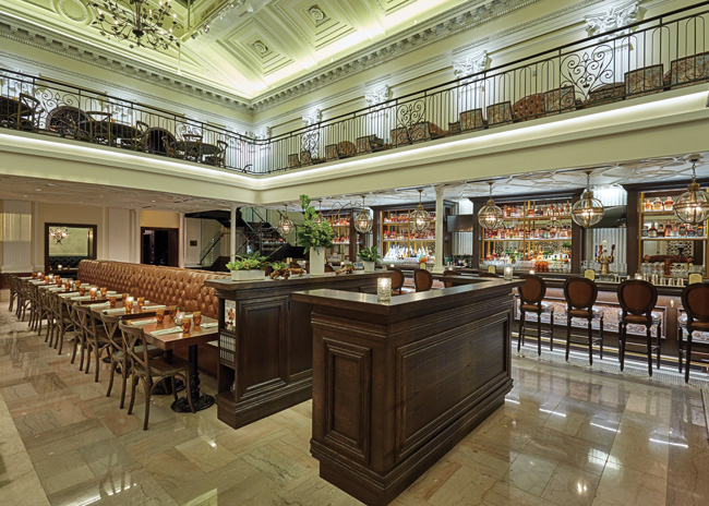 Succotash in Washington, D.C., is part of a trend to bring a little glamour and art deco flavor into restaurant spaces. Image courtesy of Clarence Butts
Scott: Make sure new clients understand that everything looks larger in plan view. Clients are always asking to push furniture in and trying to gain more seats, thinking that it looks OK on plan, but when they get to the real space, they see that tables are too tight. Acknowledge the need to maximize seating but stand firm to maintain proper clearances that ensure it’s comfortable for guests. It ties in to the overall lesson of paying close attention to details in the drawing and making sure annotations are updated. In one project, we had a hatch tile pattern that was to go on one wall, but contractors don’t always ask questions about exactly where and how those tiles should go. They took the elevation at face value and installed the tiles completely wrong.
Poris: Sometimes you have to get creative and keep an open mind when faced with negatives or challenges on a project. We recently were faced with having to deal with a staircase in a historic building that couldn’t be removed but that didn’t lead to anything because the second floor was blocked off. Rather than stress about trying to cover it up, we ended up turning it into an asset. It’s a beautiful staircase and is now an Instagram moment that’s very iconic for this particular restaurant.

