 Gina VeneziaAfter debuting its new prototype at the end of last year, fast-casual chain B.GOOD is on track to open nearly a dozen units utilizing the new format in 2019.
The goal was to make the design more comfortable and clean, with calming colors but also to test its new line configurations for busier stores.
Gina Venezia, vice president of construction and development at B. Good, explains the changes.
 Images courtesy of B.GOOD
Your new prototype was designed to create a more upscale yet comfortable restaurant. How did you achieve that through your design?
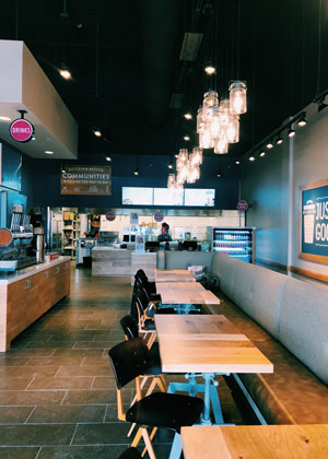 GV: Our restaurants are designed to reinforce our “Food with Roots” mantra, which we communicate through our open kitchen format, materials like natural wood and Caesarstone and decor like our farmer portraits and locally sourced boards.
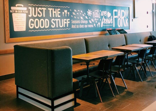
We have switched to more wood material rather than metal, which looks very clean, and we’ve updated our lighting, adding elegant long glass Edison bulbs at different heights. We’ve also added a metal lattice to help guide people around the dining room.
We have increased high-top communal seating in urban locations since people there want to eat quickly and move on. It’s more comfortable to sit at a communal table and leave.
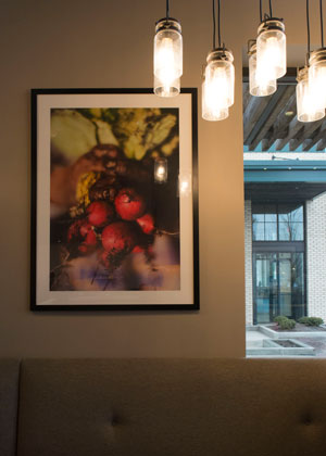 All of our imagery — photographs — are now in black frames to be more upscale. We used to feature posters on our walls. Each of these picture frames sits on one of our signature wooden squiggles, which has lighting underneath it.
Our interior colors are now all earth tones, light with a splash of deep blue, which adds the right note to the whole room.
What is the ambiance you hope to create with your new B.GOOD model?
GV: Warm and welcoming. We’ve created a space that appeals to a number of different lifestyles, whether you’re sitting down for a meal with your family or working in the area and taking something to-go. We know no two customers are the same — not only in their palates, but also their lifestyles — and we pride ourselves on being approachable to anyone.
How do you highlight the Foods with Roots mantra in your design?
GV: We’re a farm-to-table restaurant chain and our decor nods to our roots on the farm and relationships with local farmers and producers. Our pictures are all of farmers and we highlight each one. We also have a map in every store, showcasing our local sources of food.
Beyond the decor, our branding uses shapes, primarily the wooden squiggly line that we feature on the walls of our restaurant and in our logo and packaging, which symbolizes the fertile ground on which our food was grown and everything going back to the earth.
And, our logo is now cleaner. Instead of looking like a bean we created a circle that features our squiggly line with Food With Roots written underneath. We’ve changed the colors from orange to deep red, which looks richer and cleaner. The whole thing is bolder.
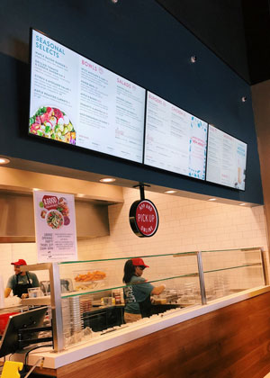 How are you changing your line configurations?
GV: Our current model has a hot line on the left and a cold line on the right. After food is prepared, it’s passed to the center at a customer pickup location. This configuration works well for us, given our diverse menu, which offers everything from burgers and fries to salads, grain bowls and smoothies.
We’re exploring a line configuration where two lines are worked from both sides and push everything to the front. Both sides are identical, which would afford us a faster speed of service during peak hours and increase efficiency with online and app orders as well as catering. We are testing this in a couple of urban locations.
Do you think having these different configurations will help with B.GOOD’s expansion, and if so, how?
GV: Different configurations serve different purposes. Our traditional concept works really well in suburban areas where customers tend to be more relaxed and have the time to wait for their order. That said, it can still accommodate online and app orders for those who are on-the-go. The two-line model lends itself well to both urban and suburban locations. It has the space to maximize throughput, yet still offers a relaxed dining area.

