Camden Spit & Larder, a modern London-inspired eatery from Chef Oliver Ridgeway, opened in Sacramento, Calif., late last year. rd+d caught up with designer Brendan Koon, principal of VITAE Architecture, to learn more about the 4,200-square-foot, 225-seat restaurant.
 Images courtesy of Eric Rorer
BK: To explain the design concept, I need to first explain my personal theory on restaurant design in general. Restaurant design has the opportunity to tell a story. The food and service area are an experience and the design setting brackets that experience. In the that sense, the design should be an extension of the food just as the food is an extension of the chef. I first had to learn and understand the chef and what he has to say with his food in order to design the restaurant as an extension of his story. I wanted the design to be uniquely him — something about his heritage or roots, just as he was planning a menu based on his heritage and roots. The initial direction from the chef was that he wanted a tailored look. He encouraged me to look at British fashion designers such as Fred Perry and Ben Sherman. At first, I thought that wasn’t much to go on. At one point when talking about his history, he mentioned his father was once a tailor before becoming a restauranteur. That small piece of information suddenly clicked for me. I thought of the British Haberdashery, which offers a true “tailored” experience. Along those lines, I wanted to design a restaurant with tailored food and tailored service, so why not design cues from a tailor shop, yet one that has elements of the familiar but which is also modern and edgy? To execute this idea, I took familiar silhouettes and modernized them. I used patterns from men’s and women’s suiting and combined them in unusual ways to provoke the senses. I applied these patterns to the built environment, not just the furnishings, making the panels on the front of the bar out of horn buttons, incorporating a plaid-patterned, Venetian mosaic tile on the walls of the restroom, herringbone-patterned hardwood floors, wingtip-patterned tile floors and more. All of these patterns represented a history of refinement but now they sat in contrast to the colder concrete and glass shell. In short, the aesthetic was an attempt to bridge generations to create a place where Kingsman meets Downton Abbey, and they could all sit down to enjoy a phenomenal meal prepared by Chef Oliver Ridgeway.

What is the layout of the space?
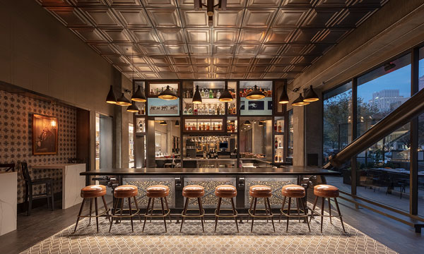
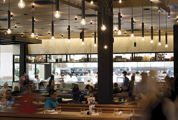
 BK: The space is long and linear, divided into three zones, including the bar, dining and private dining. The partial-height and semi-permeable back bar tower along with a similarly shaped wall of gilded mirrors bookend the dining room. The back bar creates a permeable separation between the dining and the bar areas while the gilded mirrors divide the dining area from the private dining room. Some of the mirrors are two-way mirrors, such that someone in the private dining room can look out into the main dining area, but someone in the main dining area only sees the reflection of the dining space. The kitchen is fairly central to the restaurant — 30 feet of it is open to the main dining area, showcasing the cookline and expediting area with 11 counter seats for an up-close view of the action.
What inspired the color scheme?
BK: The color scheme is taken from the London underground with a lot of blues, reds, blacks and white. We’ve added tan and gold to warm the whole palette up. The ceilings are floating clouds of acoustical panels in a grid pattern mimicking a pressed tin ceiling with a crown molding trim. The lighting within the space was an opportunity to create both warmth and glamour. The main dining area has two large custom-designed chandeliers. The private dining room has six large custom-designed chandeliers. Reading lamps crown the banquette seating area and daisy-chained pendants follow the shape of the bar.

What about the furnishings? And artwork?
BK: All furnishings were custom made. As explained above, I took familiar shapes and tweaked them. Oversized wingback chairs, modern versions of the classic Windsor chair, parsons tables but with the legs quarter turned expressing only the silhouette of the turning, etc. The furnishings are upholstered in patent leather, pinstripes, houndstooth and plaid with exaggerated tufting, buttons and welts. The furniture makers were sourced through Rich Starley IDS in Los Angeles. The artwork is inspired by English portraiture and is meant to add humor to the space. Animal heads have been substituted for human heads on formal historic portraits and placed in gilded frames.

Were there any challenges with the development of the restaurant and how did you overcome them?
BK: The first challenge was purely about seat count. The goal was to fit as many seats into the space as possible, but in a manner that would make the restaurant feel intimate while busy and also full during slower service. The second challenge was the fact that all exterior walls of the space are glass. This created significant challenges with hiding back-of-house areas as well as exhausting grease from the cookline. We ended up blocking off one column back facing Capitol Mall, and took the opportunity to create a window display featuring Winston, the unofficial mascot for the restaurant: a subversive scooter-riding boar dressed in a pinstripe suit, goggles, riding gloves, pocket watch, wingtip shoes and with martini in hand.


