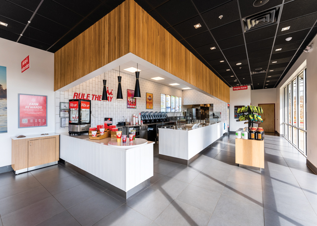
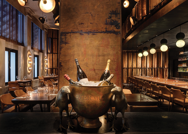
Signs of all shapes and sizes have long been a standard part of a restaurant. From the roadside sign that serves as a beacon drawing customers to an establishment to one that indicates where to find silverware and napkins, all signs look to achieve the same goal: to direct a person to or through a space. What signs look to achieve may not have changed over the years but how they do it continues to evolve considerably.
"Signage has become more decorative and integrated into the design," says Michelle Maestas, project designer for Ricca Newmark Design, a Colorado-based design firm. "It used to be an afterthought and that is no longer the case. Now it's part of the package."
Although still functional, today's interior signage helps communicate the brand promise, helping set the expectations not only about the menu but also the overall dining experience. That's why any signage selections need to take these considerations into account, Maestas adds. "It is really important that whatever you are doing for the signage design supports the overall interior design. It is another accent. When we talk about imagery, looks and ambiance, we are also talking about the different types of signage available. The choices are endless and we are putting together more packages that examine this."
Of course, developing signage that can effectively communicate a brand promise without dominating a space is easier said than done. "That's why it is important to integrate it into the design process early," Maestas says. "It should complement the architecture and design. I don't want the sign to be the only thing they remember from visiting a venue."
Despite the fact that signage is now considered part of the décor package, restaurant designers have to resist the temptation to be too clever when making their choices or even when naming specific parts of a restaurant. "First and foremost it's a sign and it serves a purpose and that is to direct someone. So it has to be legible," Maestas says. "Go with more generic names so they are easier to understand. People will know what it means and there will be no misinterpretation."
In other words, pick a font that's easy to read and size it appropriately for the application. "You have to consider all of those factors and turn it into something aesthetically pleasing," Maestas says. "Then you can turn to the materials in terms of what's appropriate."
Placement of Signage
Restaurant operators also need to pay close attention to where they place the signage to ensure it makes customers feel welcome and comfortable. "A lot of people look for signage when they enter a new space. They want something to help guide them through the space," Maestas says. "We are so focused on how you integrate the signage into the foodservice operation and in order for people to find the functional areas you have to direct them."
Being able to effectively direct customers is contingent upon understanding the overall space and how the concept would like customers to move through it. "Once you do that, you will know what signage you need and where to place it," Maestas adds.
This is when balancing the functional nature of a sign with its aesthetic qualities becomes important. "If you integrate your design too much into the architecture or the surroundings it will go away. It should still stand out as a sign that's telling people information they need to know," Maestas says.
Menu boards can be a good example. As menus continue to evolve many restaurants add items but don't want to take away others. While management may feel an expanded menu can broaden a concept's appeal, this can impact the guest experience. "The biggest issue with the menu board is legibility. You want people to be able to read the menu boards by the time they get to the front of the line so they can move through the space," Maestas points out.
In other words, when it comes to menu boards, bigger is better. Otherwise, it may take customers longer to make a purchasing decision, which can increase the amount of wait time for other patrons and ultimately impact speed of service.
Digital Menus Add Flexibility
Signage technology continues to evolve considerably, providing restaurant operators with new and more engaging ways to communicate with their customers.
For example, many quick-serve restaurants, fast-casuals and even institutional operators continue to migrate toward digital menu boards for a variety of reasons. "There's a lot of flexibility in digital menu boards. If you run out of something, you can take it off the menu for the day," Maestas says. "It becomes more of a branding opportunity. And you see more of the brand come out in the menu board." She adds that some colleges even connect their digital menu boards to campus messaging systems, giving these institutions another way to convey time-sensitive information in an efficient manner.
The most common form of digital signage or menu boards is the big screens that hang from a back wall or soffit. But some suppliers have found a way to bring the digital menu screen to the food shields or even attach them to the shields' posts.
So what does the future hold for restaurant signage? Well, the higher education market might offer a glimpse. "They want creativity, a three-dimensional affect," Maestas says. "They don't want a flat, static-looking designs because they are all about catching people's attention and bringing people into the space."
Four Considerations When Choosing Signage
Michelle Maestas, a designer with Ricca Newmark Design, suggests primary factors operators should weigh when specifying signage.
- Locate the sign in the proper place.
- Understand the right scale, so it is legible. You don't want something that's too big and overpowering, but you also don't want something that's too small and hard to read.
Think about aesthetics and branding. People still have an idea that signage only serves a function, so trying to push them outside of the box can be a challenge.
Signage can and should serve both a functional and aesthetic purpose. You can take the brand standard concept and develop it into something that will work with the design concept.- Know your manufacturer. It is important to work with people who know how to build signage the right way.
Signage Sustainability Tips from the Food Service Technology Center
From the materials selected to the way it's illuminated, signage can impact a restaurant's sustainability efforts in a variety of ways. Here are three simple tips from the Food Service Technology Center, a San Ramon, Calif.-based testing and research entity, for bolstering signage sustainability.
Turn off signage and menu boards at closing time but leave parking lot lighting on until all of the customers and employees leave.
Schedule outdoor lighting so individual groups go on and off independent of each other.
Use creative signage to communicate sustainability initiatives and bolster involvement.


