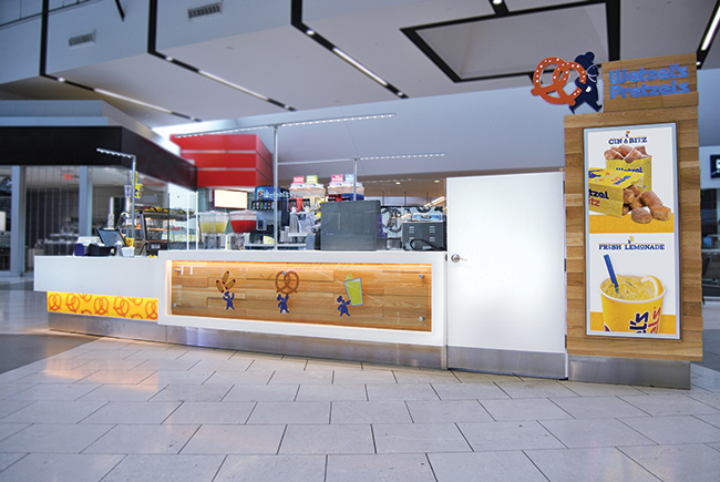
 And it’s in these malls where you’ll increasingly find a Wetzel’s Pretzels kiosk. The Pasadena, Calif.-based company has around 140 upscale mall locations and plans to grow that number. Sales in these stores are about 50 percent higher than the company’s overall same-store average. And to fit into this new urban landscape, the concept has recently released a new prototype that it’s rolled out to a dozen locations — half of them new builds and half of them retrofits — mostly in California. The new prototype is modern and more upscale than the previous iteration but about the same size (200 to 220 square feet).
What are the main goals Wetzel’s Pretzels is hoping to achieve with the new prototype?
ML: To create a competitive design that’s accepted in “A” malls. We want to lead in the category of being a snack offering. We wanted to determine what landlords were looking for and what we could deliver because they determine where we go in the mall. We also hope to engage our guests and bring them closer by showcasing a great new fresh design.
And we want a premium spot to drive our business, so it’s important to keep the landlords happy. We wanted to bring [our design] up a notch because our primary goal is to achieve great spots. We’re never in the food court in a mall, but we want to be in the fashion section — next to the Louis Vuitton store or the Coach store.
You are modernizing the brand. What makes the new design more contemporary?
ML: We were challenged by the landlords to bring in a fresh, cool design. They have a certain look they want to deliver. It’s always a challenge to fall into the specifics they ask for while maintaining your brand integrity and being a good neighbor. So, our new look is fresh, shiny and clean. It blends in but also stands out. We wanted to live within the real estate but also showcase who we are.
We’ve brought in a lot of white — it’s the new color of the design season in retail. Wood is a big part of the design, and the landlords require the use of some wood. But pretzels and wood go well together because pretzels are a very simple product, a very natural product, so just putting in that twist of wood in the detailing of these kiosks shows it’s a very modern product but also has this old, traditional feel as well.
You need to fit in and stand out in these upscale malls. How can you do that?
ML: The landlords wanted something a little muted, a little quieter for the mall landscape. We can deliver a quiet design with the white, but how do you make it stand out in a white background? So, we put the emphasis on colored lighting and maintaining pops of branding within the kiosk. The colored lights bring in that subtle glow without the saturation of color that landlords don’t want. It showcases our brand so we can still deliver on our look without the vibrant colors that are part of our design.
We added a new lemonade glass, which has detailing of yellow light and lemon graphics that are subtle. It’s transparent with lemon wedges etched into the glass, and there’s uplighting into that glass, which is yellow, so it glows through. This has started to become part of our signature design. So as stores come up for renewal and refurbishments, we’re starting to add these features.

The previous kitchens were exhibition-style. What makes them even more theatrical now?
ML: There is more emphasis on it now, and it certainly does help add to the upscale feel. There’s a desire to see what you’re eating and to have an artisanal feel to a restaurant. We want people to know it’s fresh, handmade and made just for you. It’s important that we deliver the message that it’s handcrafted.
Our dough-rolling counter has become less encumbered, and we have dropped in subtle messages to reinforce the quality and freshness. An example is our oven topper, which lets guests know the oven is hot and we are baking fresh pretzels.
You can see our oven and our mixer and everything comes fresh from natural ingredients. When you’re working with flour, yeast, sugar, salt, it’s very fresh, very basic. Children especially have a real fascination with seeing this.
How have you updated the graphics as well?
ML: We have updated them in that we are showcasing more enticing pretzel images with great photography that drives the message home that these are fresh products. Our ingredients are simple, and our process is simple. Our logo has also evolved. We have always had a pretzel man carrying a pretzel, and we’ve integrated him, so he also carries a lemonade and a hot dog, which are important parts of our brand.
The new buildout costs around $80,000 — about 10 percent more than previously. What makes it more expensive?
ML: We are using a higher-end finish, and that has led to an incremental increase in cost. We think franchisees will recoup the extra return on investment quickly.
You plan to open more kiosks in Walmart stores and outlet retail centers as well. Will they be any different than the mall stores, and if so, how?
ML: We are growing that market, and we are actually expanding in these outlet centers because developers are making more outlet centers than malls. These locations are offered to us, and we connect our franchisees with the new outlet opportunities. We do them as they become available.
These locations are very similar in brand essence. However, Walmart does have a less expensive build-out model — we follow the landlords and take Walmart’s direction on what they’d like the stores to look like. They are the same in color and design, but there’s less tile, more paint; it’s a very simple design and it’s much less expensive to build out. The brand identity is there, and you know it’s the same Wetzel’s as in the mall.
What are the rollout plans for the new prototype and retrofitting old stores?
ML: We are going to be redesigning our inline stores as well, so we have the same kind of feel and look throughout, as well as the brand recognition, as we do in our new kiosks. You have to start with one type of retail outlet, so we started this with our kiosks but will evolve and develop it into our inline stores. And as new stores come up for renewal, we’ll start rolling this out into inlines, kiosks and carts.
Tell me about your background — both with Wetzel’s Pretzels and prior to that.
ML: I’ve been with Wetzel’s Pretzels for 14 years and was with Disney for 8 years before that. What I really enjoy about being part of the Wetzel’s organization is my ability to make a difference in the way we deliver stores, and I enjoy working directly with franchisees who are first-time store owners.
We are a very nimble team and can deliver on franchisee profitability. There’s a lot less red tape working with Wetzel’s than with a big corporation like Disney. However, Disney is a leader in branding and is a great company, and I truly loved learning about branding and brand integrity and guest service there. I try to bring that understanding of branding and customer service to Wetzel’s Pretzels and try to deliver great design with the Wetzel’s concept.
What do you enjoy most about your role with Wetzel’s Pretzels?
ML: I really enjoy being able to work one-on-one with our franchisees and having a partnership with the landlord and being able to deliver a great product. Being hands-on is really important to me, as well as ensuring franchisees get great stores and great locations that are easy to operate.
I have truly enjoyed working on this prototype. This is my second design with Wetzel’s Pretzels, so I think I have touched about 300 of the Wetzel’s stores. It’s really exciting, and it’s a fun place to be. And obviously having franchisees to connect with is really important to me.


