Charleston is known for its cobblestone streets, pastel antebellum houses and, increasingly, it's beautiful restaurants. Here's six you must see.
Vintage Lounge
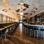
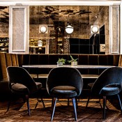
Inspiration for Vintage Lounge was taken from the movie Casablanca and the timeless elegance of French cafes. B. Berry Interiors balanced old and new while maintaining the juxtaposition of light and dark in the rustic-luxe space.
A color scheme of gilded gold and creamy white is warmed up with wooden plank floors, hand-plastered walls, mohair-upholstered seats and velvet banquettes.
The barrel ceiling was gold-leafed by local artisans and then hand-plastered to let gold peek through. Behind the bar, an elaborate wine shelving system holds many bottles on display.
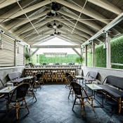
Images courtesy of Andrew Cebulka
NICO
Opened in November 2017, Nico, designed by Feit Design, is a clean and simple French seaside bistro with modern touches like custom-designed wooden wine wall mounts, whitewashed brick, black banquettes and copper accents.
An elaborate raw bar with counter seating — the focus of the 140-seat dining room — features shelving holding metal sheet pans packed with bags of shelled oysters. The shelving is highlighted by an intricate metal fixture overhead. Bright blue and white porcelain seafood towers add pops of color to the muted interior palette. The open kitchen next to the raw bar features a wood-burning oven. An outdoor patio with a bar opens up during the warmer months.
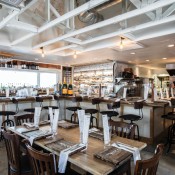
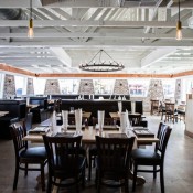
Images courtesy of Andrew Cebulka
Purlieu
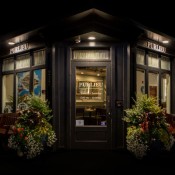
Drawing inspiration from his travels in France, Chef John Zucker serves up modern takes on traditional French brasserie favorites at Purlieu like rabbit rillettes, frog leg tarte and bouillabaisse.
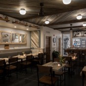
The design — imagined by Zucker’s mom, LA-based designer Terry Zucker — draws in elements of traditional Parisian bistros in the form of unobtrusive overhead lighting, a reclaimed mirrored door spanning the length of one wall, and striped serving plates.
The 34-seat space features a semi-open kitchen and a 4-seat chef’s counter. Wood is found throughout the intimate space, from the wood ceiling to the bare wood tabletops; there’s even wood detailing on portions of the walls. White tiles and white paint provide bright, reflective surfaces and an airiness to the space.
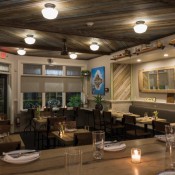
Images courtesy of Paul Cheney
Lewis Barbecue
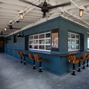
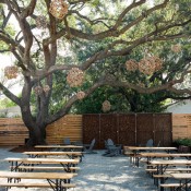
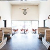
Combining neutral earth tones, reclaimed barn wood and elements like imported Oaxacan tile from Mexico, Lewis Barbecue is the epitome of modern rustic. Banquettes are made from horse stable wood, complete with original paint and bite marks.
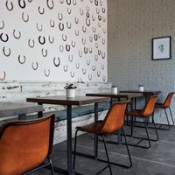
Designer Betsy Berry of B. Berry Interiors pressed horseshoes into a heavily plastered wall and then removed them, leaving reliefs, which she then painted, creating a heavily textured custom design element. She made around 40 indentations and also hung about 25 shoes on the wall. The space also features a blue and white bull mounted on the wall and more custom-designed elements made by local artisans.
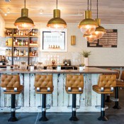
Outdoor tables were made from repurposed on-site tree stumps, and the hanging light fixtures are balls of tree roots that were custom-wired. At the bar, ’70s-style brown leather seats are flanked by large brass light fixtures and a whitewashed tile wall.
Images courtesy of Andrew Cebulka
Tu
Housed in a historic Charleston half house with an addition in the back, Tu offers a drink menu spearheaded by partner/beverage director Joey Ryan and an eclectic small dinner menu with global influences such as lamb with freekeh and labneh and pastrami on a sauerkraut scallion pancake.
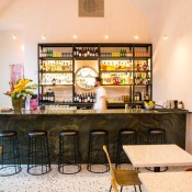
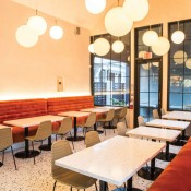
Pink is king inside Tu, which was designed by Chef Joshua Walker and his wife and business partner Duolan Li, who says she envisioned “an American diner through the magical eyes of [Haruki] Murakami.”
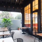
The bright and playful space is a hybrid of Italian and Japanese influences with burnt orange velvet banquettes, pink plaster walls and a Millennial pink bathroom with 1-inch tiles. A magenta foil curtain separates the kitchen from the dining room.
The original structure features private and reserve dining rooms with original, refurbished heart-pine floors. The addition houses the main dining room, a bar and a covered patio with high ceilings, pink plaster walls, terrazzo floors and a glass entryway. The addition also allowed for additional windows and more natural light.
Images courtesy of Ryan Belk
Felix Cocktails et Cuisine
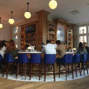
Designer Leslie Landrum, in partnership with her husband Felix, modeled the design of their new restaurant after Parisian cafes. The bar curves around the side of its 2,000-square-foot corner space, taking full advantage of the windows that overlook King Street.
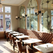
The 70-seat restaurant features natural white oak, custom-made floors and cabinetry, large subway tiles, and a Namibia Marble curved bar. Three antiqued, arched mercury glass mirrors stretch nearly to the ceiling above tufted caramel-colored banquettes. Splashes of cobalt blue are found throughout, including on the barstool chairs.
Personal touches abound, including an heirloom crystal chandelier that once hung in the couple’s dining room and art painted by the couple’s teenage daughter. A few French vintage posters and a framed piece of the original awning from the Landrum’s first restaurant, Café Felix, round out the art on display.
Images courtesy of Andrew Cebulka


