Every restaurant tells a story. Its design not only establishes the setting but it brings guests right inside to experience the owner’s chosen narrative in multisensory ways.
Most are quick to point out that designing to tell a story is distinct from designing to a prescribed theme. We’ve all seen eatertainment-esque theme restaurants that create over-the-top, easily replicable iterations of a concept’s narrative and do so loudly and proudly. But as collective cravings for authenticity and localism grow, so does the need for more subdued and complex approaches to storytelling through design.
“Storytelling and theming are very different things,” says Dwayne MacEwen, president, creative director and principal at DMAC Architecture P.C. in Evanston, Ill. “A client may come in with a particular narrative or theme for the story, but if you try to force a narrative onto the design process, it can end up feeling contrived. The story needs to sort of sneak in the back door in the design process so it fits. And the story needs to connect to the place, the culture and the people associated with it. If you’re just decorating a space to produce a theme, you end up with a commodity that lacks soul.”
Subtlety, Layers Add Richness
MacEwen, whose team recently designed the third Michael Jordan’s Restaurant, opened last summer in Oak Brook, Ill., says the polished-casual concept is a stellar example of one that could easily have swayed toward theming but didn’t. Instead, the designers were asked to create a comfortably upscale space that would convey the essence of the legendary Chicago Bulls star without, as MacEwen says, just using a bunch of basketballs and memorabilia.
Key storylines centered on using design elements to subtly convey Jordan’s finesse, strength and gravity-defying movement on the court as well as his dynamic personality and pursuit of excellence.
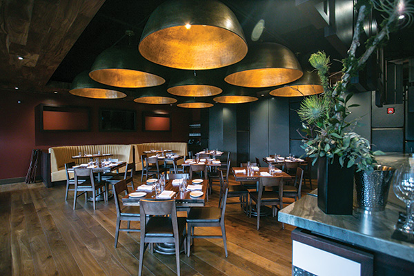 Large dome lights in Michael Jordan’s Restaurant’s main dining room were inspired by the designer’s idea of cutting a basketball in half. Image courtesy of DMAC Architecture
“I definitely had a preconceived notion of Michael from watching him play basketball over the years,” MacEwen says. “I also did a lot of research to try to understand who he was before basketball and tried to capture that nuance in the design. The challenge was how do we make it an immersive environment and still keep it simple, sophisticated and reveal the story over time? We wanted a design that wasn’t sentimental or overt but somehow lets you feel like Michael is in the room.”
Jordan is in the room, vicariously, through a featured “wall of fame” displaying exclusive photos of his career and life. While celebrity photo walls are common in restaurants, this one, which provides separation between the dining room and bar areas, is all about Michael and was inspired by his athletic abilities.
“We took the idea that Michael had this almost unearthly ability to defy gravity when designing the wall,” MacEwen says. “There’s actually no wall; the photo frames are the wall. They’re suspended from this sort of cage that you see through, and some of the frames even wrap around the corners. Like Michael, they’re not limited by the physical space. Most people probably don’t get that connection, but it’s a design solution that’s important to the space and that helps to tell the story. And if people do figure it out, they feel smart.”
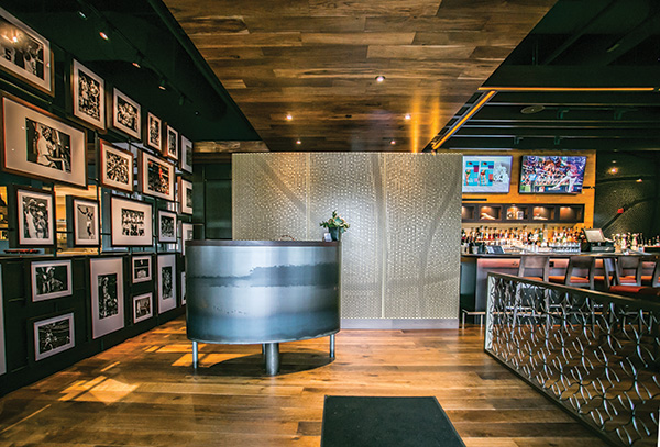 Decorative screens and a half wall separating the Michael Jordan’s Restaurant entry area from bar tables subtly evoke basketball skin and ghosted net designs. Image courtesy of DMAC Architecture
Such clues and storylines can be found throughout the restaurant, creating a many-layered storytelling approach. It begins on the exterior with a facade marked by a large red swoop, inspired by the flight path that Jordan famously took on his way up to the net. Chains strung between planters on the outdoor patio are a nod to the chain basketball nets commonly seen in urban neighborhood parks. Decorative screens and a half wall separating the entry area from bar tables subtly evoke basketball skin and ghosted net designs. Custom pendant lights over lounge booths are an abstract ode to basketballs. Softly lit lockers on the back bar wall hold a small selection of memorabilia, visible through net-like mesh doors. Bar walls are clad in salvaged basketball flooring, and large dome lights in the main dining room are another abstract take on basketballs.
“Conceptually, the idea for those lights was, ‘What would it be like to be inside of a basketball?’” MacEwen says. “It’s sort of weird, but we were looking at fixtures for the dining room and somehow that question led to these massive gold domes, which are also a nod to the championship trophy. So there was conceptual inspiration for them, which fits the story, but also a practical side because they help to bring the scale of the room down and provide intimacy.”
MacEwen adds that just as in any good book, script or theater projection, telling a restaurant’s story through design requires judicious editing. It’s a winnowing and sifting process, starting with many, many ideas gathered through collaboration with the design team, the owner, the chef and/or other key partners to get down to the strongest elements to tell the story.
“There’s a lot of editing that takes place,” MacEwen says. “A lot of ideas inspire you and get you to a certain point but may not ultimately make it through the process. We have to choreograph how all of the pieces come together, and sometimes the result is stronger when you take something away. Good design should have more of an emotional impact, or it just becomes a memorabilia warehouse.”
Characters, Vision and Setting Matter
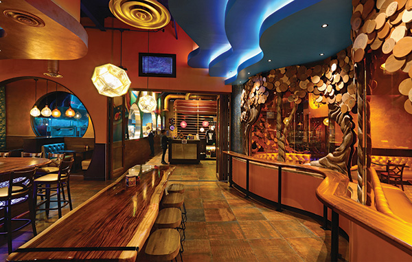 The design narrative at Mellow Mushroom in Midlothian, Va., began with the owners’ desire for a space with a warm, natural, organic look and feel. Image courtesy of Chris Cunningham
Phanie Gapinski, director of interior design at Reston, Va.-based Architecture Incorporated, agrees that a layered application of design elements, some overt but most subtle, creates the most powerful narrative. And while some of the subtler, carefully thought-out design elements might seem arcane, they’re integral to smart design and great storytelling.
Gapinski and her team have designed more than a dozen Mellow Mushroom units over the past couple of years, each one telling the brand’s freewheeling, hippie-culture story while at the same time conveying the individual owner’s vision for his or her business.
The 150-plus-unit pizza chain, founded in Atlanta in 1974, gives its franchisees a lot of latitude in how they choose to tell their own story. While a few branding and layout elements are consistent from unit to unit, each has a completely distinct narrative that’s played out through design.
Gapinski says her process begins with storytelling fundamentals: focusing on the characters involved, what inspires them and what location-based elements can be woven in to tell a story that reflects the culture of the local community. “Each project starts with sitting down with the owner and trying to get at a particular theme or direction that he or she wants to go,” she says. “Some have a pretty clear idea right away, and others need help to figure out what it could be. But in every case and no matter what the storyline ends up being, we try to pull on the history,
aesthetics and vernacular of the area to help bring it to life. Weaving the ‘where’ can be really important to making a connection with the local community.”
At the Mellow Mushroom unit in Chantilly, Va., for instance, the owner wanted to build the restaurant’s theme around the concept of flight. He grew up near Dulles Airport and remembers seeing the Concorde fly overhead as a kid. Providing stronger local contextual support, the Steven F. Udvar-Hazy Center National Air and Space Museum, whose exhibits include a Concorde and the Space Shuttle Discovery, is located nearby.
“This client had always been fascinated with flight, so we went with the history of flight for the design narrative,” Gapinski says. “But we didn’t want it to be too literal and just put airplanes everywhere.”
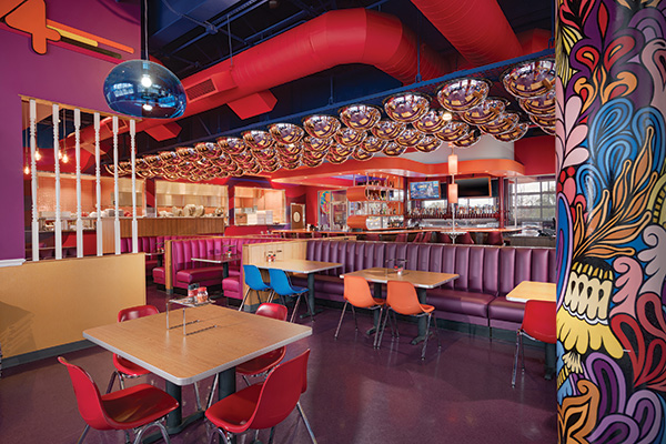 Laminate furniture, Panton-esque mirrors on the ceiling and psychedelic murals create the 1970s-era story that the Roanoke, Va., Mellow Mushroom franchisee wanted to tell with his business. Image courtesy of Jeffrey Sauers
Instead, Gapinski focused on telling the story of flight in part through materials selection. Concrete flooring is the same as that used at Dulles Airport; old propellers add interest in a ceiling treatment; wood used on the interior alludes to the Spruce Goose, the massive airplane built entirely of wood during World War II; leather seating hearkens the iconic leather jacket and helmet worn by Amelia Earhart.
The designer’s job is in part to inspire clients and help them shape their story as a multilayered, non-literal experience, Gapinski notes. Once an overall direction is agreed upon, she begins that process with a broad, concept-image presentation to share ideas about what can be done with the space and to suggest an overall design direction that speaks to their vision while steering clear of overt themes.
For the Chantilly Mellow Mushroom, the team compiled and reviewed historical and iconic images of flight for inspiration. “We started pulling from elements that we saw in those images and discussing how we could create a space that looks like the interior of an airplane hangar without being too literal,” Gapinski says.
The Mellow Mushroom in Roanoke, Va., had a very different story to tell. There, the narrative is all about celebrating the 1970s — the owners’ favorite era and a natural tie-in with the time period in which the brand was born.
That design features wood paneling on the walls, Panton-esque bubble mirrors on the ceiling, lots of color, and hand-painted psychedelic murals on the exterior and interior. The tables and chairs are plastic laminate, and there’s lots of chrome. One feature wall displays a large ’70s-style beer can collection. “When you walk in, you feel like you’re in the ’70s again,” Gapinski says.
That said, the team again took pains to not go too far. Many elements that would have clearly said ’70s — such as shag carpeting, earth tones, avocado green and harvest gold, for example — were rejected in favor of a lighter touch and more up-to-date aesthetic. “Ultimately, while we wanted to convey the ’70s story, we didn’t want it to look just like the 70s,” Gapinski says. “People do want to have updated spaces, not themey spaces.”
Sequels Need Fresh Creative
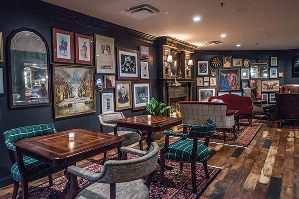 A highlight of the design narrative at Pennsylvania 6 D.C. is a lounge that evokes a residential den. Red velvet love seats front a candlelit fireplace, while charcoal gray walls, wood plank floors and area rugs create intimacy and warmth. Image courtesy of Pennsylvania 6
While new restaurants with new owners’ visions present the opportunity to tell unique stories, designers are often challenged to create sequels. Such was the case for Maggie O’Neill and the team at Washington, D.C.-based Swatchroom when asked to design Pennsylvania 6 in D.C.
An offshoot of the original Pennsylvania 6 in New York City, an American brasserie and raw bar inspired by the city’s historical Hotel Pennsylvania, the D.C. restaurant would carry the same brand narrative but with fresh design elements to appeal to the D.C. market.
“There are so many seemingly little things and layers that go into successfully telling a story through design,” O’Neill says. “But the first challenge is figuring out whether the client really understands and can articulate their concept. Many times, they haven’t thought about things like how the bar top will feel on your elbows or the sound that high heels will make on the floor, or even what combinations of materials they respond to. In such cases, we start very broad and work our way down to specific elements that will best help tell the story.”
Such was not the case with Pennsylvania 6 D.C. Based on the first unit, its owners already had a clear vision. But its success depended on bringing a well-known brand with rich, historical ties to a famous hotel in New York to a new city with no nostalgic connections.
“Why should Washingtonians care about that hotel or this concept? That was the big challenge,” O’Neill says.
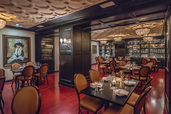 The private dining room at Pennsylvania 6 D.C. was inspired by women who frequented the Hotel Pennsylvania’s Café Rouge in the ’30s and ’40s. Image courtesy of Pennsylvania 6
To meet it, the team focused initially on layout, ensuring that customers get a clear sense of the concept’s plotline immediately upon entering the 9,000-square-foot restaurant. Within view from the entry is a 70-foot central bar topped with marble and clad in oak paneling. Sightlines also lead to a large raw bar and open kitchen, communal tables and intimate booth seating in the bar, a signature red lacquered wine cabinet, and multiple areas for both public and private dining.
“The owners wanted it to be very clear to guests what’s available to them within 30 seconds. They also wanted to emphasize major points of profitability and distinction — the bar, raw bar, wine program and private event capabilities,” O’Neill says. “So form and function in that way established the foundation for the narrative. The layout drove much of what they wanted to communicate.”
From there, the design team focused on conveying the essence of the Pennsylvania 6 brand in ways that would resonate with the D.C. market while staying true to its DNA. Located on the ground floor of an iconic corner office building in the city’s East End district, three blocks from the White House, it’s ideally positioned to play host to politicos and power brokers as well as to a steady stream of tourists.
“There are a lot of lobbyists in the building, so some of the spaces and design elements stem from the idea of providing comfortable, masculine areas that convey a sense of privacy,” O’Neill says. “We wanted people to feel like they could come in and discuss business but not necessarily feel like they’re in a bar.”
To that end, a highlight of the design narrative is a separate but open lounge that evokes a sophisticated residential den. Traditional red velvet love seats front a large candlelit fireplace; charcoal gray walls and Oriental-style area rugs over wood plank floors create intimacy and warmth. Furniture includes polished wood game tables and comfortable armchairs, and a gallery-style collection of framed art and historical images adds character and local color.
“It’s very Ralph Lauren,” O’Neill says of the room. “It’s the kind of environment in which these guys love to have meetings — super-traditional and clubby but polished. And the room is a favorite spot for people on dates and tourists soaking up the D.C. vibe, too.”
While much of the restaurant’s design tells a masculine and traditional story — the main dining room mirrors the New York unit’s room, with oak paneling, gray furnishings and black-and-white artwork — the design team gave the narrative feminine touches as well. The private dining room, for instance, is in part a tribute to the women known to frequent the Hotel Pennsylvania’s famous Café Rouge. The cafe gained fame in the late 1930s and early ’40s for hosting Big Band performers such as Duke Ellington, Count Basie, the Andrews Sisters and the Glenn Miller Orchestra. In 1940, Miller recorded the hit song “Pennsylvania 6-5000,” a tribute to the hotel.
“There are a lot of nods to the women, in particular, who would spend their time at the hotel and cafe,” O’Neill says. “The more we dug into the history, the more inspired we got to weave that into Penn 6 D.C.’s story. For the private dining room, we went with a very sexy, glam look with a red lacquered floor and a laser-cut, three-dimensional ceiling treatment. It feels a little like a jewel box or as if you’re in the rotunda of the Capitol. And, as in the den, there’s a lot of art, all of which has a story to it — some connection to that time period or to the Washington, D.C., community. My favorite piece is a large impressionistic painting by a local artist of a woman who is supposedly the first woman in the city to have filed for divorce. It happened right around the time of the Hotel Pennsylvania’s heyday, so it was a great little addition to the narrative.”
To give the private dining room a more elegant feel, but one that still fit the restaurant’s overall aesthetic, O’Neill balanced heavy, black-painted built-ins with creamy white, pinstriped wallpaper and crystal chandeliers whose shape evokes the Capitol dome.
Such layering of design elements to tell a restaurant’s story, O’Neill says, keeps every project unique. “Very layered concepts with lots of narratives, which is what we had with Pennsylvania 6 D.C., let us create a very distinct experience,” she says. “The best stories reflect not just the concept of the restaurant but also who are the operators, what’s the history, what are the local connections, why is it important that you’re dining in this establishment, what do the owners want you to feel about it when you leave? That should be true whether it’s a concept’s first or fifth unit. Translating all of that into the environment is where it gets really fun.”
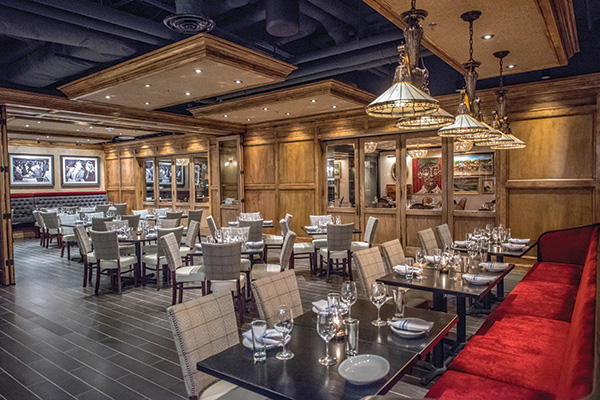 For designers, getting to the crux of that story to the essence of the owner’s vision for the concept is job No. 1. Only then can they begin to weave together design approaches and elements that support and reveal the story in ways that bring it to life and give it meaning. Image courtesy of Pennsylvania 6

