 Irene Yu, image courtesy of Laura JohnsonThe Miranda in Oakland is a timeless venue missing only one thing.
In the fall of 2016 a hotel bar opened in downtown Oakland, Calif. The unusual aspect to this is that there is no hotel attached to it. The bar was designed by Arcsine in Oakland and led by lead creative Irene Yu.
We recently discussed the project with Yu.
Why did the owners of The Miranda want a hotel feel?
IY: The owners of The Miranda were really drawn to a hotel bar and lobby feel because there’s a certain sense of mystery, possibility and timelessness about a hotel bar. It’s a space where you’re killing time or waiting for something or someone. If you’re a visitor traveling alone, it might be an opportunity to meet another traveler or guest at the hotel or even just chat with the bartender.
What is essential for a hotel bar, in terms of design, decor and overall feel?
IY: We felt essential elements include:
- Elevated bar materials, usually stone
- Collected artwork and objects
- Statement light fixture
- Small group clusters
- Generous arm chairs and eclectic side tables
Outside of that, we were inspired by the art deco building (a former Woolworth’s department store) that houses the bar itself.
Can you describe the bar for us?
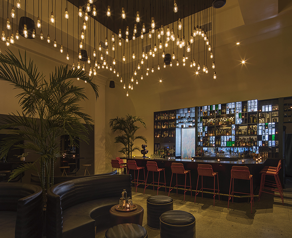
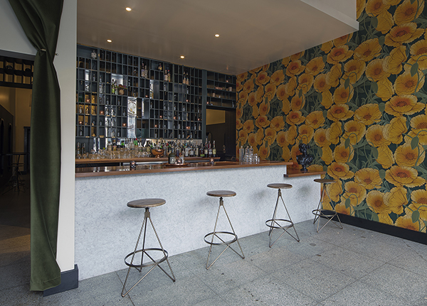
IY: The Miranda is actually divided into two zones. The entry is a cafe-like setting with barstools and a striking wall of poppies that reaches up 15 feet. It’s a light, welcoming space that leads you to a Carrera marble ‘check-in counter’ complete with a wall of mail slots and key hooks.
This custom millwork back bar connects the front bar to a more expansive interior lounge. Once upon a time, you’d collect a personal message there, but now, the mail slots serve as a candlelit liquor display with open and green acrylic-clad cubbies that filter in ambient light from the outside world. I think it adds an element of whimsy and is one of the few cues that this bar is a hotel bar sans hotel. Additionally, it acts as a great filter from the bright front space to the darker back lounge.
Is there anything you must not have in a hotel bar?
IY: Bad fluorescent lighting or a lay-in ceiling is a terrible choice.
What were some of the challenges in executing this concept?
IY: We wanted to have a fun and unique concept but didn’t want to be over the top or too gimmicky. How do you create subtle opportunities for people to figure it out on their own, instead of feeding it to them directly?
Was it important to have different styles of seating and did you use that to create niches?
IY: We felt the variety of different styles of seating was important to create clusters for small groups. The Miranda is much less a bar scene and more of a lounge scene where groups enjoy cocktails. It was important to create these niches to create that sense of intimacy and accommodate the type of atmosphere the owners wanted to cultivate. Hotel bars are places of meetings, encounters and conversation.
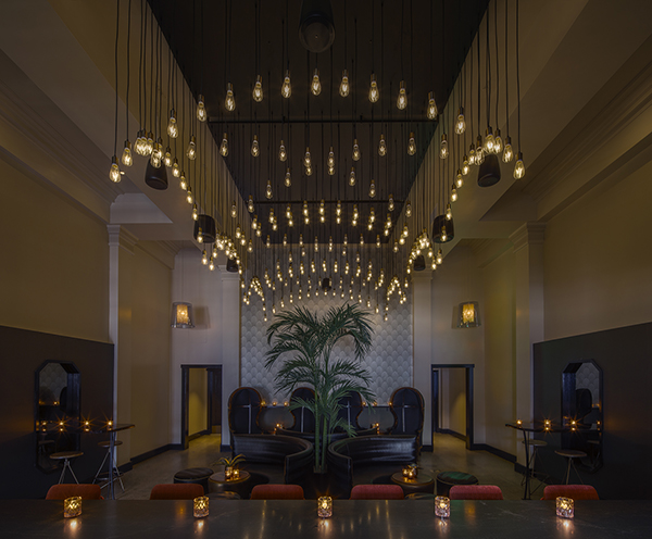
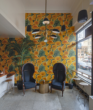 There are hooded chairs, which we selected because they allowed for a sense of privacy and worked within our plan for more intimate seating groupings. The pink flamingo bar chairs were chosen to bring a pop of contrasting color to the space. Everything else is in a black, cream and green palette, and the pink gives it a surge of unexpected color. It keeps the space from feeling too retro inspired.
Tell me about the lighting.
IY: The central light fixture is made up of many single pendant lights, arranged in a way that creates an arched ceiling system. We designed it in this way to create a statement piece that worked with the tall [15-feet high] ceilings, and that was a modern interpretation of a more traditional ceiling. Additionally, it was much more affordable.
 How did you bring in a retro vibe?
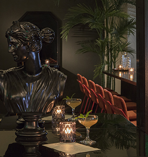
IY: I think “nostalgic” might a better word for The Miranda. We wanted to make a timeless hotel bar that would be opulent and nostalgic, which might be the perfect backdrop of a serendipitous rendezvous. The overall design cultivates this idea. From the “registration” back bar, to the barrel vault at the ceiling, the arched central light fixture, the materials chosen for the bar, and even the palm trees themselves, they all add to the nostalgic vibe of the space.
Images of The Miranda courtesy of Eric Rorer

