 Megan Walsh is a project architectural designer at Aria Group Architects, leading design for one of the four studios in the office.
Within the studio, she leads a design team of 10 architectural and interior designers while also overseeing design for each of the projects the studio produces. Walsh started her career at Aria Group as an architectural intern in 2002 and was promoted to architectural designer in 2003 before moving to California. Upon returning to the Chicago area in 2010, she was hired by Aria Group as a senior architectural designer. She was promoted to her current position in 2011.
Some of the projects and brands Walsh has been involved with while at Aria Group include numerous locations for both Nando’s U.S. and Nando’s Canada; Topolobampo’s remodel in Chicago; a new prototype for Perry’s Steakhouse; several Del Frisco’s Double Eagle locations across the U.S.; the new prototype for California Pizza Kitchen; and some new stores and remodels of Dave & Buster’s.
Walsh is a licensed architect and received her Bachelor of Arts in architecture from Washington University in St. Louis. Her previous experience includes LR Development, Lettuce Office and Robert Mahterian Architects. Here, she shares of her favorite tips, tricks and trends.
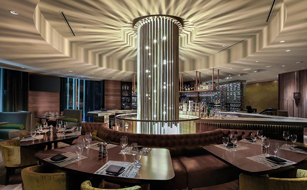
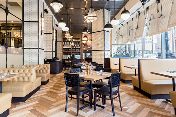
Clever fixes for low ceilings. If the ceilings are low, focus on the vertical and utilize reflective and light finishes within the space to create the effect of the space being higher.
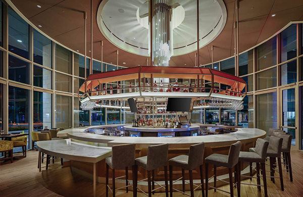
 Windows, windows, windows. Natural light and a view to the outside makes such an impact on a space — the space feels larger and connects to the outdoors. Especially in a restaurant setting, it makes patrons want to enjoy the space much longer. At the Del Frisco Double Eagle in Plano, Texas, we utilized windows to create a dramatic bar space.
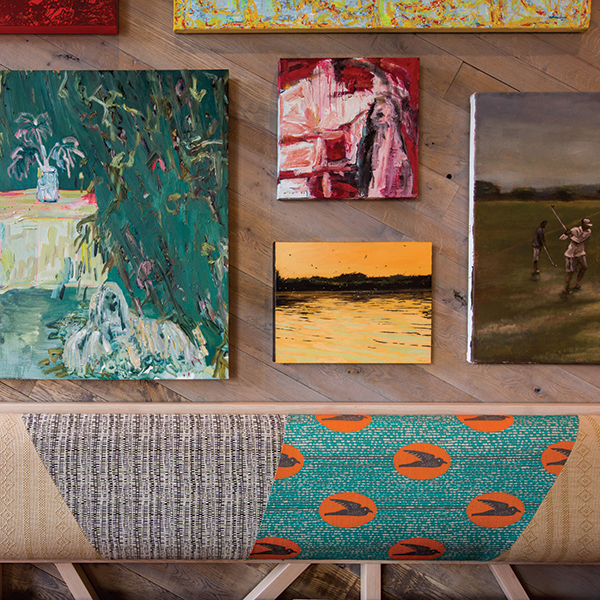
 Residential’s influence on restaurant design. Design that revolves around a more residential warmth and feel is trending right now. Spaces that feel like home with loose and organic seating areas and furniture pieces are being used in lieu of fixed and permanent elements. Right now, it’s all about comfort with a mix of vintage or an eclectic touch.
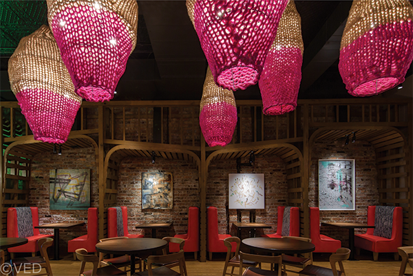
Think holistically. When designing, don’t think about the floor plan, ceiling and walls individually. All need to be thought of as a whole to create a strong design and focus on creating space rather than decorating. Nando’s in the Hyde Park neighborhood of Chicago features a holistic design approach.
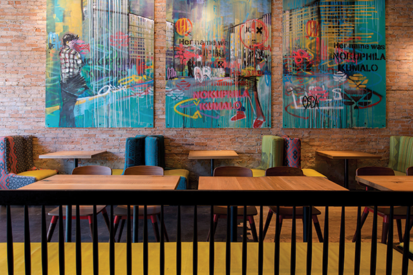
South African design and culture. With our Nando’s client, we are continually exposed to South African design and culture, and the eclectic mix of pattern and color that is seen in South African fashion and design inspires me every day.
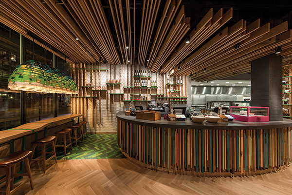
Space often dictates design. If you have an existing space that you’re working with that has a lot of character, it is much easier to design because there’s so much inspiration to respond to. A white box or a cookie-cutter space requires a strong concept to guide your design. Nando’s often occupies interesting spaces and is a good example of where we let the character of the space guide the design.
 Bonus Tips
Instagrammable moments. With the world of social media such a part of our lives, create unique moments within a space that are Instagrammable — creating free publicity and marketing for a brand. This is especially important
for projects that have tight budgets.
The globalization of design. Global travel and the influence of social media to broadly share designs have a big influence on today’s design trends; even big box retailers are on board.
Lighting design. Many designers utilize the idea of a black-out line in a restaurant space and paint everything above that line dark. Rather than a blackout line, consider using lighting to stop the viewer’s eye, so they focus below that field of light.
Spotlight your tables! Every table in your restaurant should have a nice round spot centered directly on it. The benefits are many, but mainly this puts the focus on the food and helps your customers look better. The light from the table will reflect back onto your customers’ faces and you avoid awkward shadows that unconcentrated lighting can create.


