The Galaxy Macau Casino in Macau, China, is home to a large, two-story gaming floor. It also offers a major retail component with shopping and dining options. Recently, Joanna Liu, the daughter of the Casino’s owner, opened a unique retail, lifestyle and food & beverage operation in this retail center, Cha Bei. The project design was led by Robert Polacek, chief creative officer and partner with The Puccini Group.
“The main target market is women from their late 20s to 50s, mostly married,” said Polacek. “Within the culture there, there are a lot of women who are married who don’t necessarily work. One of their biggest day-to-day tasks is tea and shopping. So Joanna saw a hole in the market for women to meet up socially outside their homes and learn about the importance and the proper way of hosting.”
Floral
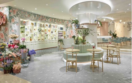
Cha Bei is divided into several sections, including tea, pastry/deli and floral. The floral area, above, features a grey hexagonal tile with a flower-like pattern, along with a large floral print on the wall and shelving for retail products. At the center of the space is a large structural pillar.
“The pillar was not necessarily in the best location for us,” says Polacek. “We took that as an opportunity to create some seating that supports the cafe/pastry area. It also provides us an opportunity to retail it out. It’s a very seasonal display that can be changed periodically.”
And since education is a key aspect of the Cha Bei concept, there is a cart where they can learn about arranging flowers.
“In all these areas is there’s an opportunity for the guests to learn about the product that’s there. In the floral area, the goal is to have an educational component that allows guests to understand the art of floral arrangements. That’s the key focal area with a retail component, where guests can purchase books on lifestyle, home decorating, cake decorating and tea.”
Deli/Pastry
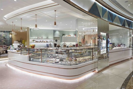
A similar education component can be found in the deli/pastry area, which features a display kitchen for teaching guests the basics of cooking and cake decorating. This space, behind the display counter, features a greenish backsplash and residential-style cabinets and shelving. “In that part of Asia, the apartments are very small and they don’t put a lot of emphasis on cooking and kitchen appliances. It’s very western in style and has a built-in convection oven, sinks and dishwasher,” says Polacek.
As a pastry area, this section was given a polished look that imparts “the idea of finish and elegance,” he added. This includes the white solid surface counter and soffit with gold banding and mirrored cake display. The flooring, meanwhile is the same hexagonal tile used in the floral area, but switched from green to pink to help define the spaces.
Tea Lounge
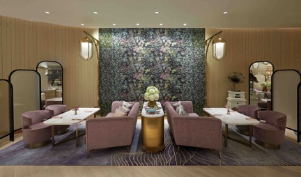
Cha Bei’s tea lounge was designed to feel like a living room, giving guests the chance to practice their hostessing skills. “The client liked the idea of using floral as much as we can throughout the space to create a sense of calmness and softness, so this large floral piece in the back is actually 3-D printed tile that we developed with them,” says Polacek.
The space is further defined by oak paneled walls, large overhead chandeliers and folded screens that provide a sense of privacy and intimacy.
Lounge
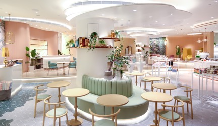
Cha Bei also features a lounge, where guests can sit and enjoy a sandwich, pastry or drink in a setting that’s less formal than the tea area.
According to Polacek, Cha Bei is designed to be a relaxed, informal space. This allowed the designers to use fun, whimsical colors. The lounge is designed to appeal to a broader group of people. “We realized there are not a lot of cafe offerings in the mall itself. The ones that are offering small plates and salads are very crowded. We saw, too, a place for people who are working in the complex to have a place for respite in the middle of their day, where they can go to have a tea and a piece of pastry or whatever that may be.”


