Is the era of authenticity in design finally coming to an end? Will distressed woods, rough metals and muted colors — which served to amplify a collective need for the genuine in a "new normal" — begin to disappear from restaurant design?
Andre Kikoski of Andre Kikoski Architect declares it's all but dead. "It's been a nice trend, one that underscored comfort, texture and naturalness in spaces," opines the award-winning architect, who has designed 35 restaurants. "But personally, we are happy to see it run its course."
Enter bright, vivid colors? Sort of, says Kikoski, who won a 2010 James Beard Award for Best Restaurant Design for The Wright at the Guggenheim Museum in New York City. There, the architect used colorful fiber optics as accents in the sculptured, bright-white eatery.
 California Pizza Kitchen Bar
Today cutting-edge restaurant designs accent largely pale canvasses with bolder colors, explains the Manhattan-based Kikoski. "We're seeing super beautiful, layered whites and elegant woods and palettes of chocolate and black," explains Kikoski, who witnessed these same schemes in restaurants on a trip to Scandinavia this summer. "These timeless color combinations are accented with a single pop of warm yellow and oranges."
Colors to Come
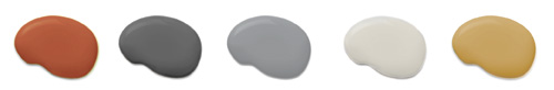
Notions of authenticity via color are indeed shifting, if slowly. Each year, color experts at Sherwin-Williams make predictions on what the hot colors will be for the year to come. A brochure predicting 2014's palette, for instance, proclaims: "Authenticity resonates anew, pulling us toward vivid colors that remind us of folkloric traditions and handcraft."
Yet the brochure notes that to "give [the colors] a bit of breathing room . . . we're gravitating to cool neutrals, the color of shadows and fog."
"That whole Scandinavian aesthetic is really resonating with us," says Jackie Jordan, the company's director of marketing. "It's the simplicity of the design, with its beautiful layers upon layers of gray and then a pop of black or a warm wood to balance out the grays."
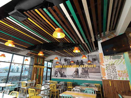 Costa Vida's interior after renovation
Yet "shadows and fog" — that is, gray — could be bad news for restaurants despite what operators may see in glossy magazines or hear from their design firms, warns architect Bill Aumiller, who has worked with dozens of foodservice companies. "Architects love gray," chuckles the founder of Park Ridge, Ill.-based Aumiller Collaborative.
Aumiller recalls a new prototype project he worked on for Smashburger a few years ago. "One of the things we found in our first go-around with them was they were using a light- to medium-gray on the walls and didn't realize how dingy gray is," he explains. (See the "Primer" sidebar for advice on using gray.)
He suggested off-white paint instead. "We said, 'Don't go to a pure white. It's too sterile. You want to stay on the contemporary side of things.'"
Aumiller also pulled out color studies to convince officials at the fast-growing burger chain to be careful selecting other colors, as well. Mossy green, gray and blue, for example, can dampen a customer's enthusiasm for a restaurant space if not applied judiciously.
Yellows, reds and deep browns, on the other hand, bring life and warmth to a dining room, he maintains.
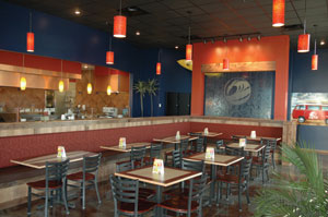
 California Pizza Kitchen at Sawgrass MillsPolished and Predictable
Clint Coleman of California Pizza Kitchen (CPK) depends on similar hues to stimulate business in the company's new prototype — a significant departure from the glossy, chain-like finishes in the existing units. Such bright finishes, one could argue, in addition to (or because of?) the Great Recession, contributed to sales and traffic declines at many casual-dining chains.
"I looked at [our current restaurants] and thought: They're not relevant anymore," notes Coleman, CPK's vice president of development. Late in 2012 CPK's new prototype debuted in Sunrise, Fla., at the Sawgrass Mills mall.
The design, which incorporates plenty of reclaimed wood, initially featured a palette of soft grays, yellows and greens. But Coleman, a former operations executive, says he balked at the wall coloring upon entering the new prototype for the first time. "I walked in and said, 'It's missing something.' It wasn't bold enough. I wanted colors that got your attention," he recalls. As a result, the design firm jacked up green and yellow accents.
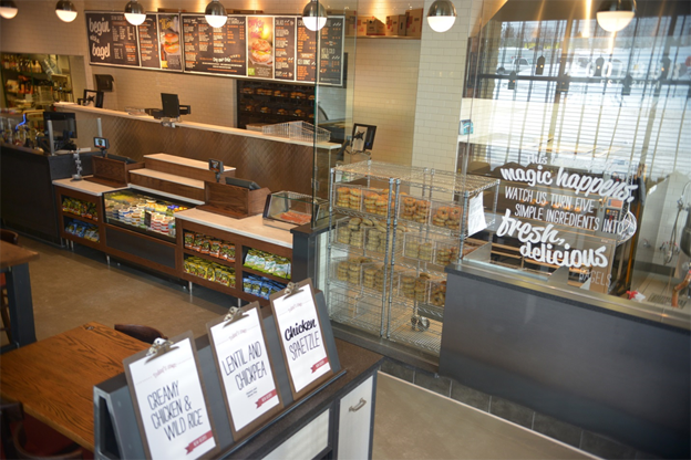
Bold colors, of course, remain part and parcel of restaurant design — particularly in limited-service formats where eye-popping palettes remain crucial to quickly catching a customer's eye. There, the trick often is to suggest an experience in addition to a tasty meal.
Vaya Con Costa Vida
That's what Costa Vida Mexican Grill had in mind when it hired SuperGraphics, a Seattle-based design firm, last year to come up with a more robust take on Mexico's coastal restaurants. Jason Stowe, vice president of development, maintains the new, brighter colors in the redesigned units distinguish the brand from other surf-oriented, fast-casual Mexican eateries.
 Costa Vida before interior color scheme renovation
"The turquoise and yellow [on walls and tables] along with some graffiti is what you see in streets in the Baja," he explains. "And that lifestyle, of people hanging out on the beach, just draws them in."
The bold color scheme impresses restaurant design consultant Dee Pettit of Results Thru Strategy. "The color palette," she says, "is on trend — bright, fresh and fun — and hits a good balance between rustic comfort and the contemporary relaxed feel of the modern Baja costal café."
Primer: Why Cool Colors Aren't So Cool
Picturing your dining room in a sea of cool, subdued blues and grays? You'd better think twice about that, advises restaurant designer Jennifer Ambrose.
rd+d: Why can cool colors, which seem relaxing, actually hurt the restaurant experience?
JA: The most important thing to remember is that a restaurant needs to feel inviting, comfortable, and that includes enticing guests to eat the food. Cool colors can be used and need to be incorporated to complete the color palette, but they need to be used minimally as accents and to be utilized in the right locations.
rd+d: Can you offer an example?
JA: Two colors I have always used with caution are blue and gray. In restaurant design, colors need to complement and enhance the food – warmer colors that are found naturally in foods themselves. Blue is not a natural color found in food. When blue is used in great quantity, such as an entire wall surface, you have to be careful about the reflection it can cast onto the food. Light reflects off of all surfaces and can change the food's color.
rd+d: How do you control for lighting?
JA: We have to be very careful about lighting. The warmer the light source, the better, due to the fact that some lighting can cast a blue tint and literally can make the food look gray.
rd+d: How can operators better use gray?
JA: Research and studies have shown that gray may not only reduce the appetite but also create a negative mood. It's not that gray can't be used. It's that we just have to be careful how we use it. Painting an entire wall gray would not be recommended, but bringing in specialty materials – a gray concrete or metal accent – is a great way to add a cool color to the palette but keep it minimal.
Chicago-based Jennifer Ambrose has worked on more than 100 hospitality design projects over a 13-year career that included a position as lead designer with Aumiller Youngquist PC. She is currently the owner of O'Sketch Studio LLC.