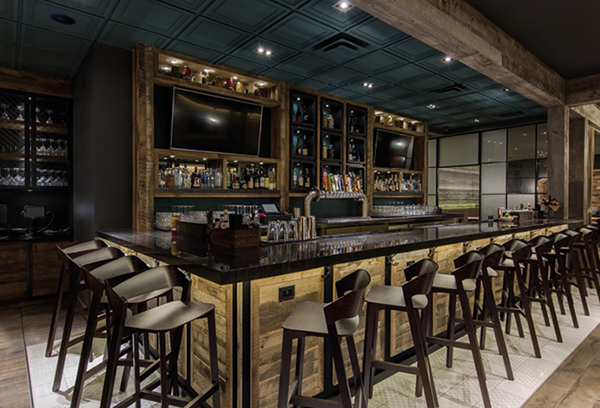
 One Fifty One in Elmhurst, Ill., utilizes tile in place of wood on the floors. Photo by Emilia CzaderCreate a fabulous-looking restaurant without breaking the bank.
It’s every restaurant owner’s dream: a fancy-looking venue that appears chic, luxurious and expensive, yet it costs a fraction of what customers assume.
Creating or renovating a restaurant is not cheap. If you are starting a new concept, design and construction will be one of the biggest up-front costs, according to Joshua Zinder, principal of Joshua Zinder Architecture + Design in Princeton, N.J.
Fortunately, there are ways to achieve high-end aesthetics at lower price points.
1. Buy used decor to drive home authenticity.
Betsy Berry scoured the internet, flea markets, and supply and seed stores when she was creating the interior for Lewis Barbecue in Charleston, S.C., which opened in June 2016.
One wall of the restaurant is covered with horseshoes that Berry, owner of B. Berry Interiors in Charleston, acquired mostly from farms and ranches in Texas. She had the wall heavily plastered, pressed the horseshoes into the plaster, and then removed them, leaving reliefs, which she then painted. She made around 40 of these and also hung about 25 shoes on the wall. “It’s abstract art,” she says.
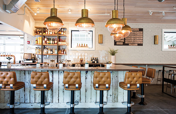 Rustic elements in the design create an air of authenticity at Lewis Barbecue. Photo by Andrew CebulkaOn other walls, Berry hung 15 authentic lassos. “This was really bang for our buck, and I love using something that’s 3-D — a form rather than a photograph,” she says.
Berry was also creative with the lighting. For the outside garden, she found, at a flea market in Texas, 20 root balls — from the roots of trees — which are irregular spheres. She joined them together and wired them, then placed a lightbulb inside each one. The real beauty was that “because they’re natural, we didn’t have to finish them in any way,” she says. Each cost $75 to $100.
The lighting in Union Cantina in Southampton, N.Y., was also done inexpensively. Owner Ian Duke decided to use empty Don Julio bottles. He cut off the bottoms, wired them and hung them over the bar.
“You are adding authenticity to a tequila bar by adding tequila bottles, it’s something for guests to talk about and you’re not going out and spending a fortune,” Duke says. He made the lights himself for about $8 each. “To get lights to fit the exact decor we were looking for could have cost hundreds apiece.”
2. Work with what you have.
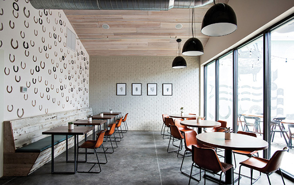 Horseshoes adorn the wall of Lewis Barbecue in Charleston, S.C. Photo by Andrew CebulkaAuthenticity being the aim in restaurant design actually helps operators create spaces for less, notes Zinder. “You can use what’s there and expose the structure,” he says.
For Red Onion, a deli in Princeton, N.J., Zinder says “doing less means eliminating things. We removed the acoustical tile panels from the metal tee-grid frame of the existing suspended ceiling. Then, we painted the grid a vibrant red and left it in place, suspended without panels, and painted the exposed conduits and ducts above the grid a pale blue. The bright red grid draws the eye and de-emphasizes the objects above it while avoiding the closed-in look of a dropped ceiling. By painting the grid, we changed how people look at the ceiling, making what was old and worn into something new in a cost-effective way.”
When Rachael Lantry, a designer at Arcsine, an architecture and interiors firm in San Francisco, was tasked with converting a former Asian pop-up restaurant into a Cajun venue, Alba Ray’s, which opened earlier this year, she was asked to do so on a tight budget.
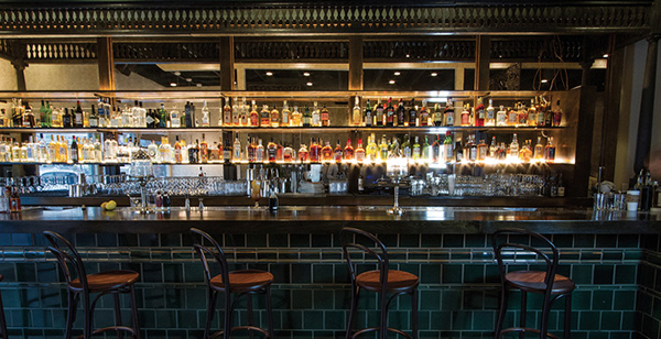
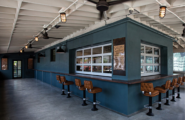 An outdoor area utilizes both natural and durable components at Lewis Barbecue. Photo by Andrew Cebulka“We had to figure out what we could reuse, but the new aesthetic was completely different,” says Lantry. The bar was a clean, light wood, which just didn’t work. “But the cost of changing out a bar is massive, so we got some locally made custom tiles and clad the bar in them. Then, we stained the rest of the bar so it’s totally transformed. The tiles are the most expensive material in the space by far, but because they’re handmade, they are authentic-seeming.” The large cost was still way less than replacing the bar, she notes.
Lantry also spent some time deciding how to soften the walls from the austere Japanese look they had previously. So, she booked a specialty painter to give the walls a rustic, weathered feel. “For that additional investment, we now have a custom hand-painted finish — six layers in total — which is unique and has a lot of variation,” she says. She also kept the floor exactly as it was — black and scuffed, so it works for the Cajun feel.
3. Do it yourself.
 An outdoor area utilizes both natural and durable components at Lewis Barbecue. Photos by Andrew CebulkaFor his outdoor patio at Union Cantina, Duke decided to jazz up what he already had. He took some old banquettes and repaired them and booked an upholsterer to recover them. “We probably saved $25,000 rather than buying new ones,” he says.
Duke refinished both interior bars by hand, sanding them, repairing them, re-staining and re-lacquering them. “As opposed to going the route of master carpenters, we went the route of hiring guys who were extremely handy,” he says. “By doing all the work ourselves, we saved in excess of $100,000 as all contractors charge a percentage on materials.”
And for the 400 Rabbits Bar, which is a tequila bar and private event space in the rear of Union Cantina, Duke refinished a tin ceiling, which he says was in “tremendous disrepair, but the air of authenticity was essential to keeping the feel of the room we wanted to achieve. We took another old tin ceiling and used it to patch areas and seams.” He painted it with silver automobile paint because the color was exactly what he wanted and because it’s a terrific sealant, he says.
Duke also worked with a landscaper, his chef and a couple of carpenters to create a custom-built waterfall at the entrance to the restaurant. “We needed to change the entire aesthetic of the entrance,” he says. “This building has a history, so it was very important to remove the memory of what had been there. If we’d hired someone, it would have cost around $40,000, and we did it for under $10,000,” he adds.
4. Use expensive-looking products.
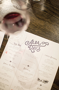
 The team at Alba Ray's opted to go with inexpensive tabletops, save for a couple of pieces of marble. Photo by Pierce Larick from New Revolution MediaIn a recent restaurant he designed in Princeton, Joshua Zinder put in a luxury vinyl floor that looks like wood. “You have to get down on your knees to see that it’s not wood,” he says. The cost of vinyl is roughly 75 percent less than wood.
Using large-format porcelain can also be a money saver, Zinder says. “Tiles 5 by 8 feet can look like granite or marble and are only one-quarter-inch thick. That saves a lot of money because they’re so thin and you spend way less per square foot.” He uses this for walls, floors, cafe counters and serving areas.
Zinder has also used concrete tile when clients have wanted a concrete floor. He combines this with wood veneer, “which gives the space a rich look, while the concrete makes it accessible.”
And in a juice bar Zinder recently designed — Arlee’s Raw Blends in Princeton — he used a recut composite veneer made from sawdust that looks like the real thing. It’s 10 to 25 percent less expensive than real wood veneer.
 Photo courtesy of Alba Ray’s by Pierce Larick from New Revolution Media“The concept is all about sustainability and eating and living healthily, and the space worked off this idea of community and home,” Zinder says. He used the veneer to make frames in the shape of houses and hung them on the walls. As they progress along the wall, they get bigger, so the representation goes from home to community.
At the same location, Zinder took coins (sections from the middle) of a fallen tree — so there was no cost — and made a drinks table and a POS stand from them. “So it has this notion of sustainability and rejuvenation,” he says.
“We love using natural materials like stone or wood,” Zinder adds, “but the reality is when you have clients with budgets, you have to come up with creative solutions to maintain the aesthetic within their budget.”
The faux beams installed at One Fifty One in Elmhurst, Ill., serve no functional purpose, but they were inexpensive, look impressive and add a lot to the restaurant, says Nicole Poole, associate, project architectural designer, Aria Group Architects, Oak Park, Ill.
 One Fifty One photo by Emilia Czader“We used a cut plank, which was inexpensive, and clad and mitered each corner to create the beam look,” Poole says.
Poole also used a brick veneer for one of the walls in the restaurant instead of more expensive real brick, and for the floor, they opted for a long plank tile that had lots of variation, was durable and wouldn’t show any repeating patterns. “It looks like a stone plank floor,” she says.
Throughout the restaurant — in the booths, on the ceiling, at the back of the bar and on the bar’s die wall — is antique oak and corral board. “We seam it together because it’s not very long, and you can see it if you look really closely at the beams in the ceiling. If you are open to varying widths and lengths, it keeps the costs down and gives that rustic feel,” Poole says.
Inside Lewis Barbecue, booths are made of a fence from a horse farm in Kentucky, which Berry’s lumber source found for her. “We kept it the way it was because we liked the look — it even has bite marks from the horses,” Berry says. “We just sealed it. If I’d wanted to recreate that finish with new wood, it would have been a lot more expensive — but the worn look was already there.”
5. Partner with local artists.
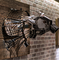
 Lewis Barbecue photo by Andrew CebulkaDue to the budget restrictions at One Fifty One, Poole worked with a local artist who created three animal heads — a large cow, flanked by a slightly smaller pig and sheep, almost to scale — largely from miscellaneous products in Aria’s archive, including vinyl and leather samples. Other products for the heads, such as telephone wires, wood backer boards and plywood, were either donated or cost-effective. “It’s a farm-to-table concept, so the animal heads worked really well,” Poole says.
The same artist, Amy Couey, helped keep costs down on a wall in one of the two semi-private dining rooms. “We found a grass cloth wallcovering, but we just couldn’t afford it,” Poole says. “We showed Amy the grass cloth, and she turned that concept into a mural painting of an abstract meadow for a much lower price point.”
6. Splurge selectively.
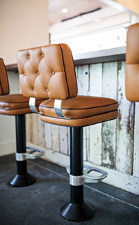
Keeping costs down is also about knowing what it’s OK to spend money on. “In really important zones, we spent more,” Poole says. For example, in One Fifty One, there are some fully upholstered chairs — “accent pieces that cost more,” she says. “So we sprinkled in a few more expensive items in areas we knew would make more impact, especially the upholstered chairs, which are the first thing you see when you come into the space.”
At Alba Ray’s, Lantry added decorative corbels to the columns and beams — a typical look in the South. She purchased six for $250 each. It was expensive, “but not crazy for the impact they have,” she says. She did the same with the lighting, sourcing some crown chandeliers and some traditional lanterns, custom made in New Orleans, which cost around $400 apiece, “but they add some luxe and authenticity to the space.” Alba Ray’s furniture is cheap, except for a couple of marble tabletops, “but that cheap look fits the aesthetic,” she adds. “You’ve got to pick where you put things. You can’t cut corners on the design and use cheaper materials throughout.”
