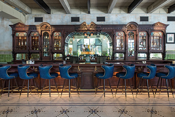
 After being stored for a decade and shipped to Austin in hundreds of pieces, New York’s legendary Cedar Tavern bar was meticulously reconstructed and shines again in Eberly. All photos by Merrick AlesMany a great restaurant concept idea is hatched over drinks. In the case of Eberly, a contemporary American restaurant in Austin, Texas, creative inspiration sprang not from booze-fueled collaboration on a cocktail napkin but from the beauty and backstory of an actual bar.
Opened last October, Eberly is the result of its owners’ desire to relocate, refurbish and give new life to the massive mahogany and stained-glass bar that was the crown jewel in New York City’s Cedar Tavern. Opened in 1866, the tavern later became renowned as a popular Greenwich Village hangout for abstract expressionists, beat writers, actors and musicians — the likes of Jackson Pollock, Jack Kerouac, Bob Dylan, Jimi Hendrix and Allen Ginsberg.
The establishment went dark in 2006, but its intricate wooden bar — considered a work of art and a piece of history — found a new home at Eberly. The operation’s development process, from concept to real-estate selection to layout and design, was driven by the opportunity to bring the Cedar Tavern bar back to life.
Purchased by Austin-based business partners John Scott and Eddy Patterson shortly after the tavern closed, the bar was disassembled and stored in a climate-controlled warehouse for nearly a decade before being shipped to Austin for its reincarnation. While the bar rested in storage, Scott and Patterson, who separately own other restaurants in Austin, worked to find a location that could accommodate its 40-foot length and elaborate 11-foot-high back bar.
They found their spot five years ago: a big, concrete bunker of a space on South Lamar Boulevard in downtown Austin. The post-World War II building, which once housed a print shop, measures more than 14,000 square feet and offered plenty of space in which to give the Cedar Tavern bar a warm Texas welcome.
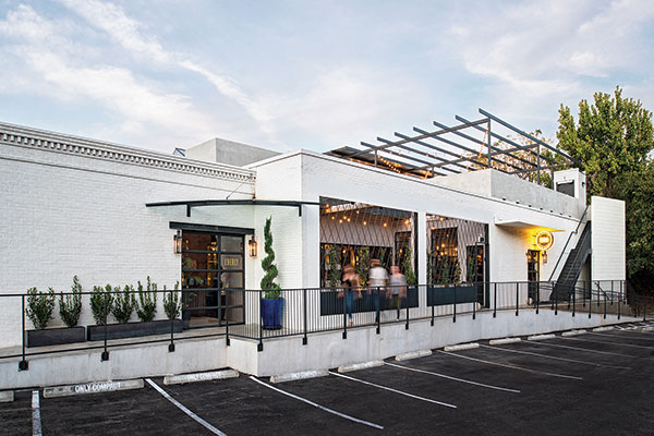 Housed in a large, concrete building built in the 1950s, Eberly’s clean, modern exterior juxtaposes nicely with its richly textured, multilayered interior.As adaptive reuse projects go, Eberly was a doozy in both size and complexity. To make it happen, Scott and Patterson brought in two additional general partners, independent interior designer Mickie Spencer and general contractor Michael Dickson of ICON Design + Build. Both are players in Austin’s thriving restaurant scene, contributing award-winning project work as well as separately having ownership stakes in several local operations.
Their first task was to figure out how to delineate all of that space. “From the beginning, we knew that it would be very tough to pull off a single-entity restaurant that big. There’s just no way you’re going to keep it full,” says Dickson. “So we shifted our thinking and worked to create a layout that would showcase the bar but also allow for intimacy and a variety of experiences within the building.”
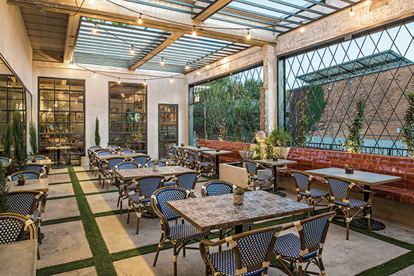 An 800-square-foot patio was created off the study by removing concrete ceiling panels from what was once interior space. Those panels were cut and repurposed as pavers, and artificial turf between them lends a modern English garden feel.The end result is what the Eberly team describes as “a thoughtful collection of dining, drinking and thinking spaces.” Named for Angelina Eberly, a local innkeeper who, in 1846, fired a canon to stave off a rebellion and preserve Austin as the capital of Texas, Eberly encompasses distinct areas that by virtue of strategic layout and smart design comfortably coexist and complement. The largest area is a 2,170-square-foot main dining room with its own bar on one end of the building (under 9-foot ceilings where the old print shop’s offices had been), and the second largest is the 1,900-square-foot Cedar Tavern bar on the other end (under 14-foot ceilings where its warehouse was).
A 40-foot-long display kitchen sits along the far wall between these two primary spaces. It helps to separate the two areas and adds visual energy. To create more intimacy and interest, the team also added a 675-square-foot English conservatory-style study between the dining room and bar. And they removed ceiling panels from a section of what had been interior space along the building’s front wall to create a new 800-square-foot outdoor patio. Separated by a glass wall from the study, it sits between the front entrance to the dining room on the left and the separate exterior entrance to the Cedar Tavern on the right. Additional space directly behind the bar was converted to a 900-square-foot private dining and event room. A 3,100-square-foot rooftop terrace, expected to open soon, completes the operation.
“The idea was to transform the building into what would feel a little like the public areas of a hotel,” Spencer says. “It was designed to allow guests to transition throughout the day and choose their experience. Each space is its own moment, but all are visually tied together and have sightlines to the bar. Even if you’re in the back private-party room, you can see into the tavern through a big two-way mirror that we installed in the back bar. You can have a private party in the study or the back room, but visual energy flows between the spaces.”
Something Old, Something New
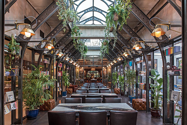 To break up the space and create intimacy, the designers added an English conservatory-style study that sits between, and has sightlines through, the dining room and bar. Classically Victorian, it takes a modern turn thanks to nouveau-style steel framing and concrete ceiling beams.From the construction end, Dickson began with what was almost a clean slate.
“Outside of demo required to put in the plumbing, mechanicals, HVAC, etc., we didn’t have to do much to the existing structure,” Dickson says. “It was a vacant concrete shell — concrete floors, walls, even ceilings — and we were able to refurbish and use the existing windows and add just a few new ones. Our goal was to use as much of the existing structure as possible. It was more about finding the right layout and creatively defining spaces than about tearing down and building up walls.”
The team’s goal of using as much as possible of the existing structure created an interesting design challenge: how to honor the building’s midcentury bones while playing up the original Cedar Tavern bar’s Victorian sensibilities.
Spencer embraced the challenge. “I liked the idea of mixing the modern and the old. That’s what shaped the overall design vision,” she says. “Everything started with the old bar. We wanted to respect the time period that it’s from but present it in a fresh way that would give it a new life here in Austin. But it also had to make sense in this Post-War building, so I ended up crossing a lot of borders between Victorian, art nouveau and midcentury modern. The idea was to stay true to older materials and aesthetics but to throw in some modern twists. The more I started looking at midcentury stuff, the more threads I found to art nouveau and late 1800s design inspirations, so it felt natural.”
Examples of period mixing can be seen throughout Eberly, from flooring to wall coverings to furnishing and lighting. The Cedar Tavern bar itself — constructed of intricately carved mahogany, brass and stained glass — set the tone for materials and color selections, including mahogany, rich saturated blue and brass. Millwork and furniture designs in the dining room were inspired by midcentury modern furniture designer Kent Coffey’s work with a hint of art nouveau for softness. The glass-enclosed study, classically Victorian in style, takes a modern turn thanks to nouveau-style steel beam framing and concrete ceiling beams.
Custom tile flooring in the Cedar Tavern was inspired by photos of mosaics in buildings built in the 1800s. “The sunburst pattern is similar to something I saw in one of the old photos, but I gave it larger scale and a more modern look,” Spencer says. “I used that same approach for much of the lighting as well. Many of the brass fixtures were salvaged from old Navy ships, but they were rebuilt to be different and more modern from what they originally were.”
Utilizing as much as possible of the existing building also meant embracing concrete in the design palette: It’s used creatively and prominently throughout. Says Spencer, “I used to live in Barcelona and love Gaudí. He used concrete in very elegant art nouveau ways, so again, it was giving this material a sort of old/modern twist. We wanted to show it off instead of trying to hide it.”
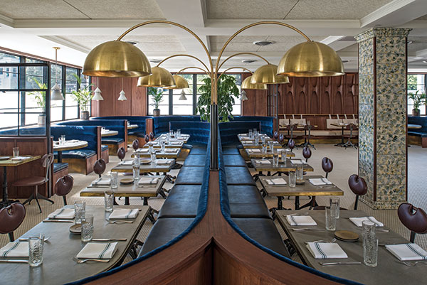 Custom furnishings and millwork in the dining room blend midcentury modern and art nouveau influences. Mahogany, brass and concrete are dominant materials, while a rich, saturated blue adds elegance throughout.When the team removed a section of concrete ceiling panels from an interior area to create an open-air patio, they repurposed them as pavers. “They’re very thick and were monsters to deal with. We had to bring Bobcats in to move them around and get them in place,” Spencer says. “We cut them in squares and put artificial turf between them for a modern English garden feel. We also added a concrete fountain feature on the patio, made by a local artist who specializes in concrete sculpture.”
Spencer also tapped that artist, Paul Oglesby, to create a variety of design elements throughout Eberly’s interior. Pendant lights suspended over curved booths in the dining room have concrete shades with brass bowls for softness; dining room tables fronting blue velvet banquettes have tops of concrete trimmed in brass, as do some patio tables; restroom countertops are concrete; and ladyfinger-style concrete tiles embellish and anchor signature light fixtures on large columns framing the Cedar Tavern bar.
Original concrete ceiling beams are exposed in both the Cedar Tavern and the study, and plaster work on walls in both spaces plays off of the building’s original, age-softened concrete.
Overall, Spencer and Dickson say Eberly was both the largest and longest project they’ve worked on, stretching over a three-year period from initial discussions to opening. However, as with most adaptive reuse projects, “the end result justifies the means,” Dickson says. “Part of the fun and part of the frustration on a project like this is that it’s very much a design-build situation, almost like an art project. Every week, there was a surprise and something new to figure out. It may not have been the most efficient way to build a restaurant, but it’s 100 percent why it has so much beauty and character.”
Snapshot
- Location: Austin, Texas
- Opened: October 2016
- Concept: Contemporary American restaurant and bar
- Project type: Adaptive reuse
- Size: 14,000+ square feet
- Seating capacity: 400+ (80 dining room; 55 Cedar Tavern; 38 study; 40 patio; 40 private dining; 150 rooftop terrace)
- Service: Dinner nightly; additional dayparts phasing in to include
breakfast, brunch, lunch, late-night - Project duration: Initial design to open, 3 years; actual build-out, 1 year
- Left: After being stored for a decade and shipped to Austin in hundreds of pieces, New York’s legendary Cedar Tavern bar was meticulously reconstructed and shines again in Eberly. All photos by Merrick Ales
- Left & Below: Housed in a large, concrete building built in the 1950s, Eberly’s clean, modern exterior juxtaposes nicely with its richly textured, multilayered interior.
Project Team
- Co-founders: John Scott, Eddy Patterson
- Interior design/general partner:
Mickie Spencer - Contractor/general partner: Michael Dickson, ICON Design + Build
- Architect: Clayton & Little Architects
- Bar reconstruction: Jonas Dufor, ICON Design + Build
- Stained-glass restoration: Kokomo Opalescent Glass
- Concrete artistry: Paul Oglesby
- Plaster artistry: Kevin McCormick
- Furniture, millwork: Michael Yates
- Custom lighting, mosaics: Mickie Spencer
- Signage: Evan Voyles, The Neon Jungle
Contractor Insights: Michael Dickson, ICON Design + Build
Bar reconstruction: The original bar had been disassembled into no fewer than 1,000 pieces, some of which were one-inch by one-inch, and many of which were incredibly detailed. We had to reconstruct it in a way that was as authentic as possible. Some parts were missing or unusable, so whether wood or brass, they had to be created to match. The original stained-glass panels were falling apart. The company that made them in the 1800s is still in business, so we shipped them there to have them strengthened and restored. The original bar wasn’t built to handle modern plumbing, electrical and refrigeration, so all of that all had to be worked in, too.
Permit purgatory: The biggest hurdle early on was learning we needed a new water line. We ended up having to cross five lanes of traffic on Lamar Boulevard, one of the busiest central-city arteries, to get it done. That process set us back about three months, and we didn’t get our water turned on until a week or two before opening.
Exterior: The building is unassuming from the outside, and that was part of its appeal. We loved the idea of a very simple, clean-lined exterior juxtaposed with the very rich and multilayered interior. It’s so unexpected when people walk inside, it takes their breath away.
Acoustics: That was very much an issue. We wanted to leave all of the original concrete ceiling beams exposed but ended up putting a coffered ceiling with acoustic panels in the dining room. We did leave the beams exposed in the Cedar Tavern, but within the first couple of weeks, it was clear the space was too loud. After the fact, we had to add some acoustic panels in there as well.


