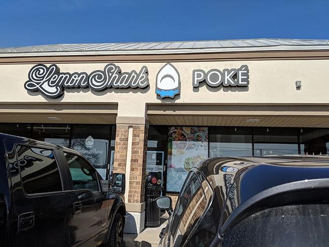
An attractive curb appeal gets passersby to stop and look, draws them into the restaurant and sets up the beginning of a remarkable dining experience. “Curb appeal — it’s what it’s all about. Unless you find a restaurant via Yelp, how else would you find a restaurant?” says Matthew Coates, AIA, LEED AP, NCARB, and owner of Coates Design Architects in Seattle, Wash.
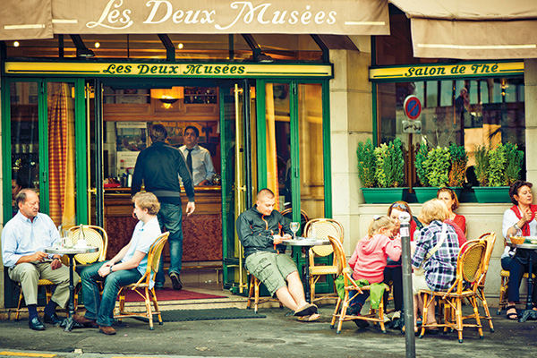 In fact, Coates, along with top-notch restaurateurs Tom Douglas, also of Seattle, and Benjamin Knight of Kinston, N.C., agree that a restaurant’s curb appeal plays an essential role in creating positive guest experiences. Rather than creating a to-do list to strike a charming curb appeal, these experts recommend focusing on excellent architectural design and creative details that create a warm and welcoming restaurant facade and entrance.
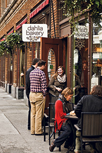 Outdoor tables, like the one here at Douglas’s Dahlia Bakery in Seattle, allow the actual dining experience, including the food, to become part of a restaurant’s curb appeal. Photo courtesy of Tom Douglas RestaurantsDouglas, the owner/founder of Tom Douglas Restaurants, with 20 eateries all within 10 blocks in downtown Seattle, says his restaurants’ curb appeal allows for the greatest amount of transparency between the inside and the exterior streetscape. Douglas likes to take advantage of the surrounding Seattle city life to make it a part of his restaurants. “I love the reflective street lighting, the sounds of the monorails going by and the energy that you see on the street,” he says.
Coates agrees that transparency is key. He describes transparency as “layers of space” and feels glass walls and windows create a first layer of “defensible space” between the sidewalk and the front of the restaurant. Having these layers of space helps people make “gradual psychological commitments” when choosing a restaurant. “People want to see what other people are eating. They think to themselves, ‘If there are a lot of people there, it must be good,’” he says.
In contrast, transparency is not part of the architectural concept at Chef & the Farmer and the Boiling Room Oyster Bar, Kinston, N.C., restaurants operated by Benjamin Knight and Vivian Howard. Kinston is a town with a population of approximately 21,000 people that does not have pedestrian and vehicular passersby to attract a casual crowd of guests. Rather, Knight says the key element that draws visitors to their restaurant is the excellent dining experience that includes good architectural design, service and food: the whole package.
“The entrance to the Chef & the Farmer is on the side of the building, not on the street front. The sign is not even clearly noticeable, either,” says Knight. “When people come into our restaurants, they usually say, ‘I cannot believe I am in Kinston.’ It’s the experience that draws people into coming back to the restaurant time and again.”
 Not commonly thought of as a critical element in the design of a restaurant’s curb appeal are the smells and sounds that come from within the restaurant. Open windows, for example, can be a useful design element for curb appeal. Coates says there is nothing more alluring than “hearing some noises from the street, like dishes clanging and people talking. Just the smell of food, like that of chocolate chip cookies or pizza, is a powerful element that can draw people into a place.”
Allowing the energy and excitement from within to spill out into the street can be fascinating. And Douglas incorporates folding glass wall systems and open windows whenever possible in his restaurants to minimize the boundary between the indoors and outdoors. The sights, sounds and smells carry out into the public and vice versa as the streetscape becomes a form of entertainment for the guests. Douglas says he likes to sit in his car across the street from one of his restaurants occasionally just to “watch, smell and listen to the activities that go on from within.”
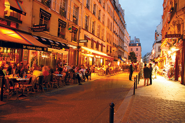
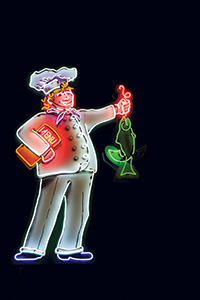 Many Tom Douglas Restaurants, including Dahlia Lounge, use neon signs because they can grab attention regardless of the weather. Photo by Corey Thompson, www.visualsensory.comIndeed, Douglas remains a big proponent of making al fresco dining a part of all restaurants. “I would like to force every mayor to make outdoor seating at all restaurants be mandatory,” he says. “European cities have tons of outdoor seating, such as Paris, Florence and Rome. Just think about all those streetscapes. Paris wouldn’t be the same without its cafés.”
Coates agrees and adds that in the different restaurants he has designed, outdoor seating is one of the most seductive elements of successful curb appeal. Outdoor seating also plays a role in his approach. “The outdoor seating and the landscaping that go with it provide an ideal buffering space that helps potential guests make a decision to stay,” says Coates. “Outdoor seating is also a perfect opportunity to put your product on display.” In fact, al fresco dining puts the entire experience on display to pique the interests of passersby.
Outdoor seating, however, is not always a picture perfect affair. Dealing with adverse temperatures, for example, can become a challenge, as with Knight and Howard’s restaurants in North Carolina. “Outdoor seating is terrible in Kinston. It is often too hot, and there are far too many bugs,” says Knight. There is no solid explanation why, but several European cities have fewer insects flying around. The weather in Europe is also quite temperate. Unfortunately, there are quite a few hot, steamy areas of the United States that often do become too unbearable to enjoy dining outdoors.
Douglas mentions the fact that there are also “unpleasant things that happen in the middle of the city when dining outdoors.” For him, though, the fact that the street life is filled with surprises, pleasant or not, is one element that he believes adds to the entertainment of those seated outside at his restaurants. It is as if the guests are watching life on a stage. “I like the excitement of being in the big city,” he says. When the weather becomes too cold in areas such as Seattle, then Douglas makes sure the outdoor dining areas are closed down and kept clean to keep up an inviting and desirable curb appeal even in the dark, cold months of the year.
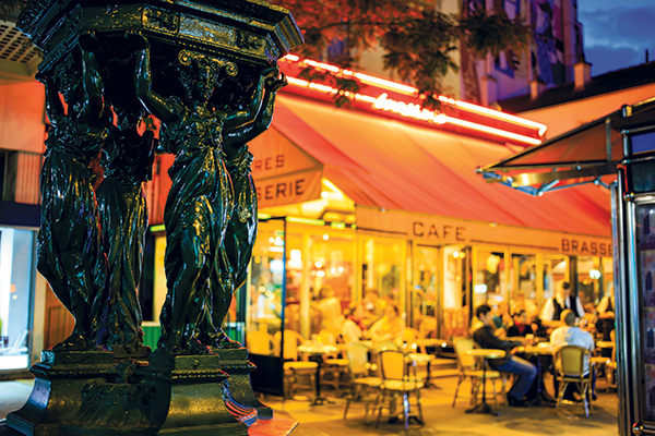 Landscaping and furniture add visual texture to the facade and should be luscious, clean, comfortable and inviting. The idea of having the restaurant’s garden on display in front of the operation can also be inviting. “There is almost nothing more appealing than to seat guests in the middle of the herbs and veggies that are used in the restaurant’s dishes,” says Coates.
Branding comes into play for both the restaurant’s exterior materials and for the signage, both of which are essential elements in a restaurant’s curb appeal. “The exterior materials depend entirely on the brand and identity of the restaurant,” says Coates. Furthermore, “the signage reflects the brand of the restaurant,” says Douglas. Keep in mind that if the branding evokes a “stop and look effect, then the restaurateur has an opportunity to convert their attention into a sale,” says Coates.
The branding style can vary significantly. “For example, there is a big difference between letters stamped out of rusted sheet metal as opposed to traditional script black letters on white,” says Coates. Both Douglas and Knight use neon signs for their restaurants. “Neon signs grab attention because they show up well even in the rain and in gray skies,” says Douglas, who also designs signage that has movement in addition to the neon. Knight says they have a hip neon sign over the Boiler Room Oyster Bar. The entrance is in the middle of an alley, and since the sign is located away from the street, the neon better catches attention.
“Outdoor lighting is critical for curb appeal,” says Coates. “The lighting needs to be designed so that a person walking by can easily see inside of the restaurant from the curb. They need to be able to see the food, the activity and the staff with the enticing food.” Lighting is an often overlooked design element that can help the curb appeal just as much as it can set the right mood for a positive dining experience. For example, brick buildings can be highlighted by a subtle wall washing effect, and spot lighting can be installed to light up signage.
Hiring a design professional to help with the lighting design is highly recommended. “Stay away from fluorescent fixtures and overly bright lighting,” says Coates. Selecting lights that highlight specific areas of the exterior and interior has more of an impact than hanging a few bright lights from the ceiling, which can cast an overly bright light over all the space. Taking advantage of natural lighting is also essential for both outdoor seating and indoor spaces.
Coates, Douglas and Knight all strongly believe in the power of good architectural design. “Hiring a designer is the best money a restaurateur can spend,” says Coates, noting several restaurants where the food is great but the architecture is lacking. Coates and Knight both feel that if the architectural design of a restaurant is good, even when the food lacks, the restaurant will have a better chance at being successful.
Architectural design plays a significant role in the success of his 20 restaurants, Douglas says. “Sometimes architecture can be a barrier if the design is not right,” he adds. “In one of my restaurants, the design was too cold and rubbed people the wrong way.” He had to make changes to the design. Another one of Douglas’s restaurants sits inside a historical building, where he says the exterior design adds a lot to the ambiance of the restaurant.
“Putting passion behind the conceptual design of the restaurant is crucial,” says Knight. “We worked with both an architect and an interior designer for our Chef & the Farmer Restaurant and recently just hired an architect to redesign its event space.” Knight says that it was a great experience to work with an architect who was able to understand the effects that design has on guests and who made the design process easier than if they had done it alone.
All that guests want is a great dining experience. If they have a sense from the exterior image of the restaurant that it will be a good experience, they are more likely to try it out. Coates says that a beautiful curb appeal will make guests “feel safe and compelled to cross the threshold.”
There’s no getting around that today’s restaurant consumer is savvier than ever. As such, a guest who sits in a restaurant for one to two hours sees everything and will note your attention to detail or lack thereof, Coates adds.
When it comes to creating great curb appeal, there’s no one right way. Coates believes primarily in the power of transparency for curb appeal. Douglas believes in giving the guest a sense of place by blurring the boundary between inside and outside. Both agree that successful curb appeal lies in painstaking attention to every detail and being authentic in every aspect of the restaurant — including its exterior.
“The whole feeling from the beginning [in this case, the curb appeal] to the end informs their opinion of the food,” says Knight. “It says a lot about your restaurant if both the outside and the inside are designed carefully and authentically. Your attention to detail speaks volumes about the ownership, the food and the experience that goes into each plate. We have spent lots of time and care to make our restaurants a terrific place for our guests.”

