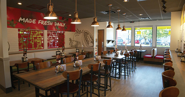
 The chain has introduced multiple seating options and divider walls, creating different types of dining spaces to appeal to different types of customers. Photos courtesy of Fazoli’sAny concept with with the staying power to last 27 years is going to experience some ups and downs. Fazoli’s, an Italian fast-casual chain out of Lexington, Ky., is no different.
According to Scott SirLouis, vice president of strategy and a 15-year veteran of the company, Fazoli’s got off to a fast start after its founding in 1988, growing its store count and selling a good number of franchise stores. In the 2000s, though, the chain hit a rough spot, suffering from lower sales and stalled franchise growth.
Fazoli’s original owners ended up selling the chain in 2009 to private equity firm Sun Capital Partners, which brought in new leadership tasked with turning the concept around.
The first stage of this effort, says SirLouis, centered on revamping the chain’s menu and improving customer service. Fazoli’s rolled out new menu offerings and made its food artificial-ingredient-free, while service upgrades focused on after-sale customer care, such as table runners offering guests fresh-grated parmesan with their meals and returning frequently with unlimited fresh-baked garlic breadsticks.
These efforts yielded positive financial results, but the chain needed to go further, says SirLouis. “We’ve spent the last eight years reinvigorating the brand from a menu and a service standpoint, but we felt like the facilities didn’t match where we were taking the new Fazoli’s,” he explains.
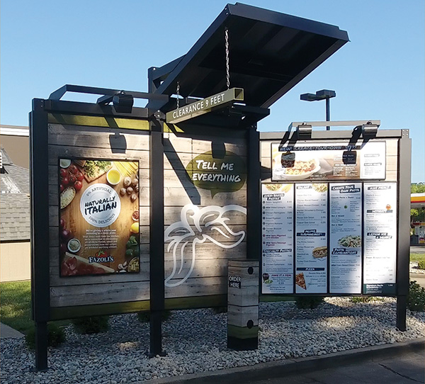
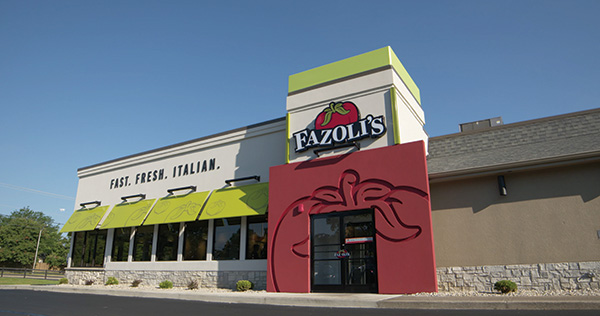
 With its branded graphics, freshness cues and wood-style look, the chain’s new drive-thru is designed to bring interior elements of the stores outside.About three years ago, Fazoli’s rolled out a new prototype. This effort, backed by another new owner, Sentinel Partners, concentrated most on the restaurant’s exterior. The goal was to help drive sales by making Fazoli’s stores more visible from the street. The chain developed a new logo and new signage, and the entrance was given a fun, walk-through that resembles a tomato. What’s more, an exterior tower feature — part of the Fazoli’s brand since day one — was given a new cap and new lighting that helps it stand out, particularly at night.
The interior portion of the redesign at that time wasn’t nearly so involved. While some fixtures and finishes were updated, the changes were more evolutionary than revolutionary. That just didn’t go far enough, the company eventually concluded. “The results from those remodels were very strong, but we felt we could do even better by improving the interior experience as well,” SirLouis says.
Earlier this year, Fazoli’s rolled out its new interior design, bringing the company’s look and feel on par with the food and high-touch service that first pulled Fazoli’s out of its slump.
Upgraded Experience
With the chain’s exterior look already set, the interior designers for this new prototype had a starting point for their work. Several exterior elements influenced the interior, including a red-and-green color scheme (which blends with but does not exactly match the exterior colors) and exterior grays that can now be seen in the dining room’s wood-style vinyl polymer floor tiles.
In addition to new colors, the new design shifted from a QSR look to something closer to casual dining. The restaurant is now a place where guests want to stay and enjoy their meal, says Chief Marketing Officer Donna Josephson.
This starts first with the seats. While the chain’s previous design offered little more than a sea of tables, the new package has multiple seating options. In addition to two- and four-tops matched with a banquette, choices now include booths with vinyl seating and wood-style laminate tables (chosen for their cost and durability), hardwood community tables, high-top bar seating with docks for charging electronic devices, and a cubby-like booth placed in an inset wall.
These options let customers choose the seating that best fits their needs, says Josephson. Older guests often choose quieter booths, while families opt for community tables that allow them to spread out.
In addition to moving away from the QSR-esque, the chain wanted the new design to emphasize the quality of its new menu, which includes significant prep work of fresh vegetables and pasta dishes made to order.
Prior to the redesign, these efforts were largely unappreciated by consumers, according to Josephson. “What we heard from a lot of consumers and guests was, ‘We don’t know what’s going on back there,’” she says. “We’ve added so much quality to our food, [but] everything was hidden.”
In response, the chain has partially opened up its kitchen, giving guests a view of prep work, breadsticks going in and out of the oven, and finished dishes being placed on the expediting window for table runners.
From a design perspective, this was an easy change, notes Josephson. Though it had been covered up due to a long-ago change in its service model, Fazoli’s had a pass-thru window in its design for years. Exposing the kitchen was simply a matter of removing a covering from the window and shifting some equipment to provide the view. Now when guests are waiting in line to place their order, they can look at the menu board ahead or to the former pass-thru window that now provides a peek into the kitchen.
Directly exposing the kitchen is just one way the chain emphasizes the quality of its food. The new design also employs several freshness cues. Some are direct, including a large closeup photo of tomatoes and text saying “made fresh daily,” wall etchings that emphasize the chain’s fresh-grated parmesan cheese, and a chalkboard graphic that talks about ingredients like tomatoes and garlic.
Other freshness cues are subtler. To counteract the sea of tables, Fazoli’s has introduced several custom-made divider walls. One wall is made with red die-cut metal forming the shape of pots and pans, spoons, spatulas, whisks, and other kitchen tools. The chain has also placed art elements on other divider walls, including etchings of ingredients like tomatoes.
Notably, Fazoli’s had to add to its portfolio of branding elements after building the first of these new stores. Layout changes, including the new divider walls, created more space for these elements, says SirLouis. “We realized how much more space we had to add graphics and branding elements to our dining room to make it even more attractive,” he says. “We’ve since gone back and redesigned the decor and graphics packages to fill those extra wall spaces. You look at it on a floor plan, and it doesn’t really sink in as much as when you’re actually standing in the space and looking at it.”
Updated Ordering
 Prior to the redesign, Fazoli’s leadership believed the company wasn’t getting credit for its fresh prep work and the quality of its food. The new prototype addresses that with a semi-open kitchen and several freshness cues in its art package.In addition to making its dining room more comfortable and appealing, Fazoli’s completely rethought and redesigned the ways guests can place orders and receive their food.
The simplest changes were to the dine-in menu board. The previous design featured a static menu for permanent items with a digital menu board below for limited-time offerings (LTOs). “We did an eye study,” Josephson says. “We thought [that design] was great, but the placement was so low that nobody was looking at it.”
The digital board now sits to the left of the static board, creating a three-panel menu. The screen is still used to display LTOs. The center board, where guests look first, showcases the chain’s highest-satisfaction items, while other offerings sit on the right board.
The chain is also taking steps to make the ordering experience better for off-premise diners, offering catering, drive-thru and to-go. Combined, these three categories make up more than 50 percent of Fazoli’s business.
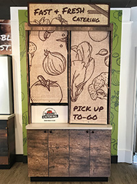
To accommodate these customers, the company has long offered online ordering and recently introduced a mobile app with an ordering option. This business is supported in the redesign as well with a new to-go/catering pickup counter, separate from the dine-in ordering line. Consisting of shelves for holding orders, the space is situated to avoid creating bottlenecks with traditional dine-in customers.
Though this redesign was interior-focused, it also included an update to Fazoli’s drive-thru, another key component of off-premise dining. Like most concepts, the chain’s pre-redesign drive-thru consisted of a backlit menu board and a speaker on a post. That doesn’t make for a great customer experience, Josephson says. “As a consumer [in a drive-thru], I’m always looking at the back of someone’s dumpster or somebody who’s out back taking a break. It’s almost like you’re sneaking around the back to place your order,” says Josephson. “This is a great opportunity to make guests feel more encapsulated in the brand.”
This encapsulation has taken the form of the “drive-thru of the future,” where several interior design elements are brought to the outside of the building. While the speaker post is still there, it is now clad in wood-style vinyl tile similar to the material used for the interior flooring. This tile also serves as the backdrop for the menu board.
Divided into three panels, one section of the board is dedicated to special messages such as LTOs, one to branding images and one to the menu itself. Instead of being backlit like QSR drive-thru menus, this is front-lit with gooseneck lights and has a small canopy that hangs over the car at the ordering station. “We’re trying to encapsulate for guests the feeling of dining in,” says Josephson. “We’ve done some focus groups with consumers, and [the updated drive-thru is] having an impact on how they feel about Fazoli’s.”
The company has also prepared for an ordering option that hasn’t yet rolled out: kiosks. In the new interior design, Fazoli’s created extra space for these self-service stations. Instead of locating them alongside standard POS stations, the kiosks will be in the lobby area, away from the traditional queue. This approach will prevent crowding and jostling among customers ordering from the different platforms.
Notably, Fazoli’s doesn’t see self-service kiosks as a way to reduce labor costs. In keeping with the company’s high-touch strategy, the chain views kiosks as a way to free up employees to take care of customers.
“A machine can take an order, but there’s no way a machine can deliver that personal touch of service that is part of the dining experience,” says SirLouis. “We want to allow our people to deliver that service. Let the machines do what they’re good at. That will free up our people to do what they’re good at.”
Ready for Investment
 Since May, Fazoli’s has opened nine stores with the completely redesigned interior and exterior. All were remodels of company-owned restaurants.
During this process, Fazoli’s encountered the usual hiccups with retrofits: wiring that needed to be replaced; structural problems only discovered once the walls were opened up. Any issues were not too out of the ordinary, says SirLouis.
The firm did learn a few things about the new design during this process. As mentioned, the new floor plan created more wall space for graphic and design elements. Some other elements, such as a divider wall made of rolling pins, were effective but likely too expensive to make the cut for additional stores.
Indeed, bringing down costs is the next major step of the project. This includes finding cheaper but roughly equivalent finishes and fixtures and working with a construction company to find ways to make building these stores easier and therefore less expensive.
Once this is done, Fazoli’s will introduce the new prototype at its franchisee meeting this fall. The presentation, says SirLouis, will likely include good-better-best models for its partners to choose from. All three levels will invest most heavily in improved exterior visibility. The most expensive of these will require the installation of a new roof, while the most economical will make use of exterior sign fences.
From early feedback and sales results, Fazoli’s expects the new prototype to be well received by franchisees. After an extended slump, the chain has taken the steps to be investment-worthy again, says Josephson. “We’re in older buildings, and so over time, the brand has needed to evolve,” she says. “Over the last year, that’s what we’ve been doing. We launched a new menu [and gave] guests a nice, comfortable place to be since we are a place where people like to gather and be together. Those were the strategic initiatives we needed to embrace in order to help catapult the brand forward.”
Project Team
- Key players: Carl Howard, president and CEO; David Hasler, CFO; Donna Josephson, CMO; Doug Bostick, senior vice president of operations & development; Sam Nelson, vice president of franchise recruitment & development
- Interior designer: Studio D
- Kitchen design consultant: Best Restaurant Equipment & Design
- Equipment dealer: Best Restaurant Equipment & Design
Snapshot
- Chain headquarters: Lexington, Ky.
- Year founded: 1988
- Signature menu items: Baked Lasagna, Three-Cheese Tortellini, Chicken Carbonara, Pizza Baked Spaghetti, Unlimited Breadsticks, Brownie Gelato Sundae
- Number of units: 211 (120 company, 91 franchise)
- Unit size: Smaller prototype is 3,200 square feet; larger prototype is 4,000 square feet; BOH for both is 1,000 square feet
- Seats per unit: 96-122
- Location type: Inline, endcap, freestanding, conversion options, nontraditional
- Total system sales: $135,132,616 (2016)
- Unit growth projections: 16 units in FY18; 8-10 units in FY19; 10-12 units in FY20
- Average per person check: $7.80
- Equipment package cost: Freestanding: $250,000-$427,818; inline or endcap: $205,000-$245,000


