This fast-casual chain’s new prototype emphasizes the concept’s food-driven approach while addressing operational concerns.
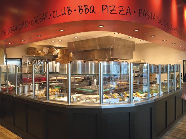 The display kitchen hasn’t changed in the new prototype. It remains the central design element of Newk’s front of the house.2014 was a big year for Newk’s Eatery. Not only did the chain reach its 10th anniversary, it also changed hands. Father and son founders Don and Chris Newcomb, along with cofounder Debra Bryson, sold Newk’s Holding Company to Sentinel Capital Partners, a New York-based private equity firm focusing on midmarket companies.
It was also the year that Newk’s decided that it needed to refresh
its appearance.
“The brand was approaching its 11-year mark, so it really was time to undergo a refresh with the design,” says Rachael Myrick, Newk’s building and design project manager. “Also, with our growth plan over the next several years, it was important for our image to be relevant and to speak to what our brand is.”
The first store with the new prototype opened last October in Lafayette, La., in a 4,500-square-foot in-line space.
Designing around the Brand
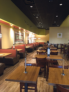 Newks-5The chain’s new color palette is based on colors found in its kitchen, including greens, golds and reds.Based in Oxford, Miss., Newk’s is a fast-casual chain with roughly 100 stores primarily in the Southeastern United States. Over the next 3 years, the chain expects to more than double that number to 220 units. Its footprint should expand during this period, with a boundary set by Colorado and then traveling east through Kansas City, parts of Indiana and then roughly following the Mason-Dixon Line before looping down the Atlantic and Gulf coasts.
During and following this growth period, Newk’s plans to keep about 20 percent of its locations company owned. This figure works for Newk’s on several levels, says Chris Cheek, chief development officer. The company, he says, does very well financially by operating its own locations. This impacts more than the bottom line, though. Operating its own locations also allows Newk’s to test new ideas before rolling them out system-wide. As a result, the chain becomes a good partner to its franchisees because it “makes some mistakes before our franchisees make them,” Cheek says.
Being the concept’s largest owner/operator also helps with franchise sales, Cheek adds. By successfully operating stores and regularly launching new restaurants and entering new markets, the chain knows and can address many questions from potential franchisees. “If someone asks me, ‘How are you going to help me open Newk’s in Ft. Lauderdale?’ we can say, ‘Because we’ve opened Newk’s in Raleigh, N.C., and Orlando.’ Walking the walk from an operations and marketing standpoint adds to our credibility,” says Cheek.
Focus on the Food
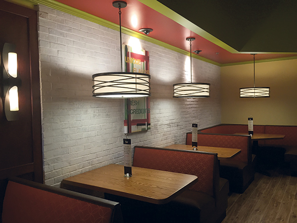 Dramatic light fixtures and a variety of textures have enabled Newk’s to limit its wall decor. Newk’s defines itself as a food-driven concept. Each unit operates a scratch kitchen to execute a menu that features salads, sandwiches, soups and California-style pizzas. Featured items include an ahi tuna salad, a shrimp and avocado salad, a house-made chicken salad sandwich, a barbecue chicken pizza with jalapeño peppers, and a margherita pizza. The chain also operates a central bakery where it makes such desserts as German chocolate cake and whoopie pies before shipping to restaurants throughout the system.
With the redesign, then, the chain wanted to drive home the fresh, culinary nature of its food. There was more to the project than branding, though. At the same time, Newk’s corporate team wanted to address operational concerns related to the old prototype. Over a decade of service, some finishes presented durability and maintenance issues, while a redesign of the store’s seating layout could better fit Newk’s customer mix.
Finally, the chain’s leaders wanted the new look to fit with its existing one. A complete break in style, says Myrick, would risk alienating Newk’s existing customers and would be expensive for franchisees to implement.
According to Myrick, carefully choosing a new color palette addressed two of these three goals. New colors drive home the chain’s culinary nature while easily integrating into existing stores.
The previous design, Myrick adds, used lots of golds, reds and rust colors. The tile floor had a terra-cotta coloring, while many walls had red brick veneers. The colors in Newk’s kitchen serve as inspiration for the revised palette and include new shades of red and muted golds along with several greens.
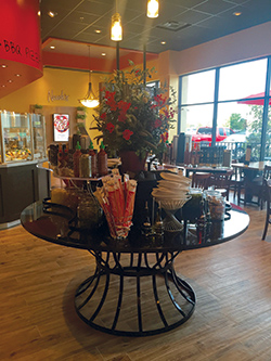 The round table is another carryover from the previous design. It holds high-end toppings and dressings, emphasizing the chain’s culinary focus.The soffit surrounding the concept’s open kitchen uses red, which also appears in the ceiling elements that highlight some key design pieces. Ceiling elements above booths and bar-height seating feature shades of green, while the dining room and the restroom use muted gold.
These colors, Myrick says, blend well with the colors used in the previous design. That was intentional. “All of the elements of this redesign are pretty much interchangeable with the old design. That allows our franchisees to do things in phases. If they want to repaint their existing restaurant, they can just repaint it in the new colors, and the existing fabrics and tile still goes with it.”
Whether franchisees upgrade in stages or all at once, they’ll find that the new finishes offer more than just different colors. They’re also operational upgrades.
The old countertops at Newk’s, for example, were made of tile. Keeping the grout between the tile looking clean and grime free was a challenge for operators. The new design uses solid quartz counters that completely eliminate the grout problem. Quartz was chosen because it is completely nonporous, making it easier to maintain than granite, which is porous and must be sealed frequently. In addition, the countertops themselves have a dappled khaki color, which blends with any stray crumbs and limits the need for frequent immediate wipe downs.
A similar change was made with the upholstery. The previous upholstery was light in color, which made stains and dirt stand out. The new upholstery is made of darker fabrics in red, brown and more, which better conceals minor imperfections. It has also been treated with a powerful stain guard, making the material easier to clean when the time comes to do so.
New Furnishings, Same Kitchen
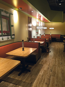 The chain put in a dropped ceiling element over booths to give these seats a cozier feel for families.The finishes weren’t the only things that changed at Newk’s. There were also some major changes to the seating design.
According to Myrick, families comprise the majority of Newk’s customers, and they tend to flock to booths. Newk’s caters to these customers by offering cozier booth spaces that line the perimeter walls of the dining area. A furr down — essentially a dropped ceiling element — now sits above the booth spaces, along with a drum-style pendant light suspended above each booth. Each new store also boasts an extra-large booth. The “hero wall” this booth sits against features a large painting of the name of the restaurant’s city, done in multiple colors.
Customers not dining with family also have more seating options. These parties, says Myrick, often consist of single customers who come in to grab a bite during the lunch hour. “We wanted to create a place for them to come in, get their lunch, sit down and not feel out of place or bothered that they were coming in alone,” she says. “So we added community tables and bar-height seating.”
Another functional change was to the floor tile. While the look changed from terra-cotta to a faux hardwood style, the new material offers a better grip, which helps prevent slip-and-fall accidents.
All of these material upgrades may have driven up the price to build out a Newk’s location, but according to Myrick, the overall price is nearly identical, thanks to several factors. When selecting new materials and furnishings, the designers made a point of choosing finishes with prices that were the same or cheaper than what they were replacing. The only time a material could cost more was when the upgrade could be justified by increased durability or reduced maintenance issues, such as the move from tile to quartz counters.
And in some cases, the materials change was both cheaper and more functional. The chairs for table seating had upholstered seats in the redesign. In the new store, the seats are hardwood. Not only is this more affordable, it also eliminates some staining and cleaning issues.
The chain also saved big on the wall decor. The previous design used a significant amount of wall art. With all the new textures and finishes and the more dramatic pendant lighting, however, the designers found that not every wall needed to be covered with painting or pictures.
Not that the walls are bare. The new design includes some food photography and some original paintings with words that emphasize the fresh, scratch-made nature of the menu, such as “fresh ingredients” and “culinary driven.”
Not everything in the restaurant has changed, though. Many of the previous design elements at Newk’s that drove home its culinary focus remain. This includes a large round table that holds various toppings, dressings and other add-ons. Long a key design feature in the dining area, the table with its wrought-iron base and granite top, remains in the new prototype. In fact, large pendant lighting with Edison-style bulbs hanging above draws even more attention to this design staple.
Also unchanged is the concept’s open kitchen, which emphasizes the chain’s focus on high-quality food and ingredients. It features an L-shaped salad line that sits on a custom millwork counter-height installation and is protected by a tall glass food shield that allows diners to watch their food being made. Two other stations sit behind the salad line, one for sandwiches and one for pizza.
Since the kitchen’s existing appearance and layout continue to work well for Newk’s, there was no need to change this area, says Myrick. “When I do a restaurant layout, that’s the very first thing that I put into the CAD file . . . The most important part of our brand in our restaurant is that open kitchen.”
The kitchen might get some tweaks as Newk’s refines the prototype for smaller spaces, however. While the first store measures 4,500 square feet, Newk’s would like to be able to reduce its footprint to 3,500 square feet without losing revenue-generating seats. That sort of flexibility would make it easier to find good real estate, Cheek says.
According to Myrick, the chain can shave off a few hundred square feet simply by separating the point of sale counter and the kitchen, which are connected, and adjusting the positioning of the three production lines. Another option would be to find smaller locations that could also accommodate outdoor walk-in coolers.
More Tweaks, More Units
When Newk’s opened the first of its new prototype locations several weeks ago, several franchisees flew out to examine the restaurant. The response was positive, with many franchise groups being very interested in the new location.
That isn’t a surprise, given that many of the ideas used in the new prototype — from the flooring with better grip to the countertops that are easier to clean — originated with franchisees.
Still, Newk’s isn’t rushing this prototype out to franchisees. Carrying through on its commitment to make mistakes so its franchisees don’t have to, the chain is evaluating the prototype’s performance in real operational conditions. Cheek fully expects to make some tweaks to the model after this period of evaluation.
“That said,” Cheek adds, “we know enough now to say it’s a really great design that’s really on trend and on point in our category and with our differentiators in the category. We’ll have a franchised restaurant that should open with the generation-two prototype some time at the end of the first quarter.”
Snapshot
- Kitchen supplier: Hotel & Restaurant Supply
- Interior design: Rachael Myrick and MJ Moreau, owner, Studio B
- Kitchen design: Chris Newcomb
- Headquarters: Jackson, Miss.
- Concept owner: Sentinel Capital purchased the concept from its founders in 2014; cofounder Chris Newcomb remains CEO and president.
- Concept: Food-driven menu featuring salads, soups, sandwiches, pizzas and
- homemade desserts. Many menu items are based on Newcomb Family Recipes.
- Segment: Fast-casual
- Average check: Average check is $14.50; per-person average is $10.50
- Location: Located in 13 states throughout the Southeastern region
- Opened: 2004
- Size: 4,500 square feet
- Real estate: Freestanding, endcap and in-line spaces
- Design highlights: A new color palette inspired by fresh ingredients; community-style and bar-height seating; a variety of ceiling elements including pendant lighting; wood-look porcelain floors.
- Build-out time: approximately 10 weeks

