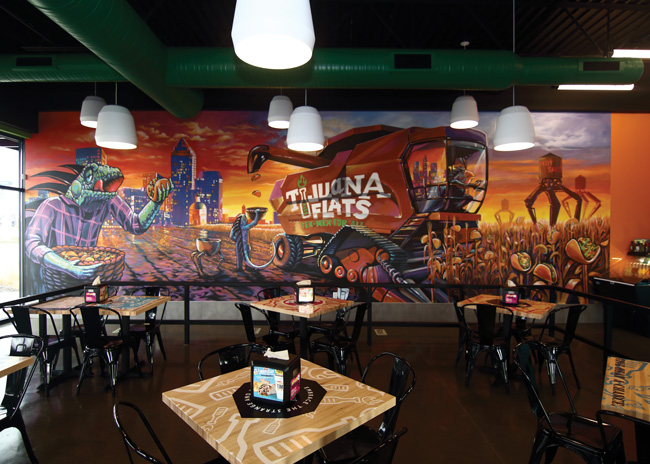
 A localized mural is a key design element in each store. This Indiana location’s mural shows tacos growing from corn stalks. Images courtesy of Tijuana FlatsThis Tex-Mex chain is keeping its irreverent feel with a redesign aimed at franchising.
What’s fun and edgy today feels dated tomorrow. That goes for restaurant design as much as for anything else. That was one issue facing Brian Wright in the Summer of 2019 when he became CEO of Tijuana Flats.
Tijuana Flats operates on what Wright calls a “fast casual-plus” model. Guests order at a POS counter from a broad menu that includes tacos, burritos, chimichangas, nachos, wings and more. After ordering, customers find a seat and table runners bring them food, drinks and refills.
This menu-focused approach and elevated service model combined to help Tijuana Flats hit 125 locations, primarily in the chain’s home state of Florida. While the company’s corporate store openings have been ongoing, its franchise sales had been put on ice. Only around 20 locations were franchised, and the brand hadn’t opened any new franchise restaurants since around 2007.
One of Wright’s goals was to revive the chain’s franchise program. That meant looking at the business from top to bottom. Tijuana Flats’ leadership — many of whom were brought on board by Wright — reviewed its operations, franchise support program and, of course, the restaurant’s look and feel.
According to Wright, Tijuana Flats had long cultivated a fun and slightly irreverent personality. While that’s a core part of the brand, he felt the expression of that personality had grown stale.
“If you look at the original design, it had anything from superheroes to cartoons to monsters painted into the murals of the restaurants. We did a number of focus groups — the majority in our major markets — and what we heard from consumers was that the brand had not evolved with time. They said while they loved the playfulness, it felt more like a restaurant they would have visited when in college as opposed to a place they might go today. It really did highlight the need for change.”
Taking the customer feedback to heart, the chain hired a design firm, Push, and began conducting brand explorations. This helped the new leadership team uncover and articulate the brand’s key elements and strengths.
These exercises were combined with feedback from focus groups to create a redesign checklist. Checklist items covered everything from big picture topics like the restaurant’s overall look and feel to more granular issues, like the need for a space to put down trays at the hot sauce bar.
With all this information, the project team began developing design concepts and ideas. Along the way, they used the checklist to stay on task and balance priorities, including functionality, guest appeal and maintaining the brand’s identity.
“There were a wide variety of ideas we started with. Keeping the checklist in mind, we continued with a narrowing process until we had the existing design,” says Wright. “Let’s face it: you can’t be everything to everybody. Although a lot of brands attempt to do that, it is just not possible.”
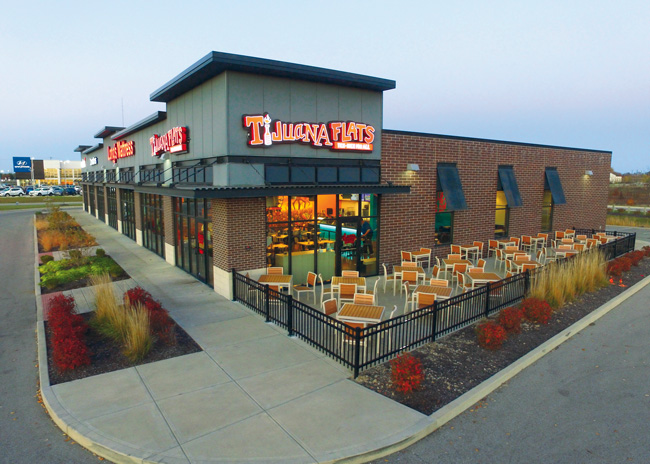
The result was Tijuana Flats’ new prototype — and the chain’s first franchise location in years — which opened in Noblesville, Ind., in late 2020.
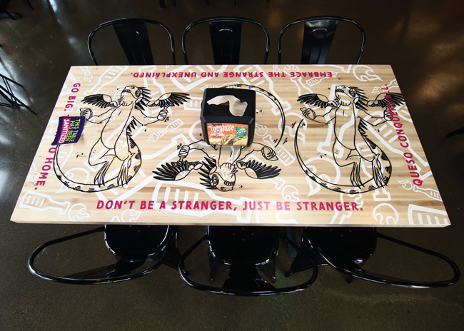 Instead of plain tables, Tijuana Flats uses theirs as branding opportunities.
Look & Feel
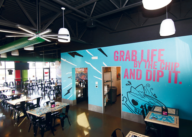
The new Tijuana Flats got a facelift but not a personality transplant. The prototype maintains the brand’s lighthearted, irreverent vibe with a look that’s more in line with the 2020s. Key design elements include a gecko character in a localized mural, a wall covering showing dip served out of a skull and crossbones and plenty of hot sauce references.
Guests entering the redesigned restaurant will find a space that’s brighter and much more open than before. This is achieved partly through Tijuana Flats’ move away from ceiling tiles and to a blacked-out open ceiling. Overhead design elements aren’t invisible, though. The lighting package was designed to be eye-catching, with custom-made star fixtures and bell-shaped pendants distributed through the space. The ductwork in this first location is painted a forest green, though, to add extra vibrancy to the space, and it has been updated to a lime green in subsequent stores.
 The new look maintains Tijuana Flats’ irreverent persona. Guests walk across the restaurant’s stained concrete floor to the POS station. This space is centered around a solid surface countertop with a corrugated face in light blue. The chain, says Wright, is testing both plastic and metal for the corrugated material. At the end of the counter is a new grab-and-go cooler filled with bottled drinks as well as with various dips.
Beyond the counter itself, the POS area highlights the restaurant’s key branding elements. On the back wall of the POS area are Tijuana Flats’ new electronic menu boards. While the chain likes the easy ability to roll out menu updates, the boards are also being used to message patrons on food quality.
“We are going to take you into the kitchen through the board. We’re going to show you those products being prepped. We’re going to show you some of the things we do, so it brings fresh to the front,” Wright says.
The POS counter area is also a spotlight for one of the themes of the redesign: hot sauce, which is a key part of the customer experience and the Tijuana Flats brand. At the ordering counter, jars of sauce are visible on high shelves on one side. This display highlights an important part of the brand, Wright notes, while also hinting that these sauces are sold by the jar. The hot sauce imagery plays a key part in the design beyond the POS counter including several heat/hot-sauce themed pieces, many featuring a character in a hazmat suit using tongs to pick up a jar of sauce.
These elements aren’t just found in the dining area, they can also be seen in the chain’s new restrooms. While bathrooms are often given little thought in redesign, Wright was determined to take a different approach for Tijuana Flats.
“I’ve been in the business over 35 years now. I can remember so many different surveys showing that restrooms are the second or third most important thing to a guest in a restaurant,” says Wright. “I think so many brands remodel and say, ‘we’ll save a little money, just don’t do the restroom.’ Fundamentally speaking, that’s one of the biggest mistakes I’ve ever seen.”
The new design, then, showcases the graphics of the hot sauce-wielding hazmat suit character and iguana mascot, while the outside of the doors warn guests, “Caution. Hot contents inside.”
The standard elements in a restroom, meanwhile, are higher end, including gooseneck-style lights above the sink and black subway tiles on the bottom half of the walls.
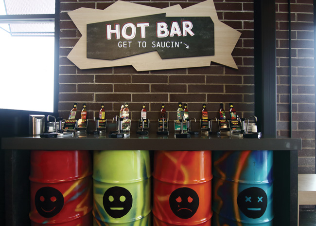 The hot sauce station’s oil drum base helps guide guests to their preferred heat level.
Localization
Many of the new design elements can be copied and pasted into every new Tijuana Flats location with ease. Other elements were selected to allow for localization.
The new design features an electronic ticker that pushes marketing messages like LTOs. However, it’s also used to send out community-focused messages. “When we opened the restaurant, the local high school’s women’s soccer team had just won the state championship. During opening week, we congratulated that soccer team for winning that championship,” says Wright. “We got so many compliments from people saying thanks for being part of the community.”
The operation’s signature wall mural is another localized element, one that’s intended to emphasize the brand’s fun and edgy vibe. With this prototype operating out of Indiana, the mural showcases a corn field with tacos growing from the stalks. The tacos are being harvested by the chain’s gecko character, with the Indianapolis skyline in the background.
Tijuana Flats has also introduced ways for area residents to contribute to the design itself. The previous design allowed guests to contribute hand-painted tiles hung from the ceiling. These were reinterpreted in the new look, with small plastic tiles that can be decorated by local high school art classes and hung around the barrier separating the dining area from the queue.
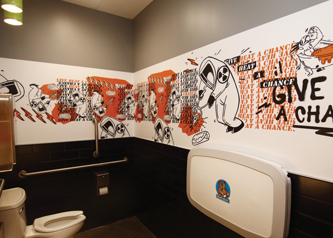 While bathrooms are often overlooked, the chain invested in these spaces as part of the redesign. “I can remember so many different surveys showing that restrooms are the second or third most important to a guest in a restaurant,” says CEO Brian Wright.
Tech enhancement
Not all the changes in this new design are about aesthetics. The redesign included the introduction of new technologies meant to improve the customer experience and operations.
While many restaurants have outlets for charging phones, Tijuana Flats installed wireless phone charging pads that are built into its tables. These charging pads themselves don’t require an outlet. Instead, they can be removed and charged up at night for use during the day.
Customers can also place orders via the Tijuana Flats app, a tablet brought to their tables or, in future stores, on a kiosk. This kiosk, says Wright, will be located at the front of the store, near a new set of shelves for to-go orders. An employee stationed in this area will be able to help with new orders, pickups and beverage sales.
The placement of this station and staffer should improve the experience for guests and delivery drivers alike. “Sometimes when a driver or a guest has to come into a restaurant, they have to go all the way to the back. They’re walking around other people, waiting in a line to get to the shelf. To me, that’s not convenient to the consumer,” says Wright. “This entire design is [based on] how it works for everybody in the restaurant, regardless of how you use it.”
Refining the Design
While the team at Tijuana Flats is pleased with the new design overall, there are always lessons to be learned from a new design. For example, the tables feature the same characters found throughout the restaurant. While those will remain, the chain is exploring options beyond the butcher block tops it currently uses.
The company also wants to expand its new grab-and-go cooler, taking it from a 3-foot counter-height unit to one that is upright and wider, allowing it to better market new to-go offerings like queso, salsa, guacamole and a seven-layer chicken dip. “We really underestimated what we could do and how we could capitalize on that grab-and-go process,” says Wright. “We did not know how well it would work for Tijuana Flats.”
One of the most visible changes will be to the flooring. While the concrete will stay, Tijuana Flats is developing a floor graphic that’s essentially a river of queso accompanied by phrases like, “It’s almost taco time!” This graphic will not only serve as a brand element, but also as a wayfinding cue, leading guests from the front door to the POS station and then the hot sauce bar. “Sometimes the floor can be a whole lost piece of real estate in the building,” Wright says. “You can use it to really message to consumers and set a tone. We are going to try to take advantage of that.”
With the new design largely set, Tijuana Flats is turning some of its attention to updating its stores.
While the kitchen was redesigned as part of this prototype, it won’t be touched in upgrades, says Wright. The return on investment just isn’t there. Floors in older restaurants will probably also remain in place.
Most other customer-facing elements will change, though. This includes the ceilings, walls, furniture, refrigerated grab-and-go case and POS area.
These changes are not cheap, but they’re important to the long-term health of Tijuana Flats, notes Wright.“There’s always this danger when you create a new prototype that you get ‘A Tale of Two Cities.’ You have this new brand that is evolving, and it almost starts to leave the old brand in the dust. I think you have to go parallel paths with new builds and [when updating] existing locations to bring them both up to speed,” he says. “Of course, you have to make sure from a capital standpoint that you are always doing the right things, but at the end of the day the idea is to move forward with both.”
Investing in the brand has been the focus of Tijuana Flats since Wright’s first few days on the job. It’s led to a redesigned kitchen, enhanced franchisee support and this new look and feel.
With these elements in place, leadership is confident that moving forward means growth in both company and franchised locations.
“I started on this literally within four weeks of arriving,” says Wright. “It’s been a labor of love, but it has absolutely gotten us to a very good place.”
Snapshot
- Headquarters: Maitland, Fla.
- Concept: Tex-Mex in a “fast casual-plus” setting with counter ordering and table runners for food and drinks.
- Segment: Fast casual-plus
- Unit count: 130
- Average check: $10
- Location of new prototype: Noblesville, Ind. (first franchise location); Ocoee, Fla. (first corporate location with the new design)
- Opened: Noblesville (November 9, 2020); Ocoee (March 8, 2021)
- Size: 2,400 square feet
- Real estate: Freestanding, endcap
- Design highlights: Custom mural in every store localized to the restaurant’s home. Hot sauce bar with barrel base painted to indicate heat levels; bathrooms with murals and subway tile; POS area hot sauce bottle retail display and menu screens showcasing fresh food preparation
- Build-out time: 90-120 days