Refreshed and Ready to Ride Again
Since opening its doors in 2008, Cowboy Star Restaurant & Butcher Shop has served up contemporary American fine dining in San Diego’s East Village. Gaining fans over the years for its top-quality steaks and seafood, the brand delivers a little something different from the typical high-end steakhouse experience. Its cowboy-chic ambience, for starters, blends casual, Western rustic with 1940s-era Hollywood polish. Elements of its concept, including a small retail butcher shop, formal dining room with exposition kitchen, bar serving specialty cocktails and fine wines, and popular Sunday Suppers showcasing elevated comfort foods, combine to make Cowboy Star both a neighborhood gem and popular destination for special occasions, tourists and conventioneers.
Prior to the pandemic, business was consistently good, so good that in 2015 owners Jon and Angie Weber and Executive Chef/Partner Victor Jimenez opened a second unit, in Colorado Springs, Colo. And in 2018, having passed the 10-year milestone in San Diego, the trio began planning for a design refresh of their flagship location.
Completed in late February 2020, just three weeks before San Diego restaurants were ordered to shut down indoor dining, the project’s overriding goal was to maintain Cowboy Star’s carefully nurtured vibe, described by the Webers as a “warm hug feeling when you walk in the door,” while keeping the restaurant fresh and relevant.
“If you’re still open and doing well after 10 years, you’re doing something right, something that’s resonating,” Jon Weber says. “Thinking about a refresh is terrifying, however, because you’re changing something that works. If you change too much, you risk alienating the people who know and love the restaurant. But you also want to give them reason to come back for another 10 years. If you don’t change enough, you’re really not doing what you should be doing to stay up-to-date and attract new guests. That was our dilemma as we approached this project, and we took our time to be sure we got it right.”
Working with San Diego-based designer Paul Basile, principal at Basile Studio, the Cowboy Star team identified key objectives for the refresh. No major changes were felt to be necessary in some parts of the operation — main dining room, small private dining room and kitchen, for example. Leather chairs in the dining room were reupholstered for a fresh look but the original curved booths were untouched. The wood floor in the dining room was sanded and resealed. A portion of wall that previously closed off part of the kitchen was removed to put more cooking activity on display. And a partial wall with banquette seating that had provided solid separation between bar and dining room was replaced with an open-shelf service station, which further enhances sightlines throughout the space.
The most dramatic changes, however, were made in the front portion of the restaurant. There, the two primary goals were to boost the appeal of the adjacent butcher shop and to expand capacity at the bar, which over the years had become crowded with regulars — Basile among them.
“When we started thinking about doing the remodel, it seemed Paul was the perfect designer to work with,” Weber adds. “For years, he’d been coming in multiple times a week for lunch, to entertain clients or just to hang out at the bar. We figured he’d probably spent a lot of time looking around and thinking about what he might do differently given the chance.”
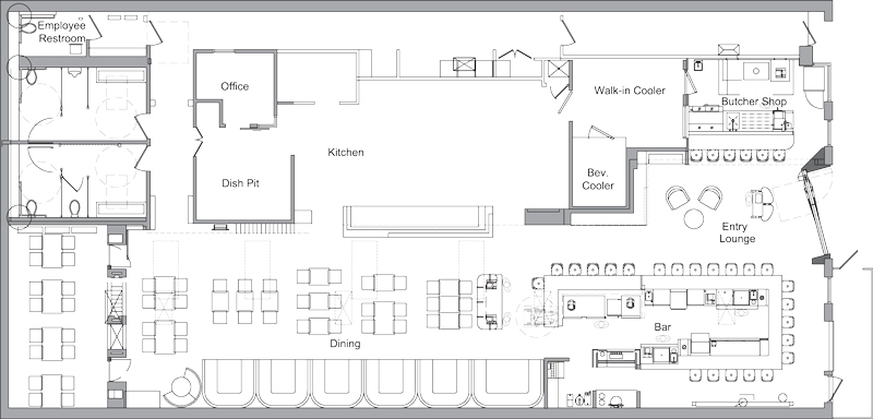
Cowboy Star’s 5,000-square-foot footprint is long and rectangular, with bar and butcher shop on opposite sides of the front entry, host stand and small waiting area in the center, and dining rooms and kitchen farther back. Basile and his team focused first on reimagining the bar and butcher shop, addressing the owners’ desire to expand capacity and provide an updated, more integrated experience.
“Over the years the neighborhood had grown around us,” Weber notes. “When we first opened, a 10-seat bar was fine, but now we needed more seats. And the butcher shop always had a separate entrance at the front of the building. We originally envisioned a nice little neighborhood butcher shop, but from the day we opened until the day we closed for the remodel, I’d talk to people in the restaurant who had no idea it was there. It would close at 7 p.m., just when the restaurant was getting busy, and never really worked as we’d hoped, so we needed to rethink that space.”
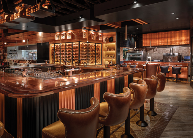
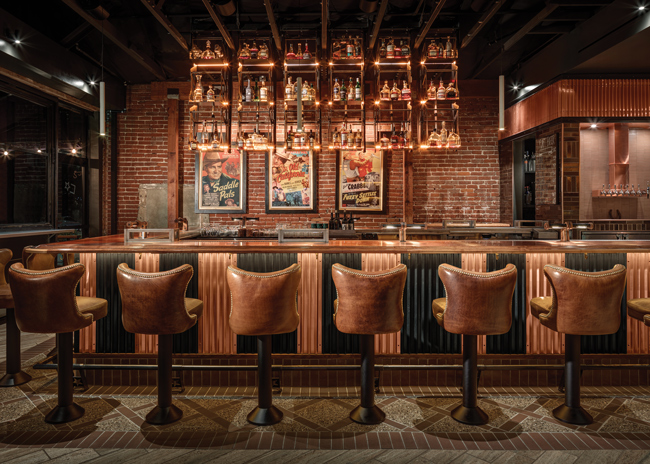 Cantilevered robotic shelves above the bar raise and lower as needed for service and stocking. Finished to blend in with the ceiling when raised, the six three-shelf units are lit to illuminate the bottles and can be activated individually or as a group by bartenders via motion sensors.
More Seats, More Sizzle
Originally a small, L-shaped bar with seating for 10 tucked along the wall to the left of the entry, Cowboy Star’s new bar seats 18 in a freestanding, U-shaped configuration that on one end incorporates an additional six seats at a marble-topped pastry counter. Set at ADA height, that counter brings dessert preparation and plating out front, freeing up space in the kitchen and enabling guests at the bar to watch both the bartenders and the pastry chef at work.
On the opposite side of the entry, Basile Studio worked to integrate the 500-square-foot butcher shop into the restaurant and make it part of the Cowboy Star dining experience. A portion of wall that had separated the restaurant’s lobby from the butcher shop was removed, opening the space up to the restaurant. In addition, a solid-fuel cooking element, copper-clad hood and refrigerated meat display case were installed and a counter with seating for six now faces that action center.
“Having a cooking element there works really well,” Basile says. “It adds a nice aroma, relieves some pressure on the kitchen and creates another experience in the front of the house. Previously, the butcher shop was isolated — guests had to basically go out and come in a different entrance to access it. Now, there’s a whole new dynamic to that space. And, like the bigger bar and pastry counter, it adds to total seating capacity.”
Before pulling the bar out from the wall and creating the butcher shop dining experience, however, Basile and his team worked to gain more space at the front of the restaurant. They did so, in part, by removing a small, underutilized banquette seating area along a half wall that had partially separated the bar from the restaurant’s lobby. And mounted stools were strategically selected both at the bar and at the butcher shop counter.
“I don’t always like doing mounted bar seating,” Basile says, “but we needed to manage traffic flow in the area by the front door and waiting area. We wanted to keep people from congregating there, and the fixed barstools work really well in that regard.”
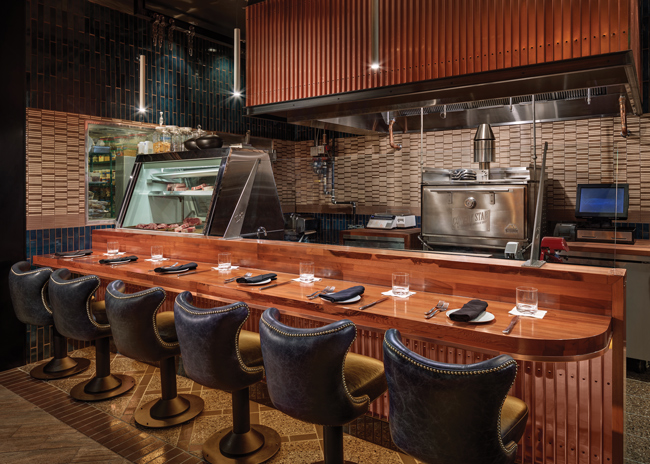 The formerly separate adjacent butcher shop was integrated into the restaurant. It now includes a solid-fuel cooking element, meat display and counter seating for six guests.
Space up front was also gained by reconfiguring the restaurant’s front door. “When we started planning the refresh, I was walking the space with Paul just picking his brain,” Weber notes. “One of the first things he said he’d like to do is to move the front door, which was recessed by a few feet, forward to the property line to bring what was basically wasted space inside. So that’s what we did. It really opened up the front of the restaurant and enabled us to do what we wanted to do with the bar and counter seating at the butcher shop.”
A tweak was required, however, to make repositioning the door a workable solution. Had it been pushed up to be flush, as first planned, the door would have swung open into the public right of way. That would have meant additional permitting hassle and expense. Rather, Basile and his team redesigned the front door to sit at a slight angle to the building, thus avoiding additional permitting.
Weber likes it even better this way. “Now, when you swing the door open, because of the angle it stays within our property and it creates a much more intriguing, unique entry,” he says. “The door itself is really cool. It’s mostly glass, but the black frame and handle were fabricated to look like our C and star logo. It’s a little abstract, which makes it a fun discovery when guests realize that’s what it is.”
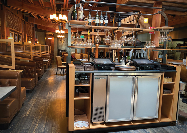 A wall with banquette seating that used to separate the bar from the dining room was replaced with a new, open-shelf server station that provides for better sight lines into the restaurant.
Fresh Finishes, Playful Touches
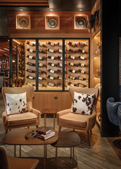 A small waiting area is nestled between the host stand, butcher shop counter seating area and new wine display. Whereas Cowboy Star’s original aesthetic featured more overt references to its wild-west-meets-vintage-Hollywood vibe, the remodel modernizes with fresh finishes and furnishings, tech-based features and sophisticated yet playful design solutions.
The front door is just one example. A new host stand was fabricated of wood, metal and leather to subtly evoke a cow’s hoof. The footrail at the bar is anchored by metal fittings cast as horseshoes and stars. Robotic liquor shelves that drop down from above the bar are styled in the shape of western stirrups. And bottles in a new temperature-controlled wine display, which Basile installed along two front-facing sides of an existing beer cooler, rest in individual, hand-stitched leather hammocks.
“There’s a delicate balance in projects like this,” Basile notes. “It’s a very popular restaurant. You can only take so much of the existing design away, but it definitely needed a refresh. Much of what was there was more overtly cowboy-focused but going too far with that type of theming is what dates a lot of projects. We kept some of the imagery and the warm colors, but wanted to make it cleaner, more modern, more subtle with a strong focus on materials.”
Primary materials used throughout the restaurant include Douglas Fir, corrugated copper, hot rolled steel and leather. Glazed tile lines the walls in the new open butcher shop area and new flooring includes travertine tile in the entry and bar, with custom-patterned decorative terrazzo and glazed tile beneath bar and counter stools. The building’s original exposed red brick walls still feature in both the bar area and dining room.
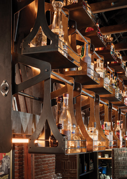 The new design incorporates tech-based features and sophisticated yet playful design solutions, including robotic liquor shelves styled in the shape of western stirrups and bar footrail supports fabricated as horseshoes and stars.“The old design had a lot of wood and stainless steel,” Basile says. “We replaced most of the stainless steel with copper, which is interspersed with hot rolled steel. It has a warm feeling and carries the cowboy spirit. And we carried the use of copper and Douglas Fir through to the bar top, both for aesthetics and for comfort. Almost everyone eats at the bar, so we wanted it to be really comfortable. Beyond the material itself, the edging had to be right. We went through five renditions of the wood edging to make sure it would be comfortable to lean on, and we incorporated a strip of leather into the edging as well.”
Everyone who sits at the bar also gets to experience what has become as an Instagrammable video moment. With the new bar being freestanding, traditional bottle storage along the back bar wall was lost. Basile’s solution, which provides storage without blocking sight lines into the restaurant, was to install custom cantilevered robotic shelves above the bar that raise and lower as needed for service and stocking. Finished to blend in with the ceiling when raised, the six three-shelf units are lit to illuminate the bottles and can be activated individually or as a group by bartenders via motion sensors. A single shelf unit can drop down for quick access to a single bottle as needed, or the entire system can drop down and remain down longer for cleaning and restocking.
“It’s one of the coolest things in the restaurant,” Weber says. “We ask the bartenders to activate them every 15 minutes or so whether they need to access something on them or not. Everyone who hasn’t seen it before immediatvintaly grabs their phone to capture a video of it.”
Still more unique features at the new bar include perforated tube lights mounted between each set of bar stools. Guests can rotate the tubes to brighten or dim the light as desired. And instead of incorporating outlets for device charging, Cowboy Star’s bar now features circular wireless phone chargers built directly into the bar top. Covered with wood veneer, the chargers are branded with a small Wi-Fi logo to subtly communicate their purpose.
It’s those many sorts of thoughtful design details that Basile says promise to surprise and delight guests when they’re able to come back inside, and that Cowboy Star’s owners can’t wait to share with them. “Paul and his team did a great job of blending so many subtle cues into the design,” Weber says. “There’s so much to discover. Guests might come in four or five times before they notice the footrail at the bar, or some of the other little details. That’s what makes it so fun.”
Snapshot
- Location: San Diego
- Concept: Cowboy-chic steakhouse with butcher shop
- Originally opened: 2008
- Project type: Refresh
- Reopen date: February 2020
- Size: 5,000 square feet
- Total seats: 118 (93 pre-refresh)
- Design highlights: Redesigned front entrance, subtle incorporation of logo, robotic shelving above bar, wine display, adjustable lighting and wireless phone chargers on bar, pastry counter at bar, butcher shop counter seating, copper, wood and hot rolled steel finishes
- Project duration: Design and off-site fabrication, 14 months; installation and finishing, 1 month
Project Team
- Ownership: Jon Weber, Angie Weber, Victor Jimenez
- Interior design and fabrication: Basile Studio
- General contractor: Hawkins Construction
- Kitchen consultant: REB Design
- Structural engineer: DCI Engineers
- Architect of record: Lahiana Architects

