 Jerry van Rooy, design director and founding partner of VANROOY Design, first became intrigued by architecture, fine arts and travel at a young age while visiting family in Europe. Born and raised in Southern California, he graduated from California State University, Long Beach with a bachelor’s degree in Industrial Design. In 2007, after working for several lighting and furniture design studios, he combined his passion for creating custom furniture, his deep knowledge of lighting and his lifelong obsession with architecture to found VANROOY Design with his wife, Christine. Here, he highlights some of his favorite restaurant design trends right now.
Bars that feel like a vacation. We’re seeing a trend toward brighter and inviting bars — spaces that make us feel happy. What’s not to like about happy places? At Tower 12 in Hermosa Beach, Calif., we served up happy by using lighter woods, light stone and matte brass accents paired with dusty sunset and other earthy colors. With a lighter, softer palette, we recommend incorporating plenty of texture and layering to keep things visually interesting and warm.
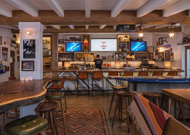 Images Courtesy of NoTriangle Studio
Make the floor come alive. Simple, monochromatic restaurants will be around for a long time. And for good reason: There is a timeless quality to them. However, even in simple, monochromatic restaurants, I like to see a strong graphic punch in the art or tiles to give the space a unique personality, as pictured here at Tower 12.
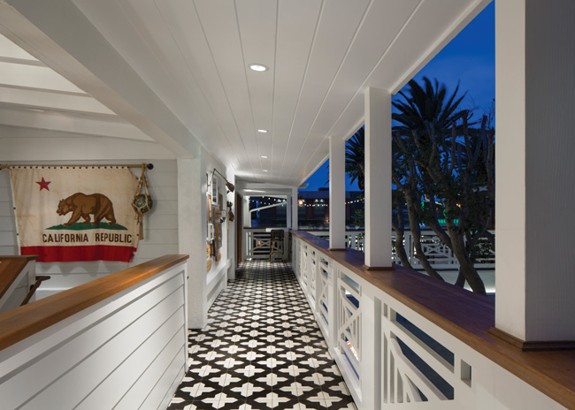
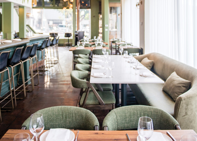
Make a statement with color. Use a bold single color, and strategically place complementary hues throughout the space to create depth and dimension. That’s what we did in the design of Harley Laguna Beach. Keep in mind when creating this effect, all other finish materials and details should be held to a minimum or the impact will get diluted.
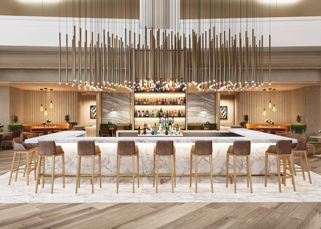
 Chandeliers that draw a crowd. We are always looking for ways to make lighting more experiential and immersive. Whether it’s an interactive light wall or a unique sculptural chandelier, we find guests are drawn to them. We are also generally seeing an increase in light levels, making restaurants more comfortable and inviting for guests. Lighting should be dimmable and purposeful, either focused on tabletops or something of special interest like a feature wall or art, just like we designed for Westin in downtown Long Beach.
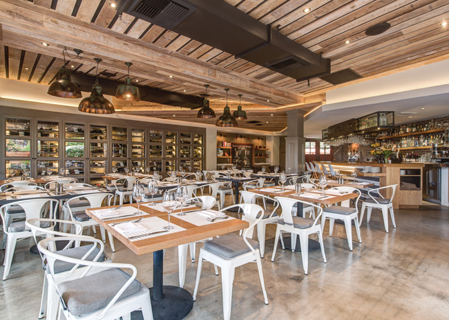
Unexpected locations. Restaurants are finding their way into unexpected locations, which really adds to the sense of surprise and discovery for patrons. I’m talking about office buildings, storage containers, back alleys or lumberyards — places that can be transformed into restaurants with great food complemented by a fun-to-discover locale. But the unexpected can also be walking through the doors of a shopping center and discovering an unusually upscale oasis, like at Provenance in Newport Beach, Calif.
Turn the tables. Most restaurants have a table nobody wants to sit at — it’s often located in a high-traffic area, probably close to the kitchen. One of our favorite tricks is to take the least desirable seat in the house and turn the tables (pun intended) by making it the most sought-after spot in the place. When we designed Panama Joe’s in Long Beach, we incorporated mood lighting, privacy screens, a salvaged wood paneled wall, comfortable furniture and a custom backlit mirror, and voilà! The table that everyone would have avoided is now the must-have table, the one at which diners request to be seated.
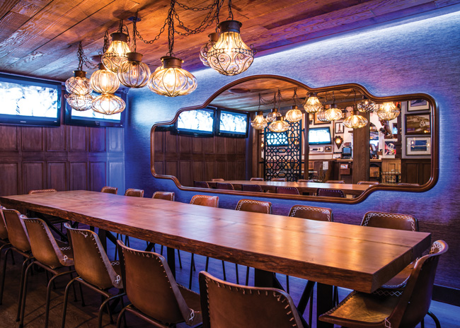
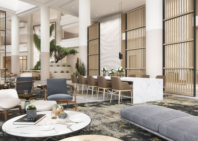
Quieter spaces. We are finally seeing a greater appreciation for the importance of comfort and acoustics. People are tired of the clamor at restaurants and bars. And when it comes to mixed-use spaces — like restaurants and adjoining hotel lobbies — we are utilizing vertical screens, drapery, wood slat walls, high-back upholstered booths and carpeting to reduce noise. And because great design is in the details, we always make sure lounge seating is just right with precise seat-height to table-height ratios.
Bonus Trends
Cool-touch fabrics. When it comes to designing outdoor patios, we aim for durable, functional and super comfy. Patrons want their rump roast hot, not their backsides burning. That’s why cool-touch fabrics are one of our favorite features for outdoor patios. We recommend outdoor fabric from Architex’s 24-7 Performance Vinyls collection.
Art over TV. In our screen-saturated society, including television screens or art installations is often the question in restaurant and bar design. We prefer no TVs because we like to see diners interacting and engaging with one another rather than having their eyes glued to another screen. But if TVs are a must, why not give the televisions an artistic touch a la Samsung’s The Frame TV so that when the TV is off, there’s a nice piece of art on the display screen?

