Design Insights on Peet's new flagship.
Read the full article on Peet's here.
Storefront: It's done in art deco but had two doors on it of different eras, one original and one just a plain glass door, like a shower door. We only needed one door, so we found the same company that did the original tile 80 years ago. They're the only one in the country that does it, but they came out and color-matched it for us.
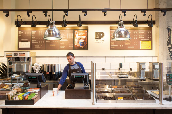
Ceilings: When we did the demo work we discovered beautiful woodwork that we wanted to expose, but to meet health codes and building department requirements, we couldn't expose it all. Instead, we installed a clean, washable surface over just the bar/service line that we also used to hang pendants from. They help to identify intuitively where the customer needs to go and how to experience the space.
Concrete Walls: When they built the building in the 1930s, they used horizontal two-by-eight boards to create the walls, filled them up with concrete and then peeled the boards off. Concrete is in our kit of parts, so this was a great opportunity. We sandblasted all of the structural walls down to their core. You can see the board forms and the craftsmanship. But we actually had too much concrete, so we mitigated it with the espresso-stained wainscot around the base to provide contrast and warmth, and to be able to put power in the walls.
Cost: Some of the biggest things were doing the work to bring the historic building up to snuff. That's expensive. And this space hadn't been a restaurant or coffeehouse before, so we had to put in a lot of infrastructure — plumbing, electrical and mechanicals that are necessary but that you don't get credit for.


