Shell unveiled its Shell Select c-store concept and with it rolled out a new food-focused prototype design that’s intended to change the way consumers perceive food available in gas stations.
“Shell Select is different from traditional convenience stores in that it provides high-quality, fresh, culinary-inspired food and beverage options for customers who are on the go, and it also provides the ability to get in and out at your own pace without being slowed and without feeling rushed,” said Gyongyver Menesi-Bondar, head of convenience retail for Shell Oil Products U.S.
The U.S. prototype was created for the site of a former Thornton’s fuel and convenience store location in Louisville, Ky., that was acquired by Estepp Energy, a Shell operator in Louisville. The site retained the original store structure, but the project team executed a complete redesign of the exterior and interior as well as a new layout. The overall design strives to create a strong food and beverage presentation that includes local touches and products.
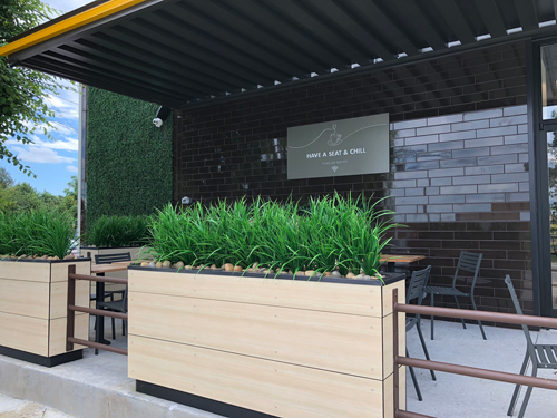
That effort began with the exterior; the modern design incorporates an upscale outdoor seating area covered by an awning and screened in by greenery, with signage that invites customers to “Have a Seat and Chill,” said Joseph Bona, president of Bona Design Lab, which developed the prototype design.
“We wanted to make sure that the architecture, including the outdoor seating, signals to people that this is a destination for food and beverage, with more than just the traditional convenience store categories,” Bona added. “It is intended to disrupt people’s usual expectations of what they’ll find at a gas station.”

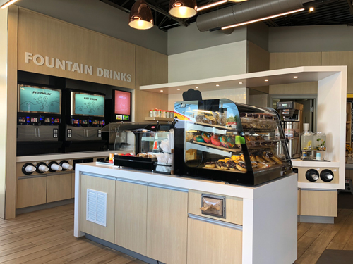
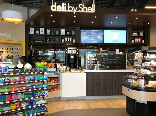
Inside the store, layout and design work together to put the focus on the consumable offerings. Customers entering the store immediately find self-serve beverages situated to their left, while facing an array of food products that fill the back wall. Although the store footprint measures just 2,221 square feet, an open ceiling and the layout help create a space that feels spacious and is easy to navigate.

The interior treatment makes use of the Shell Select palette of colors and materials, but reinterprets them to underscore the central role of food and beverage, Bona said. Natural dark materials and warm wood tones work with LED lighting to create visual interest with highlights and contrasts within an overall ambience that is warm and inviting. The effect is a far cry from the harsh fluorescent glare typical of older-generation convenience stores.
The interior design is further distinguished by a clean, understated approach to departmental graphics. “We stayed away from the hectic graphic treatments and vivid colors that characterize a lot of older convenience store designs,” Bona commented. “We wanted to keep the food and other merchandise center stage and used lighting and fixtures to achieve that.”
A notable exception is a mural created by a local artist on one wall that presents a stylized map of Louisville, highlighting some of the iconic features the city is known for.
“This was the one area where we used graphics to create a local feeling,” Bona explained. “We wanted to make sure that the people of Louisville know this is a retailer with local roots who understands their tastes.”


