We’ve all seen (and some of us have written) breathless headlines like: “What’s Hot in Restaurant Design Right Now!” or “6 Big Trends Shaping Restaurant Interiors.” There’s no end to what’s on trend — and what’s not.
For anyone involved in the development and design side of the restaurant industry, such articles and insights are irresistible. And staying on top of trends is critical to ensure that concepts and designs remain relevant. Chasing trends without at least an equal focus on longevity, however, is both risky and costly.
Why? Because trends shift, sometimes falling out of favor more quickly than operators are willing or able to keep pace. That’s particularly true on the chain side, where change requires significantly more time and effort to implement, but the scenario impacts every operator making a significant investment in design.
Kristin Hefty, AIA, LEED, partner at DADO Group in San Antonio, Texas, agrees, adding that the trick for designers is finding the right balance between fresh, on-trend and timeless. “Restaurants are a funny business because they always want to be the new cool thing, but you don’t want to design something that could be passé in two to five years,” she says. “You can do modern takes on a particular vernacular, but it does need to be somewhat timeless.”
Structure, Materials Matter
Hefty’s core strategy for achieving timelessness begins with open, “honest” architecture followed closely by what she calls truth in materials.
“Doing open architecture can actually be more complicated. In so many buildings now, everything’s meant to be covered up,” says Hefty. “Subcontractors get used to that, and their work sometimes isn’t as precise because the structure is not exposed. But with more open architecture, the structure — framing elements, connections, etc. — becomes an integral part of the decor. Subconsciously, when done well and very intentionally, those foundational elements help to create timelessness because you’re not just putting lipstick on a space.”
That’s the approach Hefty and her team used recently at Signature in San Antonio. A remodel of a former golf academy and pro shop building, the project involved peeling back portions of the existing building and rebuilding it, exposing the new construction in the process. The result is a more authentic, timeless space suited to the owners’ vision for a classic restaurant offering contemporary interpretations of traditional Texas Hill Country elements.
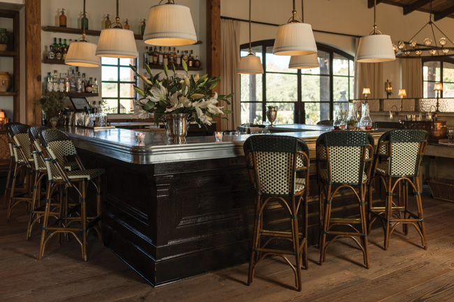
 Signature’s zinc bar top was chosen in part because it will weather and show marks, adding to the space’s comfortable, lived-in look and feel. Image courtesy of Jason Risner
What originally looked like a cupola above the entry from the exterior, for example, was just a flat, 14-foot ceiling area on the interior. “It was a faux cupola,” Hefty says. “You walked in, looked up and just saw this regular ceiling. So we took all of that out and reframed the area with reclaimed timbers and opened up the cupola at the top. Now, it brings in nice natural light and the old timbers lend solid, authentic warmth. They look like they’ve been there forever. But the approach to creating a timeless look is really concept-specific,” she adds. “Signature is not a trendy concept; it needed a classic look and feel. Even though it’s new, we wanted the whole place to feel lived in and comfortable, like it’s been there for a long time.”
Hefty stresses that while interpretations of and approaches to creating timelessness may vary from project to project, success always depends on materials selection. For Signature, that meant hand-troweled plaster, custom-fabricated steel doors and windows, zinc bar tops, and plenty of locally salvaged reclaimed wood and timber beams.
“Reclaimed wood has been a bit overdone, but for this concept and this space, it was a natural choice,” Hefty notes. “The wide flooring planks we used, as well as wood used on the ceiling, were salvaged from an old department store downtown, for instance. Those kinds of materials can make a big difference. When you use them in different and new ways, it’s just hard for them to go out of style. They help create a kind of timeless backdrop against which you can then drop in statement pieces.”
For New Jersey-based designer Susan Pitaccio, president of Maxey Hayse Design Studios, restaurant designs that stand the test of time also begin with key foundational elements. And almost regardless of concept, she advocates keeping them classic.
“To create timeless, you need fairly basic, traditional backbones,” Pitaccio says. “Maybe a better way to put it is modern traditional because traditional evolves. What we may have looked at as traditional in 1980 is not exactly the same as traditional now. It streamlines itself and catches up with the times. That’s the case with all truly classic, timeless designs, from furniture to fashion. It needs to be concept-appropriate, but if your backbones are classic — walls, ceilings, window styles, exterior finishes, interior trim and moldings — you can work from there to blend in more trendy materials and pieces that create interest and give life to the concept.”
And, Pitaccio says, updating those classic backbone elements with modern approaches achieves timelessness while staving off stodginess. “We’re seeing a lot of very classic, timeless looks right now, but the traditional dark wood base molding, crown molding and panel details may be painted white, for instance,” she says. “They’ll be a little more streamlined and not overly detailed, so it almost looks modern. There’s more color and fun. And yes, you’ll see distressed and reclaimed wood, but it’s not so much the main focus any longer; it’s an accent. The thing about the reclaimed piece is that it is, in a way, classic because it maybe came from an old barn and has a timeless style of its own. As trends go, it has proven to have much stronger staying power than we thought it might have.”
Durability Matters, Too
Aesthetics are only half of the equation when working to create timeless restaurant designs. Durability is the other. Success in this regard depends heavily on researching the right finishes and furnishings that lend a timeless look and feel to a space and that are also built to withstand the high-abuse restaurant environment. In projects with very limited budgets, that’s a big challenge as clients often push to cut costs on critical elements such as chairs.
“You have to have things that can take the abuse, so we do a lot of research up front and really stress the fact that it’s worth it to invest in quality furnishings and hardware,” Hefty says. “If you skimp on chairs, for instance, it’s going to show really fast, and before long, you’re going to be buying new chairs. And, where possible, we go with custom fabrication both for durability and to create a timeless look that’s unique to the restaurant. When you just buy things off the shelf, you see them everywhere, and the styles change in a few years. The other option we like is to do some antique shopping. Usually, it’s a mix of off-the-shelf, custom and older found objects that works to create a comfortable, lived-in look and feel that has longevity.”
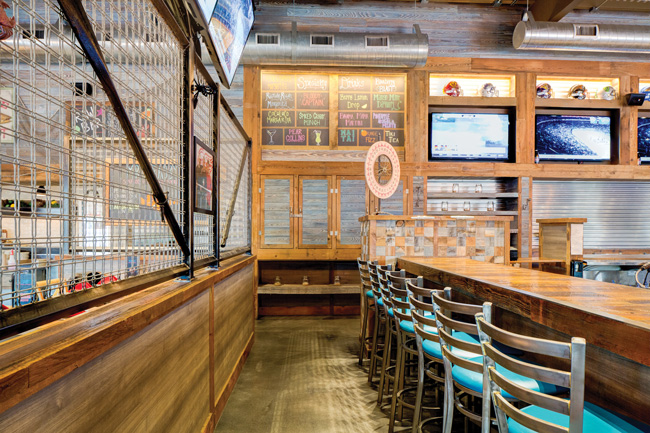
 Reclaimed wood has transcended fad status, in part because it brings a timeless style of its own to restaurant interiors. At Mr. Crabby’s Seafood House & Sports Bar in Randolph, N.J., Maxey Hayse Design used a blend of natural reclaimed woods and wood-look veneers for a casual, beachy look and feel. Image courtesy of Erik Freeland
Pitaccio adds that using the same critical eye to evaluate staying power of a building’s foundational elements is needed when selecting finishes and furnishings. “When you’re thinking about the chair for your restaurant, consider their lines,” she says. “I always think about furniture designers like Angelo Donghia, who did very classic chairs with simple lines and great materials. He would just change the line a little and update the fabrics but always kept to a classic backbone. Chairs say a lot about a restaurant, so do your research. How long has the style you’re considering been around? How has it evolved over the years? What is its staying power?”
For finishes, Pitaccio notes that it’s easier than ever to source products that check boxes for both timelessness and durability. That’s thanks to technology and constant new product development for the commercial market.
“One thing that’s really popular now, which has come back around from the ’80s, is grasscloth wallcoverings,” Pitaccio says. “Clients love them. But if you’re going to specify grasscloth wallpaper in a restaurant, you’d better find a really good vinyl alternative because grasscloth will get destroyed in a restaurant. Same with marble. It always has a nice, classic, crisp white look, but it stains. For something like that, you have to say, OK, that’s the kind of classic look that I want, but I need to do some legwork to find products suited for the hospitality market. Luckily for us, there are a lot of great new products out there now, from beautiful, super-durable wallcoverings to porcelain and laminate flooring that looks so much like wood, you can’t believe it.”
A Maxey Hayse project under construction now illustrates that sourcing strategy. A rebuild of a beach house restaurant that was destroyed during Hurricane Sandy, it called for a classic cedar shake shingle look on the exterior. But instead of true, traditional cedar shakes, which require more maintenance and naturally change color over time — which the client didn’t want — Pitaccio sourced an alternative made from recycled milled plastic. “It has a combed texture and looks just like a cedar shingle,” she says. “We can get it in a custom color that won’t fade, so we get the look we want, and it should last forever.”
The project follows suit with a classic beach house aesthetic in the interior, which functions as both restaurant and music venue. There, the team wanted to incorporate driftwood accents for a beachy, lived-in look and feel.
“Because it’s also a music venue, sound was really important,” Pitaccio notes. “We wanted to put some driftwood beams in the ceiling but weren’t able to, but we found some baffles and a driftwood-look veneer that we could wrap the baffles in. We ended up getting sound attenuation inside and the classic look that was important for this concept. Sometimes, you just have to get creative.”


