Based in Plano, Texas, Zoës Kitchen is a fast-casual Mediterranean concept with about 250 locations across the country. The chain recently rolled out a new prototype store - its fourth since its founding - in Raleigh, N.C.
According to vice president of design and construction Archie Andrews, the company had three main goals in mind when it designed this new store: Open up the kitchen, create a high-quality patio dining environment and use the design to better communicate Zoës Mediterranean menu.
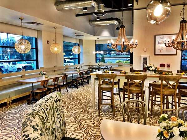
"A lot of people would come into our previously designed stores and they really didn't make a connection of our brand identity and our menu with the interior design," says Andrews. "You really didn't feel like you were dining in a Mediterranean environment."
The chain addressed this gap primarily with a new encaustic floor tile with a pattern reminiscent of design in that region, Andrews says. At the same time, it intentionally made its walls "very neutral, with a lot of creams. We really wanted the concentration to be on the floor pattern," Andrews says.
In addition to changing the flooring and walls, the design team introduced several new types of seating that offers guests different dining experiences. These seating options include booths, high-tops and round tables.
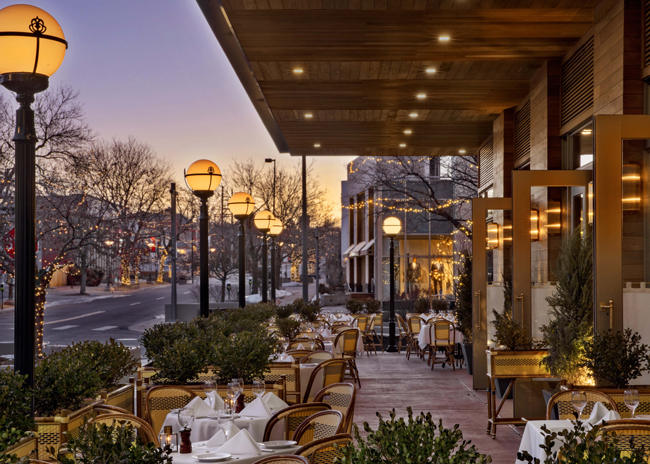
In addition, the restaurant introduced a new patio. Though these spaces are often treated as afterthoughts, says Andrews, they are a chance for restaurants to create another "pocket of energy" for guests.
The patio at Zoës new prototype is inspired by photos of homes built into the cliffs of Mediterranean islands. The space features white epoxy tables and white bench seating on an ocean blue floor that "give you a sense of the Mediterranean landscape and seascape," says Andrews.
In addition, the space includes a large planter box in front and a boxwood wall to bring some vegetation into the experience. To increase the space's utility, it has been equipped with warmers for the winter months and misting fans for the summer.
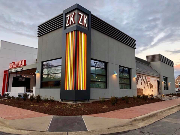
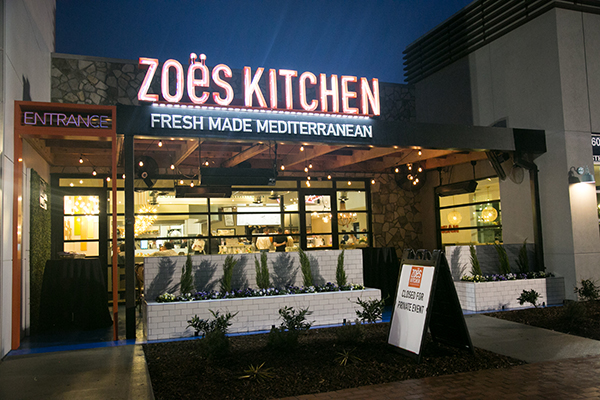
The restaurant's exterior also includes one of Zoës key branding elements: colored stripes.
"I wanted them on the interior and exterior as they are our brand identity," says Andrews. "That corner element illuminated striped tower was a custom idea." The element, he notes, was created with colored vinyl strips backlit with LEDs.
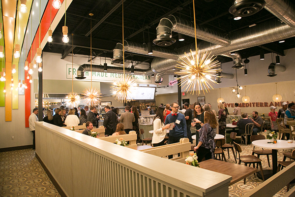
On the interior, the stripes were incorporated into the queuing line, helping to direct customer traffic. Along with the stripes, the designers installed dangling Edison bulbs in this section of the restaurant. During the normally dull task of waiting in line, these lights help create a bit of ambience, says Andrews.
This is just one of several eye-catching pieces of Zoës new lighting package, he noted. "I kind of emulate a skyscape, where you're looking at starbursts that could be stars or the sun, or globes that could be the moon. I wanted to get eclectic with our lighting."
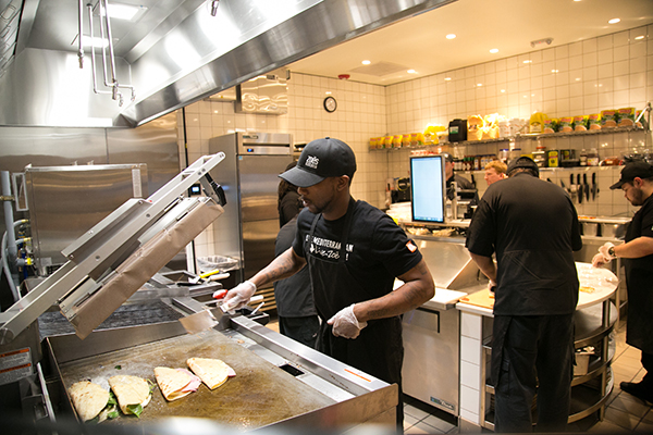
One of the key changes in this new prototype was the creation of an open kitchen. In prior designs, Zoës relied on a small pass-through. This new look puts the hot line up front, separated from guests by a glass wall.
This not only adds energy to the restaurant, it also lets the chain show off all the work that goes into preparing its food fresh.
Many operations, of course, have rolled out open kitchens for these same reasons in the past few years. Zoës stands out by how much it invested into the space's aesthetics. Instead of using a stainless table, an island prep station is made with a stone countertop. The kitchen's lighting package includes a chandelier, the FRP walls have been replaced with tile and the ceiling tiles with sheetrock. They all come together, says Andrews, to create a more elevated space.
"There really has never been a lot of form in our kitchen. There's just been a lot of functional throughput, so we start to incorporate design with an open kitchen. You've got to dress it up if you're going to show it off.

