Casual Houston Hot Spot Touts Sleek Décor, Unique Features
When multi-concept operator Clark Cooper Concepts decided to open an offshoot of its successful Coppa Ristorante Italiano, its principals had a clear vision of what they wanted to do. Finding the right place in which to do it, however, presented their initial challenge.
Ultimately, Houston's Rice Village stood out as the perfect spot for what partners Grant Cooper and Charles Clark envisioned for Ristorante's more casual sister concept, Coppa Osteria. Located near the west end of the prestigious Rice University campus, it's one of the few true pedestrian areas in Houston, "where people are actually out walking from store to store, hitting a coffee shop here or a restaurant there. It has great demographics — young professionals and families — great retail and a great neighborhood vibe," says Cooper.
The stars aligned when The Hanover Company, a Houston-based developer of luxury residential properties, approached Clark Cooper about anchoring its new Hanover Rice Village, a mixed-use development with four floors of luxury apartments above an eclectic commercial mix. It includes a valet station and has a parking garage right next door. As the corner space, Coppa Osteria would have great street-level exposure and ample room for outdoor dining on two sides of the building.
An added perk: Julie McGarr, the designer who worked with Clark Cooper on Coppa Ristorante as well as on the group's two other Houston operations, Ibiza and Brasserie 19, lives in the Rice Village neighborhood.
Following a nearly four-month build-out, the 5,700-square-foot, 250-seat Coppa Osteria made its debut last October. Although it's a brand new concept in a brand new building, it already feels as if it's been a long-standing fixture in the neighborhood, Cooper says. And that's exactly what the group wanted.
Casual Comfort Created
Starting from scratch, with no existing architectural elements to incorporate, was both a big opportunity and a big challenge, according to McGarr. "It's always tough coming into a brand new building to be able to create an authentic type of character, which new buildings typically lack," she says. "When Grant and Charles secured the space it was literally just dirt. We were able to start fresh and create our own design elements, but we didn't want it to feel brand new. We wanted it to be comfortable."
To that end, McGarr says, ceilings were kept a little bit lower and warmth was added to the space through rich colors and textures, custom lighting, plush carpeting and residential-style accessories. "The best compliment I received in this whole process is that a lot of people have commented that they feel like they're having a great dinner party when dining at Coppa. They feel comfortable just hanging out here."
Coppa Osteria's design positions the restaurant as a casual neighborhood Italian place but it's not meant to look like one in any traditional or expected sense, Cooper adds. While comfortable, the restaurant features a decidedly sophisticated appearance, in part because of its positioning as an offshoot of the upscale Coppa Ristorante. "We took the color palette of Ristorante — the blues, yellows and greys — and made it more vibrant and playful at Osteria," he says. "They're like two different kids who share the same bloodlines."
Bright peacock blue and canary yellow serve as primary accent colors throughout Coppa Osteria. A liberal use of rich natural tones, such as cream-colored tufted leather banquettes and darker charcoal greys and browns, tempers the use of the blue and yellow. All but one of the tabletops are natural maple butcher block. The exception: one large round in the center of the dining room, which has a more modern white top.
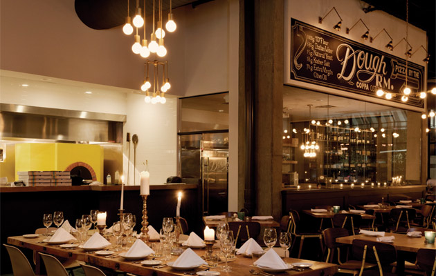
That same aesthetic carries through in the molded Eames-style chairs surrounding a larger, higher wood table that sits in front of Osteria's expo kitchen to provide direct views of the gas-fired Neapolitan-style pizza oven and hot line. Like the white-topped table, those chairs are exceptions: the majority in the dining room are warm walnut accented with the restaurant's signature bright yellow. Those chairs, McGarr notes, were among the more expensive elements of the interior décor but they were comfortable, fit the style the team was after and didn't require customization.
Tiled carpet in the dining room is thick and plush, and its jewel-tone teal blue carries through in candleholders that add a pop of color to the tabletops, as well as in restrooms and the 20-seat bar area. There, it's picked up both in the plush fabric covering the barstools and in the Baroque-style frame surrounding one of three giant mirrors that add life and depth to the space.
"The mirrors are very large and residential-style, and they have an Italian feel to them," McGarr says. "They're a fun design element that we brought over from Coppa Ristorante. They were heavily gilded gold when we acquired them, but we had them painted for our color scheme."
In fact, Cooper took the mirrors to an auto detailing company for their paint job.
The entire back bar wall was mirrored to create reflection and light. The white-framed mirrors were then placed atop the mirrored wall. "The layering brought a little simplicity and warmth to the space," McGarr says. "The third mirror, painted our peacock blue, was placed on the opposite wall, which is white, to provide some contrast."
Fresh Dough Spotlighted
While McGarr employed eclectic furnishings, vintage accessories and vibrant colors to create a warmly sophisticated residential style, Cooper and Clark, with executive chef Brandi Key, incorporated some unique operational aspects at Coppa Osteria. In addition to a large expo kitchen, the space includes a glassed-in Dough Room and a walk-up pizza-by-the-slice window.
A prominent feature in the dining room, the Dough Room's design lets guests observe Key's staff at work making fresh pasta and pizza dough. The roughly 300-square-foot space includes a 14-foot, 100-year-old wooden dough table. "It's a working part of our kitchen operation," Cooper says, "but we also make the Dough Room available for larger groups — up to 14 guests — to have special private dinners there."
"The whole design of the restaurant actually started with the Dough Room," McGarr adds. "Grant, Charles and Brandi wanted a space that would put a spotlight on the fresh pasta making and the fresh dough used in the pizzas. It's a big part of the show and is the one thing I planned the whole design around. As we started to see the room come together in construction we added design elements to it, like the large chalkboard sign fronting the top wall of the space and the brass light fixtures that illuminate the board."
Those light fixtures fit the style of others used throughout the space — simple in design but warm in finish. Along with the chairs, lighting was among the more expensive of the design details, McGarr says. "We used a furniture fabricator who created the fixtures. I used them in asymmetrical format so it feels like there are chandeliers over the tables. It was another way to bring warmth and dimension to the space."
Retro-style neon signage and a striped awning work together on the building's exterior to flag the pizza-by-the-slice window, another unique feature. Through the window pedestrians and guests utilizing the outdoor seating area can order slices of featured varieties of Coppa's signature Neapolitan-style pizza. "It's a great feature for the neighborhood," Cooper says. "We have a lot of families nearby and there are always people meandering around shopping in the area."
The window, positioned to the left of the main restaurant entrance, is serviced through a small kitchen area at one end of the bar wall, which runs along the left interior.
Energy from the Outside In
The pizza-by-the-slice window is just one of the key exterior elements that the Coppa Osteria team incorporated into its design. Natural-looking boxwood tile covers the restaurant's front façade. It's another strategy that McGarr says was employed both to create a distinctive look and feel and to add some comfort and warmth to a brand-new building.
Wrapping around the restaurant's prime corner location is a spacious
outdoor patio set off from the main sidewalk by a low, curved brick wall. "This location was particularly attractive because it is a corner and gave us the ability to have a big outdoor patio space on two sides," Cooper says. "It gives us double the exposure and creates a lot of energy for the concept from the outside in."
With seating for 80, the patio was designed for comfort, even during Houston's sizzling hot summers. Large market-style umbrellas in Osteria's bright yellow color provide shade and tabletops are epoxy coated to keep them cool. McGarr adds, "We were careful to design the space — both inside and out — to be both distinctive and comfortable year-round."
Project Team
- Grant Cooper, Charles Clark, Principals, Clark Cooper Concepts
- Brandi Key, Executive Chef
- Julie McGarr, Julie McGarr Design & Interiors
- Leo Parker, Parker Project Management & Construction
- Jerry Alexander, Acumen Design, Branding & Imagery
Snapshot
- Location: Houstononcept: Casual, authentic Italian
- Menu: Small plates, Neapolitan-style pizza, fresh pasta, soups, salads, sandwiches
- Size: 5,700 square feet
- Seats: 250 (150 inside, 80 patio, 20 bar)
- Features: Glassed-in Dough Room, expo kitchen, walk-up pizza-by-the-slice window, sidewalk patio
- Décor highlights: Residential-style furnishings/accessories, bright blue and yellow accent colors, warm woods, wine walls, brushed brass, large painted antique mirror frames, brass candelabras, chalkboard signage
- Price points: Entrees $20-$27, pizzas $14-$22; small plates $9-$15
- Buildout: 3-4 months
- Website: www.coppaosteriahouston.com


