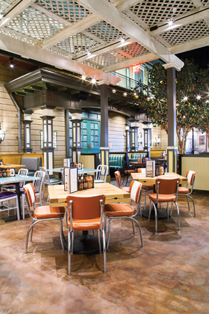
 Lucille's Vegas CourtyardWith the opening of its 18th unit in August, Lucille's Smokehouse Bar-B-Que had the opportunity to try some new design strategies. At its first unit located inside a Las Vegas casino complex, Red Rock Resort, Lucille's had no choice. The result is, if not a completely new look and feel, a decidedly creative departure for the Signal Hill, Calif.-based casual-theme chain.
One of 9 dining concepts within Red Rock — along with an 800-room hotel, 25,000-square-foot spa, food court, large pool area, bowling alley and movie theater — Lucille's serves the chain's signature slow-smoked, Southern-style barbecue as well as traditional Southern specialties such as blackened catfish, fried okra, fried green tomatoes, barbecued shrimp, gumbo, jambalaya and fried chicken with pan gravy. It's the second Las Vegas-area restaurant for Lucille's: The chain first entered the Nevada market in 2004 when it opened in nearby Henderson.
While a casino location initially wasn't in the cards, recent changes at Red Rock that brought in a collection of strong, branded restaurant concepts in addition to its own self-operated outlets made the prospect more appealing to Lucille's parent Hofman Hospitality Group (HHG). "We had been approached by the Red Rock even before we opened in Henderson about going into what was then their new development, but we didn't feel comfortable putting a restaurant in a casino," says Brad Hofman, director of marketing. "We hadn't seen it done in a way that we felt we could do successfully. It's been done with celebrity chefs, of course, but that's not us. More recently, however, Red Rock decided to change how they were doing their food. They brought in a Yard House and other concepts and let them have exterior visibility and separate exterior entrances. Once we started seeing what they'd done with the property and the offerings within the resort, it started to feel like a mixed-use attraction rather than just a Las Vegas Strip casino. People weren't just coming there to gamble; families were coming to the bowling alley and movie theater, and those are things that we felt we could align with."
Ultimately, HHG signed the lease for a space within Red Rock that had previously housed a Mexican-themed concept. Not only is the space large — roughly 10,000 square feet with seating for 360 — it's also long and narrow. The location is nothing like any of the chain's previous spaces.
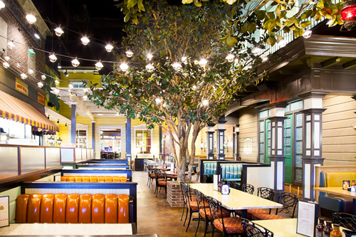 Lucille's Vegas CourtyardThe Mexican concept had been owned by the casino and shared a portion of its kitchen with the adjacent restaurant, another Red Rock-owned concept. The shared space was relatively small, approximately 200 square feet, and was primarily a dishwashing area.
"The first thing we had to do, even before we started construction on Lucille's, was separate ourselves because we were going to be two different concepts, two different operators," Hofman says. "And we had to do that in such a way that the adjacent restaurant could continue to do business as usual. We created a temporary sanitary situation where they could still wash dishes while we were working on a new dish area for them."
The space also had two primary entrances — one on the interior casino side, and one on the exterior where the street and parking lot are — which demanded a different design approach from Lucille's traditional prototype.
Site-Driven Changes
That prototype approach, from the concept's birth in 1999, had been built on freestanding, "plantation-style" buildings, according to Jeff Hatch of Hatch Design in Costa Mesa, Calif. He's worked with Hofman Hospitality Group on Lucille's concept, branding strategies and design from the beginning — including helping to create the fictional namesake character, Lucille Buchanan, an African-American woman from the South whose husband, Joe, was a World War II fighter pilot.
 Lucille's Vegas Lounge"When we did the original Lucille's in Long Beach, I went to the NAACP and told them that we were doing this project and that we want to celebrate black culture and heritage. They were a great resource. I did a lot of research on juke joints and Southern plantations. The objective has always been to celebrate the South and Southern hospitality the way Lucille might. Initially, we did plantation-style architecture, meaning a building that's raised off the ground on pillars. That was very common in the South, so we chose a comfortable, eclectic, 1940s-style plantation house theme — Lucille's house, if you will — for the brand's prototype."
That prototype worked well for the first few years and several units, but began to evolve as HHG sought to grow beyond freestanding restaurant locations. "Our leases have evolved into existing shells or sites adjacent to other buildings where it's hard to do our typical prototype and meet the criteria of different cities, counties, landlords, etc.," Hofman says. "So we've gone to kind of a blended design. Certainly on the exterior we're a bit more modern but still try to embody our spirit and traditional design on the interior. Those types of changes primarily have to do with us trying to conform and meet the design needs of new types of sites. It's tricky, though, because no matter what type of location we go into, we want it to look as if we've been there for 80 years."
Tricky, indeed, especially when that location resides within a new casino resort development.
Given the size and long, narrow shape of the space, one concern the Lucille's team had was ensuring that the Red Rock restaurant did not feel like a banquet hall. To break up the space, the designers opted to create a series of different areas within the restaurant. "Rather than a single plantation-style architectural theme, which we really couldn't do here, we chose to take a different approach," Hatch says. "We created an urban, city setting within Lucille's using a design theme that celebrates a downtown, almost tenement-style project."
The concept includes dining sections designed as Lucille's familiar "house" and front porch, which, as in the original plantation-style units, is elevated and overlooks the casino at the interior entrance to the restaurant. The house section, which measures roughly 1,000 square feet, has a living-room feel, reflected in the furniture and lighting fixtures, and the porch, approximately 500 square feet, is enclosed. The other, exterior/street-side entrance leads guests into the Flying Pig lounge, an integral feature at all locations, but one that's larger and better designed for its signature live blues entertainment in the Red Rock location.
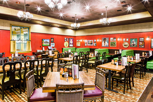 Lucille's Vegas interior
A large courtyard area between the lounge and the house serves as the restaurant's main dining area. Design features here include a New Orleans-style hotel façade and sidewalk storefront setting on one side and, on the other side, a partially exposed kitchen, which is dressed up to look like a boarding house, with awnings over a large window from which servers pick up food.
"As you move through the restaurant, you feel like you're moving through different rooms and different atmospheres," notes Ryan Hofman, director of development and construction. "It's a nontraditional approach for us, but with all of our locations we want the design to feel like you're taken away to the South. If you're standing in our courtyard, you don't feel like you're in a casino; you feel you could be in a Lucille's on Bourbon Street."
Urban Courtyard, Southern Style
The Red Rock location's courtyard represents perhaps the most dramatic departure from other Lucille's units. With 35-foot-high ceilings, its signature feature is two lifelike magnolia trees. "If you enter the restaurant from the casino side, you walk through the house and onto a back porch, which leads into the courtyard with the trees and façades of other buildings that butt up to it," says Hatch.
Constructed of steel armatures encased in real wood and bark with synthetic leaves, the trees look "absolutely real," Hatch notes. Each is 25 feet tall with a 20-foot spread. "Getting them in the courtyard was actually pretty easy," he adds. "In Las Vegas, you can build just about anything."
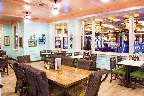 Lucille's Vegas porch areaUnderneath those trees in the courtyard is a mix of booths and freestanding tables that seat more than 100 guests. The space also plays home to Lucille's 1,000-pound smoker, a signature feature that's prominently positioned in each of the restaurant's dining rooms. "The cooks have to walk across the dining room to get to the smoker, which is loaded with hickory or apple wood," Hofman notes. "You might expect it would be placed close to the kitchen, but we put it across the dining room so that guests can watch the cooks loading it and carrying large trays of smoked meats back to the kitchen. We ring a bell every time we open the smoker, so it's an important part of the Lucille's experience."
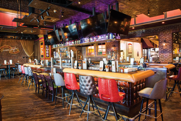
Like the courtyard, which gave the design team space and inspiration to create a new Lucille's environment, the Flying Pig lounge area in the Red Rock location was upgraded and expanded. Comprising roughly 40 percent of the restaurant's total space, it includes a freestanding, 24-seat bar, multiple flat-screen TVs, and an eclectic mix of seating styles to accommodate guests who choose to dine in the bar as well as those just enjoying cocktails and socializing.
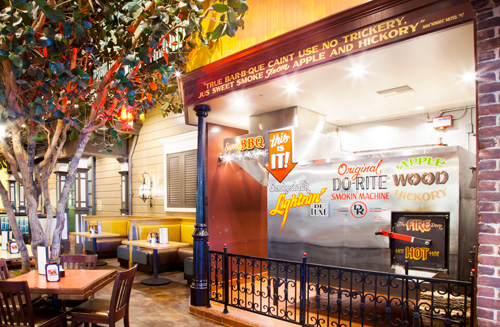 Lucille's Vegas SmokerIt also includes a raised stage for showcasing frequent live blues performances. "Live music is a feature at all units, but it's always been just one or two musicians at most, with no stage. They just set up wherever they could in the lounge and play," says Hatch. "Here, because of the size of the space, we were able to incorporate an elevated stage that can accommodate a three- or four-piece band."
Lounge guests also enjoy great views. The exterior wall incorporates large sliding windows that overlook an impressive water-and-fire feature on the resort grounds as well as the namesake Red Rock Canyon mountains.
Feature Insights: Ryan Hofman, Hofman Hospitality Group
Flooring.
In the bar we did a stamped concrete that looks like old wood planks. It looks good and seems like it's going to be a high-performance floor in terms of slip resistance and durability. In the courtyard we stained the existing concrete to give it an outdoor street look. That carries all the way through the pathway connecting to the casino. As you go into Lucille's house, we gave a combination of real white plank wood, both bleached and dark, intermixed with a center carpet in one room that looks pretty 1960s.
Artwork.
We bring a group of artists in who paint all of these logos and artwork by hand. They spend weeks on the job site on ladders and scaffolds painting these finishes directly onto the brick, onto the smoker and generally throughout the entire restaurant. We also work with several artists based in the South and have their works shipped to our restaurants. We look for art that is evocative of the South. It might be images of a family at church or fishing down by the river, or stylized portraits of old blues musicians.
Splurges.
Until we went through the demolition phase we didn't realize how much of the conduit and hard piping we were going to have to move, but we were already committed to the design. We ended up spending a lot more on that part of the project than we expected. We also had to take some very nice finishes 30 feet up in the air in the courtyard area, which is something we don't typically do. So that was a bit of a surprise.
Savings.
The public restrooms for the casino are directly next door to our casino entrance. They're very nice and well maintained, so we decided we didn't need to install our own bathrooms. That saved us both money and space. We also save, in general, because for our last three or four projects we've taken all of our construction management in-house. We hired one superintendent who works for us directly to oversee the job, and I write the contracts for each sub. We track and oversee everything in-house, which gives us a lot of control and savings over using a general contractor.
Project Team
- Lucille's: Paul Williamson, vice president of operations; Brad Hofman, director of marketing; Ryan Hofman, director of development and construction (all from the Hofman Hospitality Group)
- Fertitta Entertainment: Joe Haley, vice president of design and construction
- Station Casinos: Scott Zucker, project director; Jason Moody, project manager
- Design: Jeff Hatch, Hatch Design
- Architect: Craig Oka, AIA, ADC (Architects Design Consortium)
Snapshot
- Ownership: Hofman Hospitality Group
- Headquarters: Signal Hill, Calif.
- No. of units: 18
- Menu style/segment: Casual dining
- Dayparts served: Lunch, dinner
- Average prototype size: 7,000 to 9,000 square feet
- Key expansion markets: California and Nevada
- Red Rock unit size: 10,000 square feet
- Project design highlights: Multi-environment, urban tenement/streetscape; center courtyard with lifelike magnolia trees, plantation-style art and architecture

