Capriotti’s Sandwich Shop’s had a very simple, almost sparse design: white linoleum floors, some black-and-white checkerboard tile and basic
tables and chairs.
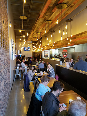
Today, Capriotti’s design makes it much more comfortable and welcoming to guests.
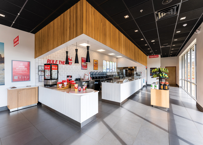
Modern design elements in Capriotti’s Sandwich Shop include subway tiles, a metal front to the POS counter, a stained concrete floor with exposed aggregate, and Edison bulbs hanging from the ceiling on long chords, pendulum style.
The furnishings also have some modern touches. If space allows, restaurants can deploy high-top and communal tables.
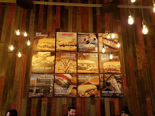
Like the rest of its design, Capriotti’s art program features warm and modern elements. Brick covers large portions of its walls, with one section featuring the Capriotti’s name in the chain’s signature script. The chain also has food photography, a community wall showcasing a word cloud with phrases connected to the area, and even a large sign that spells out the word “turkey” with light bulbs.

To drive home the quality of its offerings, the chain also prominently displays the awards its food has won over the years. “We’ve won hundreds and hundreds of awards for our food. We display a lot of those more prominent ones, like the Greatest Sandwich in America Award from AOL and the World Cup of Sandwiches award,” says Capriotti’s CEO Ashley Morris.
Check out our sister publication’s complete profile on Capriotti’s.


