When Empire City Casino in Yonkers, N.Y., asked the Goldman Design Group to create a new, eye-catching fast-casual concept just off the gaming floor, the company knew it was facing a big challenge. After all, practically everything in a casino — lights, noise, tables, machines — is designed to attract people’s attention.
In response they created Lil’ Cocina, a fast-casual operation featuring bright, fun colors, innovative grab-and-go coolers, and even a hunk of an old VW bus that provides a food truck experience to guests outside.
Under the direction of the casino’s food and beverage team, Lil’ Cocina was originally conceived of as a Chipotle-style Mexican restaurant. During development and construction, the concept evolved to serve sandwiches, pastries and a variety of grab-and go items.
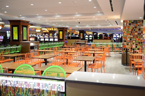
Despite this change, the team went with the bright colors found in many Mexican restaurants. Combined with the operation’s bright lighting, the space easily gets the attention of passersby on the relatively dark casino floor.

Customers entering the operation first encounter the restaurant’s seating area. The standard two- and four-tops are matched with powder-coated metal chairs in bright orange. Counter-height stool seating in powder-coated green is situated along the rim of the dining area. According to Goldman co-owner Jennifer Geddes, the mix of seating — and the absence of high-top stools — was selected in order to accommodate the casino’s older customers.
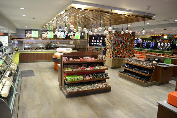
In the ordering and grab-and-go area, the designers covered the structural column in multicolored tiles, making what might have been an eyesore instead a design element.

These colored tiles play off several other design elements, including the lighting installation at the center of the grab-and-go area. Pendant lights in a variety of colors hang down through wooden slats attached to the ceiling.
Another element that picks up cues from the colorful tile work is found in the partition that separates the seating and ordering areas. It consists of metal frames holding resin panels with bright colored fabrics embedded in them. The millwork for the frame and the resin panels were completed in Goldman Design’s shop.
Another millwork piece is the operation’s stand-alone grab-and-go unit used to hold bags of chips. The piece has a wood-style veneer, but is made with a heavy-duty resin that won’t dent easily.
“Durability is a huge issue for a concept like this,” says Geddes. “They get so much traffic, so we had to keep that in mind with everything we use.”
The restaurant’s other free-standing grab-and-go unit was custom built by a manufacturer. It holds sandwiches and drinks. It’s orange base adds to the overall color scheme and provides a splash of color and its oval shape helps guide guests to both ordering and creating an orderly line during busy hours, according to Goldman Design co-owner Shelia Goldman.

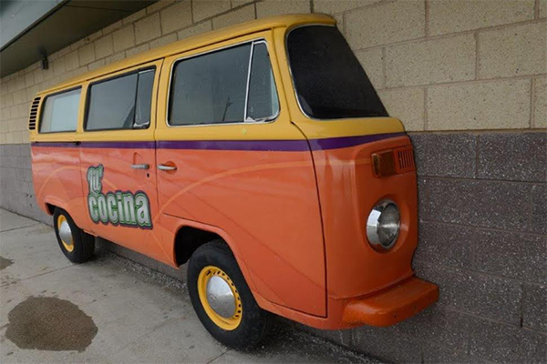
Despite all the bright colors in the restaurant, one of Lil’ Cocina’s most eye-catching design elements isn’t even in the building. Attached to the outside of the operation, covering an external window, is a slice of an old VW bus painted with the operation’s bright color scheme. The bus not only gets people’s attention, it is equipped with a sliding window that allows customers to place orders from the outside.
“It was a really old rusted, beat up bus,” says Goldman. “It took quite a bit of work, but it really makes a mark on the restaurant and they love it. In the summer, there are tables outside. People love that idea that they’re coming to a food truck.”
Guests in general, in fact, are coming to Lil’ Cocina — so much so that the casino is exploring developing a Lil’ Cocina food cart that can be rolled around the gaming floor, Goldman says.
Photos courtesy of Goldman Design Group.


