This 48-year-old sandwich chain has introduced a new prototype inspired by the city that gave it its start.
Austin, Texas, is a city on the rise. It’s a tech industry hub, hosting major campuses for Apple, Facebook and Google, among others. It’s got vibrant street art, great outdoor spaces and one of the world’s best live music scenes.
And of course, there’s the city’s food culture, which includes everything from adventurous high-end dining to killer barbecue to food truck parks.
All these elements have helped Austin earn the #1 spot in U.S. News & World Report’s rankings of the best places to live in America.
With all that it’s got going for it, then, it’s not a surprise that a chain like Schlotzsky’s would embrace its Austin roots with its latest brand refresh.
Austin Born
Now owned by FOCUS Brands, Schlotzsky’s was founded in Austin in 1971. Its original menu consisted of just one sandwich (The Original, served on its still-signature fresh-baked sourdough bun) and one side. That limited menu was good enough to launch a full chain that today has more than 360 restaurants across 35 states.
Over the years, of course, Schlotzsky’s menu grew and its look evolved from that simple start. By the middle part of this decade, it had settled on a bakery-cafe-style menu that covered sandwiches (including The Original), flatbreads, pastas, pizzas and salads, all served in a functional QSR-style interior.
But three years ago, Schlotzsky’s leadership decided the chain was due for a brand refresh. The move was driven by demographics.
“The core brand is built for Boomers and Gen Xers,” says Schlotzsky’s President Kelly Roddy. “If you look at who the guest of the future is, Millennials have kids and Gen Zers have their own money and their own transportation now. You have to build a restaurant and design and menu to support the generation that will be our guest from now until the next decade.”
After researching its targeted customer base and studying its own strengths, the chain realized its history held the key to its future. The end result, after years of work and multiple prototype iterations, is Schlotzsky’s Austin Eatery, a restaurant whose menu and design take inspiration from the Austin food scene — particularly the city’s food trucks and food truck parks.
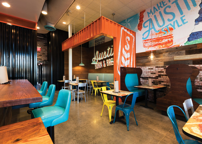
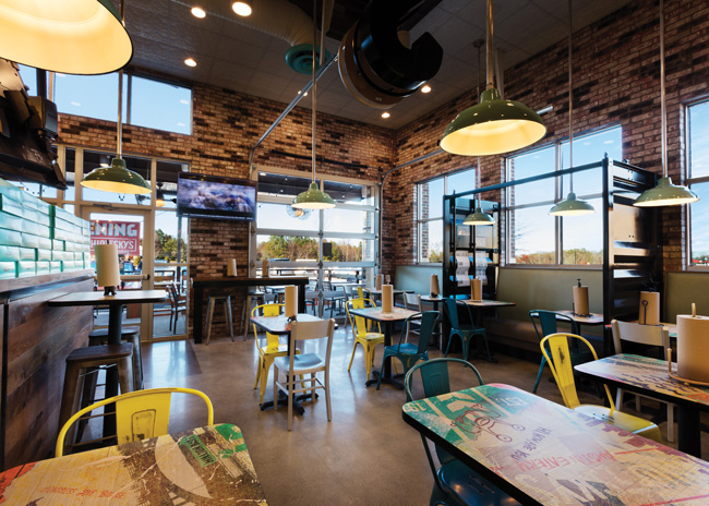 Chairs at different heights can provide a sense of privacy in an otherwise full space.
What Millenials Want
According to Roddy, getting to this point started with the chain exploring where younger guests are in their lives and what they want out of a dining experience. Millennials, he says, like to eat in large groups and are now bringing their young children out with them. They want healthy options along with food they can share with friends and family. And they enjoy having an alcoholic beverage with their dinner.
Schlotzsky’s legacy menu and design simply couldn’t meet these desires, Roddy says. “We didn’t sell beer or wine; our restaurants were set up more like traditional QSRs with a lot of two- and four-tops,” he explains. “Our design was tired. It wasn’t trendy, wasn’t relevant. We saw some gaps there.”
Meeting the menu preferences of younger guests was relatively straightforward: If customers want shareables and a drink, offer them shareables and a drink. Schlotzsky’s then introduced beer and wine for the first time and has added various options, like sliders, to existing group-friendly choices like pizza and flatbreads.
Changing the restaurant’s design was also in order. If the chain’s target customers want family-friendly spaces to dine in large groups, basic two- and four-tops aren’t what they’re looking for. Read between the lines, in fact, and it becomes clear that they want not just a meal but also an experience when they dine out.
With Austin roots, the chain realized an Austin-inspired design could provide the experience guests want as well, according to Roddy. “If you go to a restaurant in Austin, it’s pretty common to see reclaimed wood or reused container material,” he says. “The furniture doesn’t necessarily match. There are large [group] seating areas and patios with outdoor seating and lighting. Schlotzsky’s has always been inspired by Austin. That’s how we decided to just own it. We decided to tell everyone this is what an Austin eatery looks like, no matter where it is.”
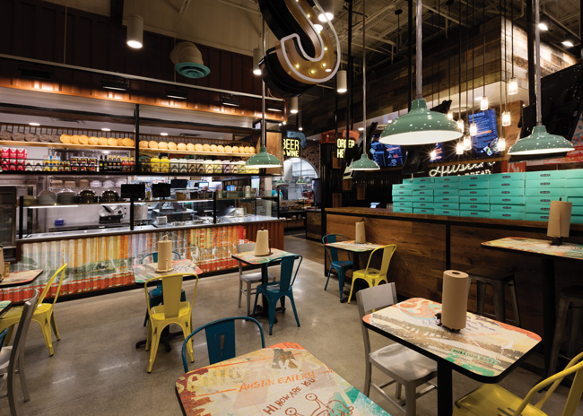 Fellow FOCUS Brands concept Cinnabon is a frequent co-location partner with Schlotzsky’s. Boxes of cinnamon rolls are now displayed at the queue line for purchase, as are bags of chips and bottled drinks in an ice well.
Eating in Austin
Schlotzsky’s new prototype gives guests that Austin feel as they’re walking toward the restaurant. Drawing on food truck parks as its inspiration, the Austin Eatery design features a covered outdoor patio with string lights and games like cornhole and giant Jenga to help people get a break from the daily grind.
“I have a young family,” Roddy says. “If I can dine somewhere where my wife can have a glass of wine and I can have a beer and there is something we can do to slow the day down, it’s good.”
Entering the restaurant, guests see a space filled with authentic materials, including polished concrete floors, reclaimed wood and corrugated metal in several elements.
As guests move to the order line, they find many of the options that were once behind the counter up front. Bottled drinks are now held in ice wells, while chips are on shelves along the order line. These
displays allow guests to browse their options, with the ice-cold drinks being particularly appealing on a hot day.
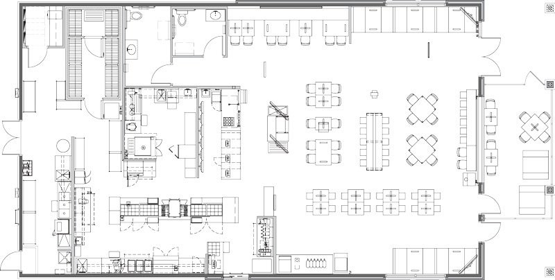
Once they reach the POS station, guests will also get a close-up of the chain’s open kitchen. While the production has always been on display, the kitchen in this restaurant has a new look, with a front made of corrugated metal and shelving suspended from the ceiling where the chain displays many of the ingredients it uses to make food from scratch.
After ordering, customers have their choice of several seating options, including various high- and low-top tables, soft seating and bar-height stools along a window for solo diners. Many of these seating options include laminate tabletop graphics of both food and Austin-themed imagery that tells the Schlotzsky’s story.
In addition to these options, the Austin Eatery design includes some featured seating areas. One of these, dubbed the Power Table, is a community table with built-in power outlets, USB ports and wireless charging pads. These features make the space appealing to lunchtime workers or students studying for their next exam, says Roddy.
Another featured space is the shipping container seating section. The chain has used corrugated metal to create what appears to be a section of shipping container that have been cut open. Here, guests will find seating for easily a dozen people in the form of an upholstered banquette matched with tables and chairs. With its cubby-like quality, this space offers guests a more intimate and even elevated dining experience, says Schlotzsky’s Vice President of Strategic Initiatives Jeff Edmiston.
 Testing the Design
Apart from the research and initial design iterations, getting to this final prototype was itself a major undertaking. The first draft of the Austin Eatery concept had many of the core design elements found in the the final design, including the open kitchen, the shipping container seating area and the food truck park-inspired patio.
After its opening, though, the chain spent a few months studying this store’s performance, then built six new stores with test variations on the design. “We remodeled them all a bit differently so we could send in researchers to get feedback from guests and really try to value engineer it and find out what was important to the guests,” Edmiston says. “Do they really need to see the kitchen or the bakery? Do they like the materials we are using? Is the seating arrangement good? We tried a whole lot of different things and came up with the final design based on that.”
Many of the major changes resulting from these test stores revolve around how the chain featured its kitchen and fresh food preparation/production. In terms of the kitchen layout, the first Austin Eatery restaurant placed the kitchen in a prominent location that was separate from the POS station.
While Schlotzsky’s wanted to emphasize its fresh food, this approach worked too well, says Edmiston. “When we brought the food so far forward, it was almost overwhelming to enter the restaurant. It drew the eyes so much that it changed the natural path we wanted guests to take when they came in. Guests would walk over to that action, to where the food was being created, as opposted to where you go to order food.” In response, Schlotzsky’s kept the open kitchen but moved it back in line with the POS station, eliminating confusion.
Similarly, research on that first store found that the most appealing parts of food prep and production — such as making fresh bread from scratch and assembling salads (with all their bright-colored ingredients) — didn’t need to be up front. “[Guests] didn’t care if the salad was made in front of them. They just like the idea of being able to see into the kitchen, that things are happening and that it’s clean and that it’s not like a QSR where things are prepared ahead of time and held under a heat lamp,” Roddy says.
This revelation allowed the chain to save money by eliminating a glassed-in space for the bread room. It also let Schlotzsky’s design its kitchen for the best operational flow rather than the best display, making the restaurant more efficient, notes Edmiston.
Another important lesson from these test stores involved signage. Schlotzsky’s tested several versions of its exterior sign with these new restaurants. In the end, the chain found the best results with a reskinned logo featuring the same font but new colors along with the addition of “Austin Eatery.” That approach, Roddy believes, maintained guest connections with the restaurant they remember while enticing them with something new.
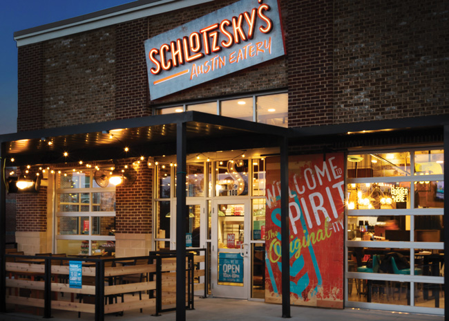 While the chain tested different versions of its signage, as seen here, it eventually went with a legacy look that retained value and recognition among existing customers.
Success Measured
With the completed, essentially final prototype in the field for roughly a year, Roddy is happy with the design’s performance. Sales are the number-one metric for any new restaurant, and on that front, the Austin Eatery is a success, he says. But related metrics show the Austin Eatery is achieving other goals as well.
Through the addition of beer and wine, Schlotzsky’s expected to improve dinner and weekend sales. Growth in the Millennial market was also a big goal. Schlotzsky’s is succeeding on both fronts: Dinner and weekend traffic has improved, while anonymized credit card data shows the new store is bringing in a younger customer base, Roddy says.
This Austin Eatery design has also opened up new markets for Schlotzsky’s, Roddy adds. While the chain has typically built out in suburbs, it’s now finding success in small Texas towns like Lampasas (population 6,681) and Liberty Hill (population 1,608).
When Schlotzsky’s had a QSR look and feel, there wasn’t much to distinguish it from the restaurants already in those communities. With its hipper, elevated design, it can now stand out.
“Those small towns only had Dairy Queens and Sonics and Subways. Today, we’ve become the nicest place in town,” Roddy says.
Beyond those small Texas towns, the chain sees its growth coming from Phoenix east, and as far north as St. Louis. As it grows, the sandwich shop that started in Austin 48 years ago is taking its roots on the road.
Project Team
- Project Lead: Jeff Edmiston
- Architect: IDStudio4
- Kitchen Supplier: Trimark
- Interior Design: Julie Turner, FOCUS Brands
- Kitchen Design: Julie Turner/Brian Farris, FOCUS Brands
Snapshot
- Headquarters: Atlanta
- Concept Owner: FOCUS Brands
- Segment: Fast-Fine
- Unit Count: 370
- Location of New Prototype: Duluth, Ga.
- Opened: 2016
- Size: 3,500 square feet
- Real Estate: Freestanding
- Design Highlights: The design of the restaurant has been updated to include elements of recycled wood and corrugated metal. Eye-catching materials and funky design elements, such as an “Austin Born & Bread” lighting fixture, are in each dining room.
- Build-Out: 4-6 weeks
Floor Plan
