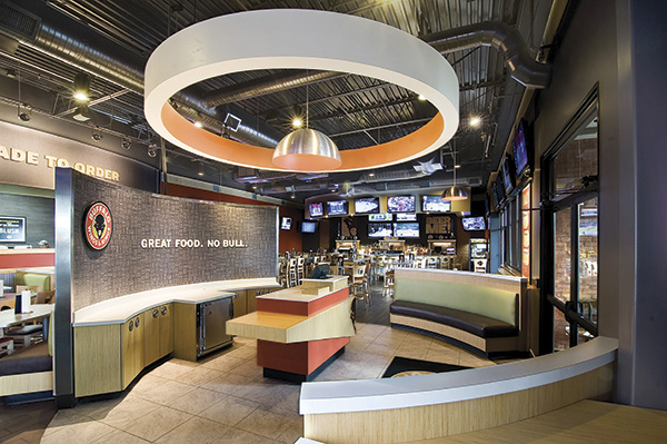
The food truck craze resulted in the founding of several brick-and-mortar restaurants.
Among these is St. Louis-based Seoul Taco, a Korean-Mexican fusion concept that, on top of two trucks, now operates five locations in Missouri and Illinois. The newest of these recently opened in the St. Louis suburb of Chesterfield, Missouri.
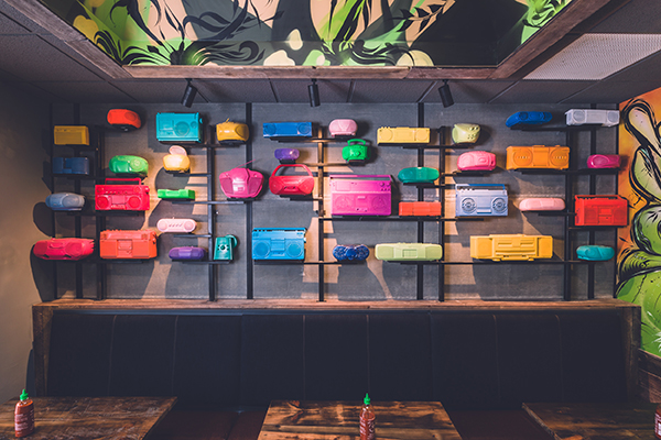
According to Seoul Taco owner David Choi, all his restaurants are inspired by the street food/street art connection. One of the restaurant’s signature design elements, developed by Evanston, Ill.-based SmartMouth Design, is a collection of ’90s era boomboxes, spray painted in bright colors.
“We wanted to bring is some urban street culture and we wanted a fun, vibrant atmosphere. The spray painted colors [contribute] to that as well,” Choi says.
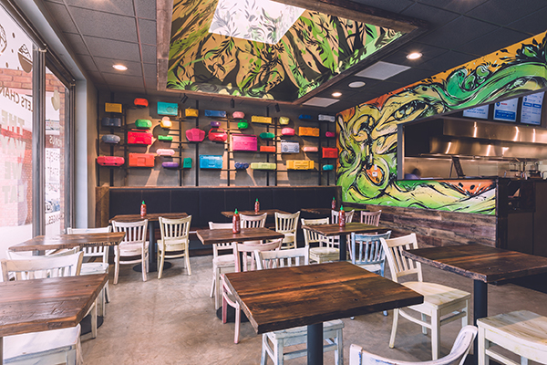
The restaurant’s street concept also inspires its mural work. The company, says Choi, has built relationships with muralists from Chicago. Seuol Taco’s Chesterfield location came with a skylight, so the muralists painted vines growing toward the opening. While the design changes from store to store, a Luchador vs. Tae Kwan Do fighter element (representing the chain’s Asian and Mexican influences) will appear in each location, Choi added.
The murals in this particular store took advantage of the space’s existing skylight, with vines on the wall and ceiling growing up toward the sun.
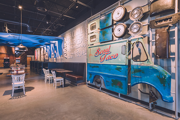
A signature design element particular to Chesterfield is the life-size food truck model kit. According to Choi, the designers purchased an actual 1950s-era delivery truck that Seoul Taco has disassembled into sections.
“We painted it our brand colors and made it look like a retro taco truck,” says Choi. “You know those model kits, with the twist off pieces? We made our own build-your-own-food truck kit, but life scale, and put it on the wall.”
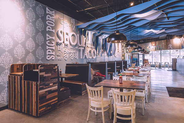
Other design elements include a wall covered in phrases in three languages (English, Korean and Spanish) representing the three cultures that inspire Seoul Taco. The restaurant also uses a wooden ceiling element dubbed “the cloud.” “It’s something we have in our other restaurants, just to help with the space, especially with the ceiling. All of our ceilings are exposed. Instead of just having only raw, exposed ceilings, it’s another fun element.”
While Seoul Taco puts a lot of effort into creating a unique look with these signature elements, it’s more relaxed about other parts of its design. The spaces’ previous tenant left its booths behind, so Seoul Taco simply reupholstered them, and the chairs were bought from a shuttered restaurant, then painted.
“It’s wasteful to throw it out,” Choi says. “You could buy brand new, but at the end of the day people are there for your products. If you could make what’s already there look good, then you’re going to save a lot of money as well.”
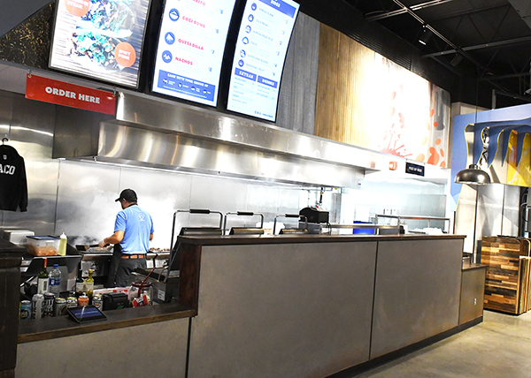
While most of Soul Taco’s interior is designed to be eye catching, the one exception is the dining area and kitchen. This space is dominated by metallic finishes and has very few adornments. This design, Choi says, is easy to keep clean and provides a bit of calm to the restaurant while complimenting the operation’s industrial elements, such as the exposed ceiling and ductwork.
“We have a lot of texture around there and obviously we have an open kitchen as well. From there, I wanted at least the kitchen part to not really stick out as much. I just wanted a clean, stainless steel vibe.”


