Justin Cucci really didn’t want to do another restaurant. He and his team at Edible Beats had already developed four Denver hot spots, each a unique concept and all involving demanding, multiyear adaptive reuse projects. He felt he had neither the time nor the energy for another one.
But once he saw the open fifth floor of the new five-story office building going up next to Linger, his restaurant in the city’s Lower Highlands district, he knew he’d be doing one more after all.
Three and a half years later, El Five made its debut as the newest addition to the Edible Beats portfolio. Opened May 1 of this year, the 300-seat restaurant serves Cucci’s take on tapas in a vibrant space bookended by unobstructed views of downtown Denver on the east side and the mountains and sunset on the west side. A 660-square-foot terrace along the city side instantly put El Five on the short list of top spots in the city for outdoor dining. The fact that it overlooks Linger’s popular outdoor dining deck three stories below only adds to the vibe and visual appeal.
For Cucci and his team, this particular project was an anomaly. Being a new building — and an office building at that — there was no conceptual starting point or architectural history with which to frame the concept or the design.
“For me, the space always drives the concept. I never go into a project with a concept in mind,” Cucci says. “I only have a love for a building or a space. Then, I start developing it, and then the concept crystalizes, usually last. Part of the reason for that is that I don’t necessarily want a concept or a theme. I want stories that are nonlinear. I like bringing disparate things together and hopefully doing it well enough that it creates its own unique story. That’s why I love adaptive reuse projects so much. My biggest struggle with this building was that there was no history. What was here, however, was a great space and amazing views. Ultimately, I felt that it needed something exciting but not overwhelming. I wanted the views and the experience to be at one with the food. Something about the small-plates approach just felt right, and in the landscape of Denver, there weren’t many places doing tapas — or doing it at the level that I felt it could be done.”
El Five’s menu showcases the Mediterranean region’s cultural and culinary melting pot, venturing well beyond familiar Italian, Greek and Spanish staples to include liberal doses of Middle Eastern influence. Says Cucci, “The Middle Eastern region is often left out of the Mediterranean cuisine dialog, but cuisines from Turkey, Syria, Israel and Lebanon are starting to have their day in the culinary lexicon. We wanted the Middle Eastern side of the Mediterranean to shine through, too.”
With that as the overall concept and menu inspiration, Cucci was still left with the challenge of turning a sterile new space in an office building into a suitably rich and vibrant setting. A passionate collector of old and unusual things, he ultimately found his muse on eBay.
The Aha Moment
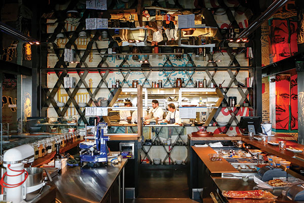 Middle Eastern patterning is featured on a wall that partially encloses the kitchen. Photos of El Five by Adam Larkey Photography; courtesy of Ricca Design Studios
“I had bought a couple of huge, vintage Middle Eastern movie posters from a guy on eBay. When I got them, I just kept buying more,” Cucci says. “They were so beautiful. I bought 30 or 40 of them. I was really stumped as to what this restaurant should look and feel like, but then I saw these and thought, ‘Why not bring in a very obscure element and make that the theme?’ That’s when I felt, ‘OK, now I’m inspired. I know what this needs to be.’”
Kevin Stephenson and Chris Davis, principals of Denver-based BOSS.architecture, who worked with Cucci on Edible Beats’ previous adaptive reuse projects, shared his uncertainty about how best to give such a new space some soul. The posters clicked for them, too.
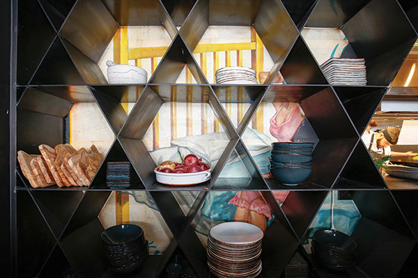 Pieces of steel plate were built into a geometric grid pattern that adds visual interest and provides shelf space for plates and other items.
“Justin is sort of like a mad scientist and collector of all manner of found objects and obscure things, which he likes to incorporate into his restaurants,” Stephenson says. “This project took a turn when he found the giant movie posters, some the size of billboards. We were sorting through them and playing with imagery that would work and ultimately decided to cover most of the walls and portions of the ceiling with them. We curated the various images based on colors or designs or how the people were depicted in them. They’re all graphic designs, not photographs, and have a nice vintage quality to them. The soul of the project really started to emerge when we brought them in because they had such authenticity. We always believe that there’s an artistic or handmade component of every restaurant that we work on that transforms it — takes it to a level that you can’t just do with materials and finishes. These were that component. And it’s so interesting because the content of the imagery is such that it couldn’t really even exist in the Middle Eastern social climate now, but somebody saved them.”
With the posters and the actors in them — who Davis likes to think of as the “permanent entourage” within the space — providing the mainstage drama, the team worked to add shapes, textures and materials that would complement but not compete with them or with the views outside. They again tapped Cucci’s collection of oddities and interesting materials, including hexagonal mirrors that he’d bought in bulk and a cache of Monkeypod wood that he’d sourced from Indonesia.
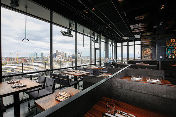 The main dining room offers terrific views from every seat, whether toward the terrace and the city outside or inward toward the vibrant design and energy of the kitchen.
The mirrors, which the designers layered strategically over sections of the posters, add interest and texture as well as reflect snippets of the view beyond. “Some of the mirrors are sort of bronzy, and some have a coppery tone,” Davis says. “So we manipulated them to create a layering effect that evokes Middle Eastern patterning. At first, Justin just wanted to show the images, but ultimately, he bought into the idea of the layering with the mirrors to bring more depth and interest into the space.”
Similar patterning comes into play on a wall that separates the two portions of the kitchen. There, pieces of steel plate were built into a geometric grid pattern that adds visual interest as well as provides practical and much-needed shelf space for storing plates and other items.
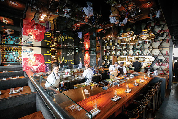 Designed to celebrate food as an open dialogue, a completely open, centrally positioned display kitchen incorporates a chef’s counter. Black acrylic material used on the ceiling creates a watery, reflective effect.
The installation of the grid, Stephenson says, “was certainly inspired by traditional patterns that you see in Southern Spain or in Eastern countries throughout the region. As with the mirrors, depending how you look at it, it also creates a repetitive Star of David shape.”
As for Cucci’s stash of Monkeypod wood, it was used to build custom tabletops, a chef’s counter and banquettes, serving as a warm, rich and strategically lit counterpart to the otherwise muted, dark interior. While initial design schemes pulled a lot of colors from the posters, the team later opted for simple, quiet charcoal gray for the fabrics and matching concrete floors.
“We started out with colors galore, playing off the vibrancy and celebrating the aesthetic in the posters, but ultimately, it was a little too noisy,” Cucci says. “It took away from the view, from that beautiful feeling of being on top of the world. So, we really scaled it down, and the posters became the basket that we put all of our marbles in.”
Kitchen Center Stage
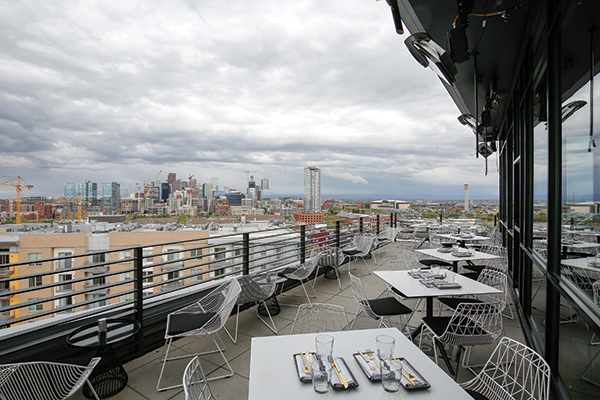 With stunning views of downtown Denver and beyond, El Five quickly became one of the city’s hottest spots for outdoor dining.
If the vintage movie imagery gives El Five its unique character and soul, its kitchen gives it the buzzy energy that brings it all to life. Designed to celebrate food as an open dialogue, it’s presented as two separate elements: a slightly larger, completely open “cold” kitchen that incorporates a seven-seat chef’s counter and, across the corridor, a semi-enclosed “hot” kitchen.
The display portion of the kitchen is a central feature in the dining room. “We wanted it to be a prominent energy source in the space, probably because there wasn’t a lot of other energy in that architecture and building; it was just a box with windows,” Cucci says.
Arriving guests depart the elevator into a small foyer, where the first welcoming feature they encounter is a glass-walled wine storage room. Wine isn’t a major focus at other Edible Beats restaurants, but it is at El Five, so the visual helps to underscore that aspect of the menu and promote its natural pairing with tapas.
An intersection of corridors then takes guests either past or through the kitchen on their way to the bar, terrace or dining room. “The circulation is like a figure 8, so you can move around the kitchen or cut through it,” Davis explains. “The two ‘donut holes’ of the 8 are the kitchens.”
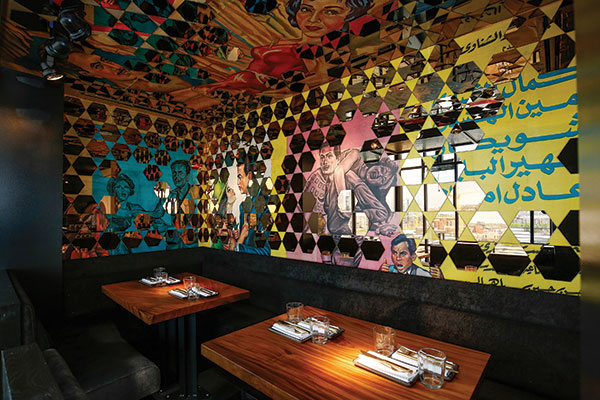 The design team strategically layered hexagonal mirrors over the main design feature, vintage Middle Eastern movie posters, to bring more depth and interest to the space.
The only portion of the kitchen that’s completely out of view is the prep kitchen with cold storage located six floors below in the building’s basement. Even the dish room, tucked off an open corridor between the wine room and the lounge, could presumably be viewed by curious guests passing by.
Of El Five’s total space, one-third was designated for the bar and lounge seating. Fronting the east side of the restaurant, the bar offers gorgeous city views and spills out onto the terrace, thanks to a wall of accordion-style windows that open to create indoor-outdoor appeal.
Customers can sit at the large u-shaped bar on the terrace side and face the interior of the restaurant, or they can sit inside and face out. And the slightly tapered lower end of the terrace, in front of the bar, offers additional bar seating, high-top cocktail rounds and counter seats along the outer railing.
As for the design of the large dining space at the other end of the terrace, Stephenson says that the intent was to create a contradiction to the dark and funky interior. “We wanted it to be a lighter, more airy experience outside, so we went with a crisp black-and-white palette there,” he says. “While the same is true to some extent inside, outside the view really is the design hero.”
Snapshot
- Ownership: Edible Beats
- Location: Denver
- Concept: Mediterranean/Middle Eastern tapas, paella
- Size: 4,400 square feet inside, 660 square feet outside
- Seats: 200 dining, 100 bar/lounge
- Average check: $40
- Dayparts: Dinner
- Design highlights: Vintage Middle Eastern movie posters, open kitchen, chef’s counter, outdoor terrace, city and mountain views, glass wine room, Monkeypod wood tabletops, and charcoal gray floors and fabrics
- Project duration: 3½ years
Project Team
- Edible Beats: Justin Cucci, Megan Baldwin, Corey Ferguson, Shannon Jones, Jeremy Kittelson, Jill Zeh Richter
- Interior design: Chris Davis, Kevin Stephenson, Brent Forget, BOSS.architecture
- Kitchen design: Sean Callnin, Tarah Schroeder, Ricca Design Studios
- General contractor: Catamount Constructors
- Steel fabrication: Joan of Arc Welding
- Wine display, barstools: Black Hound Design
- Custom concrete: Concrete-Visions LLC
- Millwork: Robert Chillino
- Landlord: Gravitas Development
Consultant Insights
 Sean Callnin of Ricca Design StudiosTwo-Kitchen Scheme: We liked the experience of entry, and we knew that the kitchen had to be tight to the entry. So instead of fighting it and going around it somehow, we figured, ‘Why not go through it?’ Guests literally walk either right next to the open kitchen or through it via the corridor that separates the hot kitchen from the front display cold kitchen to get to the bar, terrace or dining room. Having a separate hot and cold kitchen isn’t the direction we wanted to go initially. We wanted to have some live cooking going on out front, showcasing a woodburning feature for the paellas. But ultimately, we recognized that the seating was too close and, given the indoor-outdoor nature of the space, there were safety and smoke concerns due to airflow. We also realized that we needed to maximize seating, which called for a more compact kitchen design.
Wine Room: We all had various ideas about what you’d see when you first exit the elevator but decided on wine. As soon as the elevator doors open, you see into a glass-walled, temperature-controlled wine room. It helps to emphasize that part of the menu, and BOSS did some really cool things with lighting in there, so it’s pretty dramatic.
Cold Kitchen: It’s completely on display. It includes the chef’s counter and four different refrigerated stations: vegetable, raw bar/seafood, dessert and general. Given its central position, we had to be careful not to obstruct sight lines from anywhere in the restaurant. All storage had to be undercounter, which means there’s definitely a lot of restocking of plates that goes on given the small-plates menu format.
Hot Side: It’s semi-enclosed and has openings that enable easy communication among staff and that create an expediting area between the two kitchens. From the dining room, when you look back toward that kitchen, you can definitely see the chefs at work and get the energy from the hot kitchen. The setup back there includes a grill line, saute, salamander, plancha and hot holding equipment. There’s also a small, mise en place/garde manger prep area directly behind it. It’s small but very efficient.


