Not long ago, grabbing dinner was a simple affair: good food brought by a friendly server in a pleasant environment could make most people happy and create a successful operation.
Times have changed.
With the rise of third-party delivery and off-premises dining, as well as generational shifts in attitudes and preferences, dinner out needs to be about more than some good eats.
“At the end of the day, people love an experience,” says Jereme Clymer, vice president of creative and design for P.F. Chang’s. “Especially with a lot of the data coming out, Millennials and even younger generations would rather pay for an experience versus paying for stuff.”
Recognizing this, P.F. Chang’s has refreshed its brand over the past two-plus years, introduced new menu items and a new look, all designed to make for a more memorable night out that guests will come back for again and again.
“We want people to come and feel like they’re not anywhere else. We want to make sure our cuisine stays approachable, and our restaurants are approachable, but we want to make sure it feels very high-end and gives them a feeling they truly can’t get anywhere else,” says Clymer.
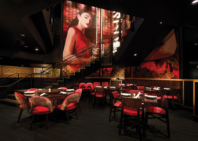 Each flagship store will have a hand-painted mural featuring a Samurai woman. The space also features Chinese characters and a dragon element overhead. Images courtesy of P. F. Chang’s
On the menu side, this polished-casual concept introduced some fun, eye-catching offerings. These include items like sizzling dumplings, sushi and spareribs served under a clear dome filled with smoke as well as cocktails made with smoky aromatics.
Along with menu upgrades, the chain’s design has been upgraded. This look has been rolled out in several refreshed restaurants along with two flagship locations that offer extra showpiece design elements.
The designs for these restaurants were a collaborative effort among P.F. Chang’s creative and design team and Zebra, the chain’s long-time interior design firm with offices in the U.K., U.S., UAE and Hong Kong.
According to Ashley Popich, director of interior design out of Zebra’s U.S. office, located in Scottsdale, Ariz., much of the look and feel and many of the design features started out as seeds planted by the P.F. Chang’s team.
These seeds would come in the form of things like magazine ads or photos. Through several iterations, different design elements took shape and came together to create the overall look of the restaurant.
“This isn’t one of the brands that says, ‘Hey, take this and make it different.’ We were working as a team, and I think that made it a special relationship,” says Popich. “They would give [an idea] to us, we would create from there and go back to them and hear, yes, no, or maybe change this. There was that kind of back-and-forth dynamic, which was great.”
The collaborative nature of this work has carried through to the build of specific restaurants, such as featured murals found in the chain’s flagship locations, Popich says. Zebra conceptualizes the mural. If approved, P.F. Chang’s designers finalize the look before sending it to the artist, who hand-paints the pieces on-site.
This was the process for the opening of the chain’s second flagship restaurant, a redesigned location in Waikiki, Hawaii, in September 2021.
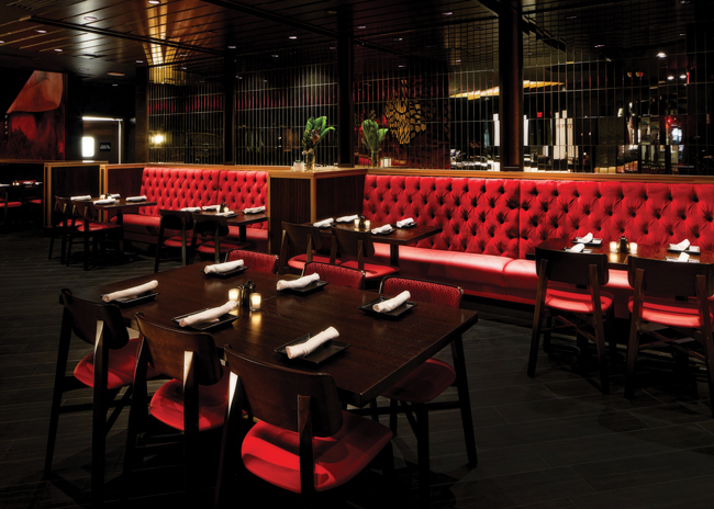 Banquettes with vinyl seats and velvet backs add a bit of luxury to the space while still being easy to clean. This banquette sits against mirrored glass tiles. The bar is on the other side of this wall.
Dark and Moody
According to Popich, the Hawaii flagship location sets forth the look and feel of all P.F. Chang’s restaurants going forward. The new space was created to be dramatic, with a slightly dark and moody vibe, along with a bit of elegance. Its key colors are red, black and gold. That color trifecta leaves a real impact, Popich notes.
“We look at every vignette, every corner, everywhere the guest is going to sit to make sure they get that,” says Popich. “We don’t want one section to be all black, one to be all red and one all gold. We want those three to be everywhere to give that proper balance.”
Other design concerns were the use of guest sight lines and the strategic use of lighting. The Waikiki location is a two-story space, so special attention was paid to the views from both floors as well as the trip up the staircase. Along those same lines, new locations play with ceiling heights. Spaces could range from 9 to 13 feet tall, adding visual interest to the restaurant while helping define zones within the space.
The restaurants are low lit, in keeping with the dark and moody vibe. Some spots, though, are highlighted. The lighting design, says Popich, “pinpoints the features that really stand out. Those could be murals, textures. We created design through lighting. Certain tables are highlighted, and we emphasize certain areas over others. There are layers of light and volumes of light.”
Finally, says Clymer, the team worked to make practically every design element worth looking at. This comes through in smaller but still eye-catching elements like a drop ceiling with dark long horizontal tiles and recessed lighting, a wine storage area turned into a display thanks to wooden doors with glass windows, or a small wall covered in mirrored glass tiles.
This approach, Clymer says, came from the chain’s ownership.
“Something [they said] that stuck in my brain was that if you have to pick something, make it interesting. If you have to pick a table, make sure it is interesting. If you have to pick up a chair, you have to pick flooring, make sure it is interesting…I don’t pick something just to pick something. I want to make sure everything we pick is interesting.”
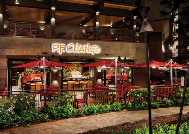 The redesigned store aims to turn foot traffic into customer traffic with an appealing outdoor patio and energetic bar placed front and center.
Flagship Exclusives
As a flagship, the Waikiki restaurant has some eye-catching, flagship-exclusive elements that give the space an extra kick.
The restaurant starts to make this impression from the outside in. Located in the Royal Hawaiian Center, a high-end shopping mall with both indoor and outdoor sections, there’s plenty of foot traffic going past this P.F. Chang’s.
The design team worked to create an appealing indoor/outdoor space that could turn these passersby into customers.
It starts with the facade made of puka stone, a pockmarked stone formed by lava, which helps tie this Waikiki restaurant to the area. Other flagship stores won’t use puka but will likely have some of their own local materials incorporated into the design, Popich notes.
While the facade helps distinguish the space, the outdoor patio grabs attention. The space features new custom-made outdoor furnishings in red, one of the chain’s signature colors, along with pavers in an arch pattern. Reminiscent of dragon scales, this pattern is a key design theme that can be found again and again in the new restaurant.
From the sidewalk, though, the real highlight is the bar, which is located just inside the large accordion-style doors and is fully visible from the sidewalk.
Simply making the bar more visible isn’t enough to make the space stand out, however. The entire space has gotten an upgrade with new materials and design features meant to create a high-energy, appealing environment. The space features new barstools with red vinyl seats, a quartz countertop
and a glass tile bar face with gold-colored backing.
“This is an incredible area and space. We went ahead and did the indoor-outdoor feel for the doors so the whole facade is open. We shifted the bar to the central feature so that suddenly the energy is translated street side and to the patio. It really has a vibrant feel to it,” says Popich.
The most eye-catching element is the bar back with a hand-painted dragon art piece. “There is something unique and special about the artistry of hand-painted murals versus printed murals,” says Popich. “We will definitely incorporate them whenever we can, but for the most part they will be for the flagship stores.”
Indeed, the barback mural is only the opening act.
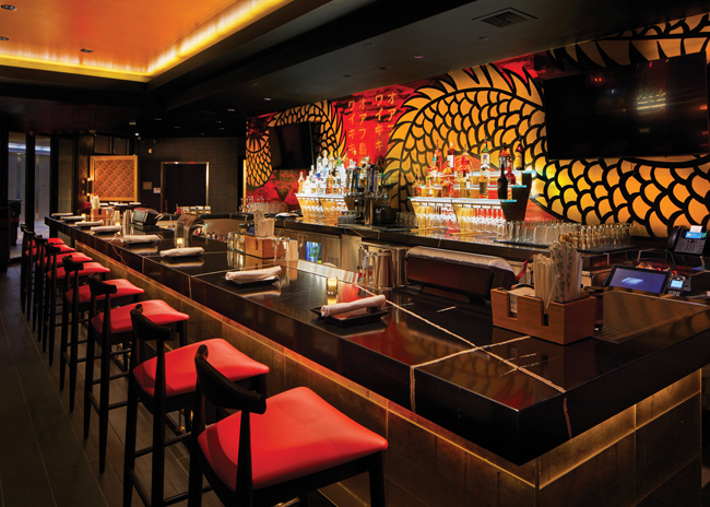 The bar features a hand-painted dragon mural, quartz countertop and glass tile face. Together, they create a high-energy space intended to draw guests in.
The main event mural is the two-story, hand-painted piece near the restaurant’s spiral staircase. The piece features two identical images of a samurai woman brandishing a sword. This, says Clymer, is a powerful portrayal of Asian womanhood.
“There are a lot of hip Asian restaurants, especially in New York City and other places, where they really lean on the Geisha image. We wanted to make sure we didn’t do that. We didn’t want to sexualize them. We wanted it to be bold and make sure their eyes were always looking at you. We don’t want them to be aggressive, but we don’t want them to be passive either. We want them to be a symbol of strength,” he says.
While the murals naturally get lots of attention, many of the design themes can be found throughout the restaurant in smaller ways. Specific ceiling and wall elements, for instance, feature the overlapping arches that recall the dragon scale concept. The furnishings, meanwhile, now feature dark wood tables and red upholstery, sometimes with gold accents. This aligns with the color palette and plan of the new design.
The furnishings add a sense of luxury to the space. Chairs, booths and banquettes are upholstered in red. Many seating options use tufted velvet for the backs, while easier-to-clean vinyl is applied to the seats. This approach, Popich says, contributes to the restaurant’s feel of luxury and decadence.
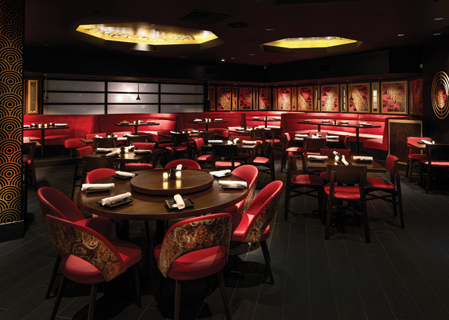 The new design’s furnishings moved away from neutral browns to the new color palette of black, red and gold.
Flagship to Standard
Furnishings like red tufted velvet banquettes are likely to be used in every P.F. Chang’s going forward, says Popich. Other Waikiki elements, however, won’t be used across the board. As a flagship, this location got extra bells and whistles during its refresh. Other, more standard restaurants are being refreshed, but with a slightly scaled-down package.
“A lot of our restaurants going forward, except for the flagships, will follow the 90/10 rule,” Clymer says. “90% will be the same. 10% we’ll have a little bit of wiggle room based on the existing location and what we want to do.”
Elements that will be common across locations will be color palette and most of the new furnishings and finishes. To contain costs, though, standard locations will not have hand-painted murals.
In addition, structural elements like the bar will likely not be moved. That’s simply too big of an investment, Popich says. The area, though, should get new finishes. Ideally, the typical P.F. Chang’s bar will have its own feel and energy while maintaining a connection to the dining area, she notes.
These changes are far from theoretical at this point. The chain has been updating existing stores with this new look for months.
Though these don’t have quite the wow-factor of the full-blow flagship restaurants, they still offer guests a reason to go out at a time when staying in is easier than ever.
“We look for a lot of those Instagrammable moments,” says Clymer. “I know that is a phrase that is a little outdated, but we look for those moments to say ‘I was here.’ Then there is that cool sense of discovery, ‘I found a new-old restaurant, and I want to come back.’ I think our food has always been amazing, but in order to compete, the key is to make sure that within your four walls you have that look and feel that can give them an experience.”
Snapshot
- Headquarters: Scottsdale, Ariz.
- Concept: Polished-Casual asian concept
- Unit count: Approximately 215 units in the United States
- Location: Hawaii flagship; numerous renovations across the country
- Opened: 2021
- Size: 10,727 square feet
- Real estate: End cap or freestanding
- Flagship design highlights: Native Hawaiian puka lava stone facade, bar with a hand-painted mural; two-story hand-painted mural at the staircase, vibrant outdoor gathering spaces on both the first level patio and second-floor balcony, a dragon motif and life-sized ancient warrior statues are scattered throughout the dining areas
Project Team
- Interior design: Zebra
- Project lead: Ashley Popich, Zebra
- Architect: LDA
- Kitchen design: Landmark Kitchen Design
- Kitchen supplier: Myers Restaurant Supply and KEC


