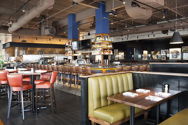
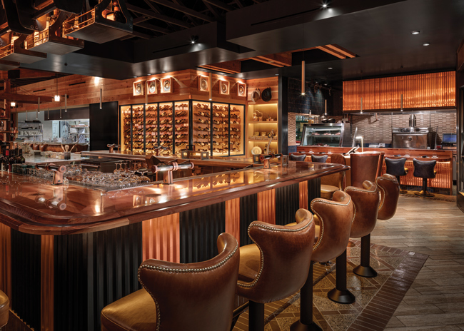
Krista Watterworth, of Krista Watterworth Design Studio in Jupiter, Fla., is the star of two HGTV shows and recently teamed up with host Robert Irvine to provide design solutions on Restaurant: Impossible. rd+d asked this restaurant design pro to share a few kid-friendly ideas.
rd+d: What should operators consider when looking to design a child-friendly restaurant concept, both architecturally and from an interior design point of view?
KW: Comfort and safety are keys. Various seating options are a must, the cooler the better. Fun, brightly colored highchairs or boosters appeal to even a stubborn child. Booths, upholstered seating, and round or square tables with soft edges are real life savers. Furnishings laminated in vibrant hues will appeal to the youthful eye and create an overall happy mood. Adequate seating in reception is an absolute necessity! Parents with children waiting for tables need a place to relax, especially with infants and toddlers. Changing tables in the bathrooms and storage for strollers are also important elements when laying out the new design. Restaurant owners, designers and architects should give these features similar credence as ADA requirements if they want families as repeat customers.
Sound design is also important (and often overlooked). My kids love to be in a bustling environment but want to leave ASAP if a restaurant is too loud. A good sound designer (or a little Google research) can help determine which areas of the restaurant need sound absorption or reflection. Carpeting, cork flooring or sound-absorbing acoustical tiles are good places to start.
rd+d: What are some easy changes that operators can make to existing locations to make them more kid- and family-friendly?
KW: A new branding strategy is a great jumping off point. When I design restaurants for Restaurant: Impossible, I create a brand that incorporates a new logo in line with the new color scheme. Don’t sacrifice chic for kid-friendly! Keep the branding fresh and modern to appeal to parents too. Fun elements throughout can be easy fixes. Think organic shapes, geometric patterns and interesting textures. At a restaurant in Connecticut, I incorporated a cool wood-slatted wall with an integrated fish tank.
If you don’t have a children’s menu, create one! That’s probably the easiest change to make. Include fun options for kids with food allergies such as grilled chicken nuggets or sliders with gluten-free buns. Oh, what I would do for a restaurant that offers carrot sticks, grapes or apple slices!
Families will dine out during the week so it’s a great opportunity to take advantage of slow nights. Offer fun kid activities like balloon animals, face painting or discounts on kids’ meals. Distractions are key and can come in many forms, but coloring and activity books are amazing and relatively easy to incorporate. A restaurant I designed in Florida had a jar filled with large shells and sea stars and each kid was allowed to take one when they came through the door. I also find that restaurants with open kitchens are mesmerizing to kids. Some parents may disagree with me, but a television with Nick Jr. playing non-stop would make many parents with young children ecstatic.
rd+d: Do you recommend color changes to walls, etc., to appeal to younger diners and their parents?
KW: Definitely, but only if done tastefully and in moderation. Using color properly is not for the novice, so I recommend hiring a professional to consult on a color palette. The best color palettes for bold accents are primary colors, jewel tones (i.e., sapphire, ruby, emerald) and neon, which is certainly on trend. Doing lighter tones of these hues with a gray base would be more in tune with modern style.
rd+d: What’s on your “top five” list of priorities for kid-friendly restaurant design?
KW: My five key priorities would be:
- Comfort. You must have ample seating.
- Activities. Distracted, busy kids are happy kids.
- Entertainment. I love my children, you should, too.
- Color. No one likes boring décor, least of all kids.
- Sound design. I like when I can hear myself think.


