The Mid City neighborhood of Baton Rouge, La., has undergone a revitalization in recent years, with more businesses, shops and, yes, restaurants popping up.
One of these is Rocca Pizzeria, a full-service operation that specializes in Neapolitan pizza and pasta made in house. The restaurant, which opened its doors in 2017, was designed by Ritter Maher Architects.
According to Steve Maher, principal at Ritter Maher, one of the biggest challenges in designing Rocca is its footprint: The operation actually spans two separate buildings with a shared wall. Naturally, this presented some high hurdles to clear when designing Rocca.
“The real design challenge was figuring out how to configure the bar, separate the spaces, work with existing plumbing and changes in elevation and how to structure the kitchen. It was just grinding through scheme after scheme, weighing the pros and cons from a cost standpoint, a kitchen logistics standpoint and design standpoint — all the main criteria that go into restaurant design,” says Maher.
 The wood-burning oven at Rocca in Baton Rouge, La.
The floorplan places the restaurant’s wood-fired oven, dining room and bar in the first building, where guests enter the operation, creating a fun, energy-filled space that’s a hit on date nights.
This area features custom solid wood tabletops, a stained concrete floor and a custom-made storage piece holding wine and wood for the restaurant’s pizza oven.
The pizza oven itself sits besides a large pasta-making machine. Their location in the front of the house, says Maher, offers the transparency in food production that many of today’s guests want.
The oven also serves as a major design element, adding energy and activity to the space. In fact, it served a linchpin of the entire operation’s design.
“That was the first design element for this entire project,” says Samantha Bastion, who leads Ritter Maher’s interior design efforts. “The bronze-colored tile kind of jump started the rest of the color scheme.
 The bar is at the center of the restaurant, and its back wall separates the two buildings Rocca occupies.
The bar is at the center of the restaurant, and its back wall separates the two buildings Rocca occupies. While existing infrastructure understandably played a role in the bar’s location, its placement and design are intended to draw people into the operation with energy and a sense of fun, says Bastion.
Helping the bar stand out are its finishes. The back of the bar features white subway tile with black grout and the bar face is solid wood painted blue while the bar top is a white solid surface material.
 The bar are at Rocca in Baton Rouge, La.
“In the rest of the building, the finishes are dark, like charcoal gray and navy blue. We wanted to draw you into the bar, so we used contrast. It’s crisp and clean and really draws your attention,” Bastion says.
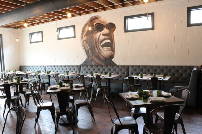
 The Ray Charles Room at Rocca in Baton Rouge, La.
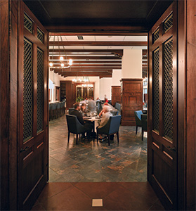
The third area of Rocca’s front of the house resides in the second of its two buildings. Guests can access this space through doorways on either side of the bar. While the front space has more energy, the back room is a bit calmer and is often where families and large groups gather.
That’s not to say the room is dull. The space is nicknamed the Ray Charles Room, thanks to the large mural of the musician on the wall. The mural is actually a holdover from the restaurant that previously occupied the space. It fit with the relaxed, fun vibe Rocca wants to offer and serves as a nod to the space’s occasional live music performances, so the design team decided to keep it.
The room’s wood flooring is also a holdover, though it’s been sanded down and restained to a rich dark wood color. New to the space are the wood rafters, which add a sense of height. As in the dining area, the seating and tables are all custom, including the tufted banquette, which serves as a more traditional counterbalance to the modern feel of the bar/dining area.
As with the bar/dining room, this space has a large window looking out on the street.
“One of my favorite parts of the space is the connectivity to the sidewalk and the street. The Mid City is not a suburban setting. It’s very urban where buildings are right on the streets and there is a lot of foot and car traffic,” says Maher.
Though not as challenging, solving the operation’s exterior for the two-building factor also required a bit of work. The goal, says Maher, was to make the two buildings look like one. The operation was given a single paint job and the signage spans both structures. The same type of windows was installed on both, giving the restaurant a more unified look.
“These are not Earth-breaking design challenges, just simple design solutions to make this more like one building, but if you look behind the curtain at more detail, you’d see this is two different buildings,” Maher says.


