Convalescing children filled the space at 321 West Hill Street in Decatur, Ga., 99 years ago, when a building was erected as the East Wing of the Old Scottish Rite Convalescent Home for Crippled Children.
Today, the facility is a mixed-use building that includes the restaurant Scout, which opened in December 2016 after a renovation.
It was the bones of this building — listed on the National Register of Historic Places — that attracted Chris Martha, the restaurant’s managing partner, to the space.
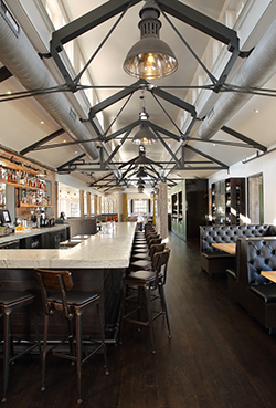
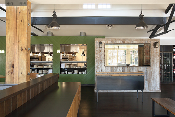
The building’s clerestory was also attractive, says Ed Seiber, founder and principal, Seiber Design, Atlanta. “It was part of the original historic building and a wonderful existing feature we wanted to highlight and bring back to prominence.”
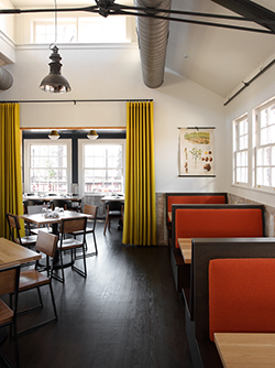
The challenges were mostly dealing with a building that had not been constructed with modern necessities in mind, such as HVAC, plumbing and electricity. And, to open up the space, interior walls had to be removed, and beams added since they were load bearing.
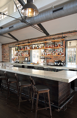
Martha kept some of the existing features of the building, including a brick wall behind the bar, and some clay tile, as well as steel and wood trusses in the clerestory.
While Martha and Seiber aimed to open up the space, they also wanted to create some intimate spaces. So, opposite the bar are a couple of booths, and at one side of the bar is a small area with a low ceiling. There’s also a private dining space, which can be used for regular dining.
“So, we have some sub-areas that have a slightly different feel while everything is still open to everything else,” Seiber says. All of these areas are visually connected, he says, but also stand as their own individual settings.
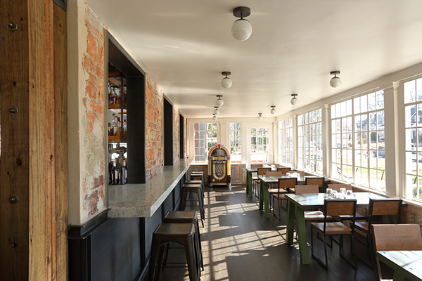
Martha also opted to open up a covered, open-air porch along the front of the building that at some point had been enclosed.
One final challenge with the space was the ingress. Most customers enter from the parking lot in the rear, but others come in through the front door. It was a challenge locating the hostess stand to welcome everyone, Seiber explains, because the front door and back corridor don’t line up. So, he placed the hostess stand laterally between the two. “Coming in from each side you have a pretty clear view of where the host is, and we have a wall behind the hostess stand with some sconces on it to visually reinforce where it is.”

