Mom-and-pop restaurants put together on the fly and on a budget can easily end up with a design that’s all function and no form. As a result, the customer experience they offer can easily fall short. It’s not a recipe for success.
A new breakfast/brunch spot in Vancouver, though, shows that independent operations with limited resources can still develop a well-considered interior design that successfully communicates their brand.
Breakfast Table opened its doors just a few weeks ago as a partnership among chef George Koay, his brother-in-law and front-of-the-house manager Michael Lee, and their significant others.
The restaurant’s menu features breakfast staples like bacon and eggs alongside innovative offerings that include coffee-crusted pork belly hash and chicken karaage hash, all made with fresh, high-quality ingredients.
According to co-owner Carina Wickstrom, since Breakfast Table is a family-owned, family-operated business, the partners “wanted it to have a mom and pop feel, but with a fresh and clean design.”
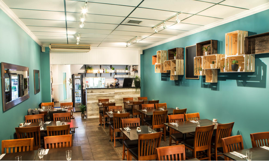
This is done first through the restaurant’s color palette. The dining area’s walls are a lively blue/green, while softer browns and tans are introduced using natural materials.
Wood-framed mirrors sit on the left wall of the dining area. With the restaurant occupying a long, narrow space, the mirrors help make it feel more open, says co-owner Sylvia Lee.
More tans and browns are introduced through a collection of both new and vintage apple crates that hang on the restaurant’s right-hand wall. These crates hold displays such as coffee cups and jars of ingredients, along with small, live potted plants, which emphasize the operation’s commitment to freshness, quality and genuine caring.
This display, notes Wickstrom, was not in the owners’ original plans. Initially, that space was slated to hold a set of shelves. As they began construction, the partners found that the bottom section of that wall had a melamine covering that couldn’t be removed without damaging the drywall. Their lowest-cost solution was to simply add a fresh layer of drywall over the existing wall. That additional thickness made it difficult for them to reach the building’s metal studs, making a heavy set of shelves unsafe.
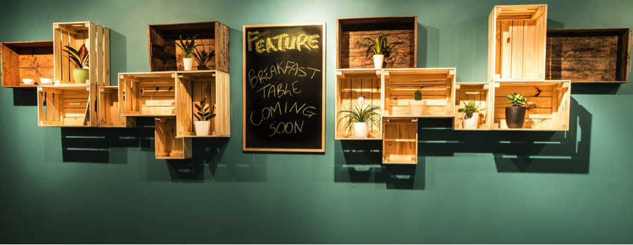
Those shelves, made by the owners, now sit on the back wall of the front of the house, behind the point of sale counter. They hold dishware, displays of locally sourced coffees and teas, along with more potted plants that add extra splashes of color.
The POS counter is itself a study in well-done work on the fly. Though the owners planned to use the space’s existing counter, during construction they discovered that it was actually just a pony wall without enough counter space to work with. A friend with carpentry skills just happened to be at the restaurant when this was found; he ended up framing out a new counter in less than half an hour, says Mike Lee.
While neither the drywall nor the inherited POS counter worked out, Breakfast Table was able to make use of a few other elements left from the Greek restaurant that previously occupied the space.
The brown tile flooring stayed, as did the chairs: hardwood with upholstered seats. For tables, the owners chose solid oak tops stained dark to mesh with the chairs. The tabletops were specified at just ¾ of an inch thick for a sleeker look.
New to the restaurant is the gallery wall, made up of images in wood and gold frames. According to Sylvia Lee, the gallery wall holds pictures, “that we’ve selected from our personal photos, just to give it more of a warming, family environment. We have photos from our friends, just to represent who we are as a family and to give our customers an idea of who we are.”
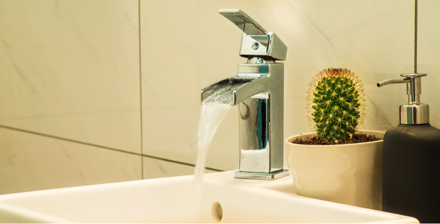
Compared to the dining area, this hallway and the restrooms were given more muted colors, providing customers with a calmer space. To cut costs, the operation used a sink and cabinet from a consumer retail chain. The money they saved on those pieces allowed the owners to splurge on two different types of higher-end tile for the bathrooms, along with stylish fountain-style faucets.
With the restaurant now up and operating, the owners and customers alike are happy with an elevated space that matches the quality of the food, says Wickstrom. The restaurant is proof that a DIY-approach to design and construction can yield impressive results when done right.
“Use all of your resources,” says Michael Lee. “We’re fortunate that Carina and Sylvia both have a background in fashion and good eyes. Trust your instincts and trust the people you’re working with. It’s got to be a collaborative effort and everybody’s got to speak their mind.”

