When Peet’s Coffee & Tea decided to open a new unit in Washington, D.C.’s colonial Georgetown neighborhood, the restaurant’s design had to fit both the historic building and the expectations of the community.
MBH Architects, based in Alameda, Calif., opted to restore what they could, contemporize the rest and work with local municipalities to find appropriate solutions.
The Georgetown Peet’s spans three levels: a 1,120-square-foot first floor, a 220-square-foot mezzanine and a 930-square-foot third floor. A basement and crawl space spans 1,125 square feet.

“Peet’s standard prototype is only for a single-level store,” says Celso Rivera, senior associate for MBH. “The store designers managed to modify the back-of-house standard layout and worked around the parameters within the footprint at the basement level.”
 As the architect of record, MBH was tasked with finding solutions to fix the building’s deteriorating structure. “Additionally, the multilevel building space was previously under construction with another prominent retail brand, which had been halted,” says Rivera. “This led to an interesting building process as the ceiling was not completely finished and there wasn’t a connection between the multiple floors in the building.”
To resolve this challenge, Peet’s made the decision to replace a significantly larger portion of the roof and the building’s infrastructure than originally planned. This was in addition to their extensive restoration of the existing exposed brick finishes on the interior and the preservation of the existing historic building’s facade.

Another challenge was working within the restrictions of a historical neighborhood. Extensive planning had to take place for approval of the painted facade with Peet’s Tribal Brand pattern. “[We] worked with the OGB [Old Georgetown Board], the historic commission, and the local community through meetings and reviews to create a concept that added visibility for Peet’s brand while adhering to Georgetown’s signage restrictions,” says Rivera.

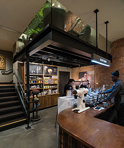
The result is a Peet’s that reflects both the brand and the neighborhood in which it resides. The interior utilizes a mix of dark bronze, wood and exposed brick. The traditional service counter finishes were replaced with reclaimed wood and white marble.
A custom painting by a local artist and a living wall that extends from the mezzanine to the top level creates a sense of connection and community.
New skylights highlight the top floor, which also features more seating options, including sofas, than a typical Peet’s location.
Photos courtesy of Paul Burk Photography


