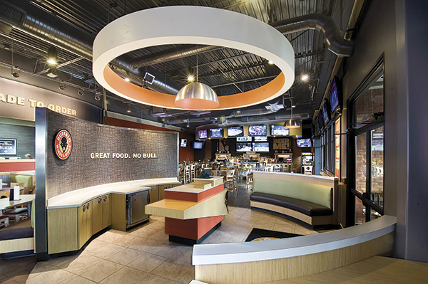
After a couple of years of testing and refining, casual-dining chain Buffalo Wings & Rings is rolling out a new prototype that leaves any vestiges of its former sports-centric “man cave” ambiance behind.
The new design, which is fully realized in 8 new stores so far but has been adopted in varying degrees in around 40 percent of units, is part of a strategy to boost the chain’s appeal to women and families.
CEO Nader Masadeh says the 46-unit company set out to create a new experience for the sports and wings category while not alienating its traditional male, sports-loving clientele. Working with the Cincinnati-based branch of Interbrand Design Forum, the chain did a lot of back-end soul searching and brand analysis before settling on its new persona.
 Ultimately, the entire front of the house was revamped. Colors are now lighter and reflect the oranges and reds of the sauces and celery green of the fresh salads on the menu. Wall graphics convey brand messages instead of sports imagery. Rounded elements have been added to the design to convey the rings in the brand’s name. All seats are slightly larger and padded for comfort.
“We also did some reconfiguring of zones to meet the varied needs of guests and appeal to families,” Masadeh says. As part of the reconfiguration, the bar and dining areas are better separated, there’s more space between tables, and a small gaming area is positioned in a corner in the dining area so children are kept in sight.
Additional female-friendly ambiance boosters include silverware upgrades, use of white china plates and restroom upgrades.
