As a Mexican casual dining chain based in New England — a region better known for lobster and clam chowder — Margaritas Mexican Restaurant represents something of an anomaly.
Its locations are anomalies, too. The chain doesn’t have a “cookie cutter” box that serves as the design prototype, said Hugo Marin, Margaritas’ president and CEO. “Every single one of our restaurants is different, so throughout the years, we’ve adapted the design of each restaurant based on what the building was. We’ve had some that are three stories on a river. There’s a two story restaurant that’s in an old house.”
While these different structures make each Margaritas location unique, all of the chain’s stores share some common design elements and ideas. These recently got an update thanks to a redesign of the chain’s Waltham, Mass., location.
This project, a complete gutting that was completed in just 30 days, has created an environment that the chain believes will appeal more to younger diners while helping the restaurant get noticed from passers-by, Marin said.

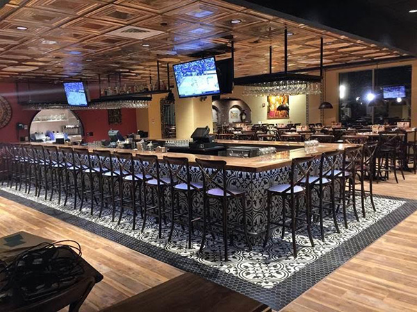
One of the most obvious changes is in the floor plan. Multiple interior walls were torn down, giving the space a much more open feel. “Instead of...a separate dining room and a separate lounge, we wanted to have a little more openness, where we feel people want to be today. People want to be seen in the restaurant, they don’t want to be hidden,” says Marin.
In addition to creating a more lively energetic space, the more open plan should catch the eye of street and foot traffic, he said. The Waltham store has several exterior windows and a very lively lounge. In the previous design, the lounge wasn’t visible from the outside. Now, with the interior walls gone, people passing by can see the activity inside.
The lounge was also upgraded using the new design. The black and white tiles run in a mosaic pattern down the side of the bar and a few feet out onto the floor, while large, copper-colored metal panels cover the ceiling. The two combine to give the space a fun, contemporary look that appeals to young adult diners, Marin says.

The lounge isn’t the only part of the restaurant that’s designed to grab people’s attention. This new store also places a bigger emphasis on its artwork, which Margaritas sources from craftsmen in Mexico.
The restaurant’s new color palette emphasizes earth tones, moving away from its bright pastels of the past. Art pieces naturally stand out more against these colors. What’s more, this store has fewer pieces, but ones that are more dramatic, like a six-foot plaster lizard sculpture that’s bolted to the wall, and large statues of Incan warriors.

“Our approach was a little bit less is more. So we have some bigger pieces that jump out. It’s [received good] feedback from our guests,” Marin says.
The chain made a number of more subtle changes to the design, as well. The new store uses parquet-style wood laminate flooring, which is more affordable and durable than real wood, Marin said. It also has parquet walnut tables, which are custom-made by the company’s in-house construction team. Other tables, also made by the team, have a mosaic tile surface using tile imported from Mexico — a material that is both cost-effective and adds a level of authenticity to the store.
With this new location opened only a few weeks, the company is now evaluating the redesign. Elements that will almost certainly be brought to new stores include the new mosaic tiles and the parquet wood laminate. Others, like the earth-tone walls, are under consideration, Marin said.
“It’s a work in progress. Our renovation was more of a testing ground. We’re just wrapping it up, [and] now we’re going through the post-renovation to determine what we liked, what we didn’t like and what we’d do differently.”
