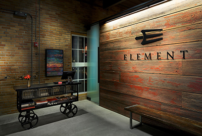
Element's entrance greets guests with a taste of what's to come, including repurposed materials such as reclaimed barn wood and original brick walls juxtaposed with contemporary design elements.
At its largest, City Hospital in St. Louis occupied four city blocks with 12 separate structures, including a power plant that supplied power to the entire complex. Built in 1906, the hospital was shuttered in the mid-1980s and sat vacant for more than 25 years before developers began to breathe new life into the historic structures and, in turn, revitalize the surrounding neighborhood. Element, a New American, "contemporary comfort food" restaurant designed by St. Louis-based Remiger Design, has played a significant role in that revitalization since its opening in September 2013.
Now led by Executive Chef Brian Coltrain and Co-chefs Sam Boettler and Brett Beckert, Element takes up the top two floors of the former power plant building and includes two rooftop patios. On the building's first floor is an indoor rock climbing gym: Guests headed for the restaurant's elevator have views of climbers ascending the walls and swinging from ropes that extend all the way up to the third floor as they pass through the lobby.

Element's main dining room on the second floor exudes a polished casual, industrial-luxe vibe with authentic, historic overtones. Lead designer Cara McKedy says the building, which is part of the National Historic Registry, presented certain parameters that the design and construction teams had to work around to maintain its historic designation. Doing so was also a key objective, as the team sought to create a modern dining environment that also honors the building's past.
"As part of the adaptive reuse, we wanted to be very transparent about the building's original structure and feel," McKedy notes. "We wanted to celebrate and expose the raw materials and have a lot of transparency of former use, current use and even transparency into the kitchen space."
To that end, a large display kitchen is the long, rectangular room's centerpiece. Open on three sides and with tables butting up against its partial walls, the kitchen "gives every diner a seat at the chef's table," she says.
Following the chefs' vision of creating a kitchen that would showcase Element's approach to contemporary, farm-to-table comfort foods, modern subway tile was selected to surround the base of the kitchen. Stainless steel trim provides a sleek finish and sense of cleanliness. Balancing that modern look are reclaimed, epoxy-finished wood tables with angled steel edges and polished concrete floors. Booths along the side of the room provide softer, more intimate seating options, and a banquette along the back of the room adds additional seating flexibility.

Reclaimed wood and charcoal grey walls provide a neutral backdrop for pops of red throughout, both in seating and in a custom art installation above the banquette. "We picked up on the red in Element's logo to incorporate some warmer tones and make it a more comfortable dining space," McKedy says. "The art piece adds some texture and is one of many nods throughout the space to the linear aspects in their logo, which is like the tines of a fork. Given that the restaurant is long and rectangular, it also helps to widen the space and bring the eye left and right as you're looking into the room."

Element's third floor lounge has large windows that overlook the city and its iconic Gateway Arch. A variety of seating styles, including distinctive custom high-back chairs and contemporary soft-seating clusters add modern design touches juxtaposed against original exposed brick walls and ceiling ductwork. Rustic wooden stumps add a bit of whimsy and double as tables or seats that can be moved around as needed.
"We wanted the space to be flexible and comfortable," McKedy says. "Even the arms of the chairs were designed to be flat so that they could be a perching spot."
The bar itself is fronted in vertically oriented glass mosaic tiles that glow thanks to under-bar lighting. Balancing that modern finish is a warm, epoxy-finished reclaimed wood bar top.
"Given that the bar generates significant profits for most restaurants, we wanted to make sure that the layout of the bar worked well for the long, narrow room," she says. "Situated along the wall with the windows, if you're at one of those bar stools you have a really great view of downtown. We designed the entire space around the desire to have a long bar that faced that view, and then to make the rest of the lounge a fun, comfortable, hip space that people really enjoy and feel they can make an evening of it in."

