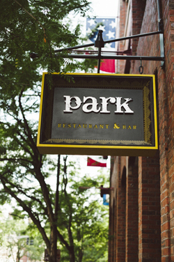
Design Insights on PARK Restaurant & Bar. For a complete profile click here.

Low Ceilings. You just have to deal with them and make them look good. Just painting them black isn't going to make them go away. The ceilings in the front room of PARK are very low, so we decided to put a lot more effort into that surface and make them more interesting and tactile. All of the ceilings in the very low areas were clad in reclaimed wood. In the lounge, or den area, we actually did a vaulted brick ceiling. It was another way to add character and interest to a challenging space. There are four vaults that are lit with LEDs, so there's a real warmth to them.

Colors and Finishes. We wanted to do things that were little unexpected, a little obscure. For colors, there are wonderful caramels, reds and a throwback to avocado or olive green. There's a mix of warm natural woods, black painted wood, soft leather and industrial galvanized steel. It's an eclectic mix of colors, finishes and materials that all come together to create a nice warmth with visual interest.

Cool Stools. We loved the fabric we found for the bar stools. It's a very heavy fabric that's like very heavy, almost unrefined linen. It's nubby, tough and has an interesting print — kind of like potato sacks. It was another gesture toward an eclectic look. There are a lot of stools at the bar, so we wanted to mix it up a bit and not just have that uniform, leather-backed bar stool look.

Facade. PARK is set below grade in kind of an arcade in the parking garage, and frankly it's grim and dark and damp. When it was Redline, we had French doors that opened out, and we put café seating out there, but nobody wanted to sit there. We put in awnings and lighting, sound systems and flowers, but nothing helped. This time, we didn't even try. We just kept the storefront as it was, and we actually filmed the windows and put in shutters because the view was unattractive. To save some money, we said let's just put all of our efforts into the interior and keep the outside a simple urban storefront with discreet signage.


