
Nathan’s new design starts with the exterior. While red, yellow and green (for ketchup, mustard and relish) have long been its primary colors, the new prototype places green at the forefront. Green towers with the Nathan’s logo make the chain more visible from the street. To drive home the fact that Nathan’s offers more than hot dogs, lit-up signs announcing other menu items ring the building.
“We’re letting people know what we serve by putting letters around the building on canopies that tell people we have hot dogs and fries, burgers, cheesesteaks and more. So we’re communicating that on the exterior and utilizing the green colors that are very bright,” says Don Schedler, Nathan’s vice president of development, architecture and construction.

With younger customers one of Nathan’s target markets, the chain now uses an open, bright space that it believes will appeal to these guests. “Younger customers like the open space. It’s well lit. We didn’t want the feel of the space to be closed down, dark and dingy,” says Schedler.
Floor-to-ceiling windows let in plenty of natural light, while glossy green laminate with lifestyle photography and white brick veneer stenciled with either brand messages and the restaurant’s logo cover the dining area walls.
The new design features an updated seating strategy, as well. The Cape Coral location doesn’t have any standard four-tops or floating tables. Instead, every seat is at a banquette or booth, with some booths rounded to offer one extra seating option.
Other than the chairs accompanying the banquettes, every seat is upholstered, as well. This appeals to older customers who appreciate the comfort and younger customers who might want to stay and linger, says Senior Director of Marketing Phil McCann. The seating areas have also been given one additional feature. “Charging stations are also important to those guys so they can recharge with our food while they recharge their phones at the same time.”
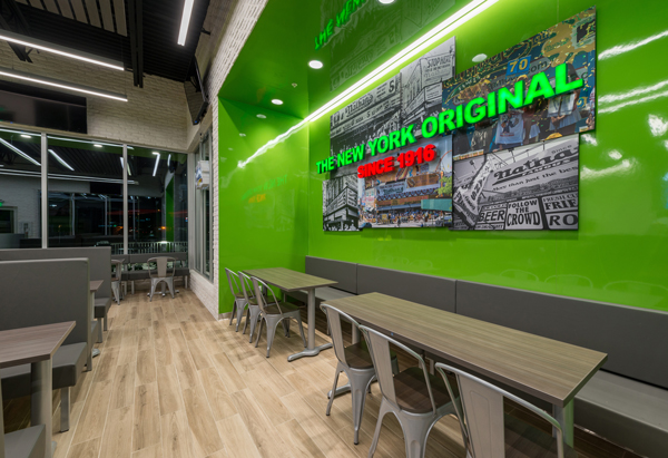
While Nathan’s wants to appeal to younger guests with this new design, the chain makes sure to maintain some connections to its rich past with the heritage wall.
This wall features photos of Nathan’s past, including the company’s founders and well-known Nathan’s locations. Notably, these same images appear in every free-standing and in-line Nathan’s restaurant.
“They left enough elements inside where we look contemporary modern but you still look and say, ‘aha I get it.’ The people that know us say ‘it’s still the Nathan’s I know. I see pieces that I recognize,’” says Oliver Powers, senior director of franchise operations.

The new prototype also includes updates to the POS counter and surrounding area.
The counter face features a mustard yellow backlit acrylic material that provides a pop of color to a normally routine space.
The section also includes new menu boards that the restaurant has already rolled out at more than 100 stores and are intended to help drive sales.
“They are much more bright and contemporary,” says McCann. “There is a lot of food on them to help them build the guest check. You don’t just show a hot dog and a fry, you show a top hot dog and a top fry. It helps build the guest check and it’s that visual communication that is much easier to follow, easier to read, easier to order.”


