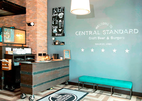
Central Standard, a gourmet burger concept owned by restaurateurs Mark and Kelly Roemer, recently opened its second location, in Waukee, Iowa.
According to co-owner Kelly Roemer, the restaurant is designed with an elevated look to offer different experiences for different customers. “We wanted to appease everybody for why they are stopping in, whether they are guys stopping in for a beer or people going out with the family.”

The overall aesthetic at Central Standard is industrial chic.
This is evident in the entryway, a space that features a host stand made of wood planks and metal bands. Chic elements include a drum lighting fixture, a hand-painted chalkboard feature and a teal-tufted bench for guests waiting for a table.
“We had a lot of these pieces made,” says Kelly Roemer. “We wanted that industrial element in there mixing with a diner feel. Then we added that drum shade and the chalkboard to make it whimsical.”

To appeal to different customer bases, some areas of the restaurant lean more toward one side or the other of the industrial-chic spectrum. The bar/lounge is clearly more industrial. Flooring is wood-style ceramic tile laid out in a herringbone pattern, while metal cages on casters are used to store items like napkins and ketchup bottles.
“You can see the bar area is a little more industrial,” says Kelly Roemer. “We wanted it to feel masculine and like, ‘Oh yeah, we could grab a beer here.’"

The masculine feature is carried to the bar itself, which features a reflective black granite top along with grey shelving and undercounter refrigeration with gray doors. Notably, though, the bar back is broken up by windows that face outside.
“There's so much going on inside we wanted to have some sunlight and a way to look out so you don't feel claustrophobic in the space. I think that was necessary,” Kelly Roemer added.

While the bar leans toward the industrial, the dining area is softer, with higher-end finishes to match the restaurant’s gourmet burgers.
Nearly all the booths and chairs, for instance, are upholstered and tufted, providing a slightly elevated old-school feel. Wall treatments are also elevated and include a hexagonal patterned wallpaper as well as vertical white subway tiles with the restaurant’s name in gold letters.

These touches, says designer Davia Gallup, principal with HomeFront Interior Design, make the space feel special.
“A lot of effort went into the whole look. There’s not one bad table in the restaurant where you feel they stuck it in a corner. The finishes play a big part in that because there’s something to look at everywhere you sit.”

The final seating option for Central Standard guests is the outdoor patio. This space features hightop and standard height tables, as well as a fire feature that acts as a barrier at the edge of the outdoor seating area. The patio (as well as the interior) also offers several televisions.
“We definitely do not want to be a sports bar. It definitely doesn’t feel like that when you go inside. But in the culture we live in everyone wants to see what’s happening, so we provided TVs for people to watch a game,” Roemer says.
