The opportunity to snag a spot in a prime urban waterfront redevelopment project doesn’t come along every day. When one did, Washington, D.C.-based KNEAD Hospitality + Design didn’t hesitate.
The boutique restaurant development and operations firm, which last year unveiled its second Succotash unit in an elegantly renovated Penn Quarter bank building, made more waves this year with the opening of Mi Vida Restaurante at District Wharf.
Part of Phase 1 of what ultimately will be a $2 billion, mile-long mixed-use project along the Potomac River, Mi Vida is a collaboration between KNEAD Hospitality and celebrated Mexican chef and cookbook author Roberto Santibañez. He and KNEAD founding partner Jason Berry had both spent years helping to grow the Rosa Mexicana restaurant brand — Santibañez as culinary director and Berry leading operations — and had always wanted to work together again. The Wharf project provided the opportunity to do so.
In developing the Mi Vida concept, the KNEAD team spent 10 days with Santibañez in Mexico experiencing culture, food traditions, music, art and history. “We went well beyond the facade and really felt Roberto’s passion for authentic Mexican,” says Michael Reginbogin, a hospitality industry veteran who partnered with Berry to found KNEAD Hospitality + Design in 2014. “We wanted the design of the restaurant to speak to the same sort of nuanced narrative that he creates with food. We didn’t want to do a trendy Mexican place with Day of the Dead skulls all over the place. Those kinds of trends come and go, and the last thing we needed was to build an 11,000-square-foot restaurant that we’d have to renovate in a couple of years because it’s no longer relevant.”
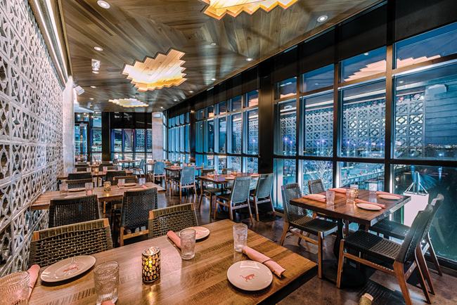
 The top-floor dining room incorporates pre-colonial Aztec and Mayan motifs and imagery in its wood cutout ceiling, wall mural and concrete breezeway block wall. Images courtesy of Rey Lopez
Managing Scale
Starting with an empty shell, KNEAD brought in D.C.-based architecture and design firm Studio //3877 to help bring the Mi Vida team’s vision for a vibrant, contemporary Mexican experience to life in ways that would take full advantage of the space. Occupying a prime two-story corner location with three patios and window walls on three sides, Mi Vida is bold in size, scale and signature design features. But it’s also strategically understated.
Two requests set the jumping-off point: one, to add a mezzanine with semiprivate dining space between the two floors; and two, to accommodate Reginbogin’s idea for a large, indoor Tree of Life inspired by Mexico’s traditional Árbol de la Vida.
And one reality drove initial architectural decisions: With 23-foot-high ceilings and lots and lots of floor-to-ceiling windows, creating scale and intimacy would be a challenge.
“Getting the mezzanine in there helped to make sure that we were taking advantage of the maximum square footage available, which also meant getting an elevator stop and accessibility on that level,” says Dave Tracz, partner at Studio //3877. “Beyond that, the big thing from an architectural standpoint was figuring out how to resolve this 23-foot-high space without making it feel like there are massive walls in front of you when you walk in the door. We took a lot of care on the first floor to make sure that the elements there are smaller in scale or broken down. For instance, the kitchen sticks out a little bit, the private dining room sits back a bit, the restrooms tuck underneath the stair landing leading to the mezzanine. So there’s a play on volumes on the first floor, almost like small boxes.”
 The Hacienda Room sits behind arches with ornate wrought-iron balcony details overlooking the first floor. Wide-plank flooring, arched wood ceiling treatments and period-inspired furnishings create a Spanish colonial design narrative.
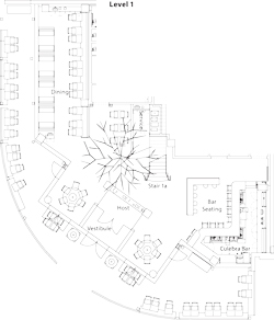
The roughly 4,000-square-foot first floor includes a spacious entry, 2,200-square-foot main dining room, 350-square-foot bar and two patios, one on either side of the restaurant’s entrance. Back-of-house space takes up another 1,400 square feet. It is home to a large, gas-fired hearth oven, five cooking stations and a full, flight-type dishwasher that can handle volume that easily exceeds 1,300 guests on a typical Saturday.
The mezzanine holds the 800-square-foot Hacienda Room, a semiprivate space that overlooks the main entrance and dining area below, as well as offices and storage areas. An additional 3,000-square-foot dining room, 500-square-foot private dining room, and a second, smaller bar and outdoor patio comprise the top level. That third floor is also home to a second kitchen (1,000 square feet), which provides prep support, a pastry prep area and an always-busy fresh tortilla-making station. Staff uses a dedicated staircase in back to transport food and supplies between the levels.
While the multiple levels and variety of eating and drinking areas help to bring the space down to scale, they also provided Reginbogin with the opportunity to tell different stories within the overall design narrative. “I had the three levels, so I decided to cut the narrative into three ‘stories’ or three different experiences through design,” he says. “The first floor is more of a modern Mexican aesthetic, the Hacienda Room on the mezzanine pays homage to Spanish colonial Mexico, and the third floor has elements of pre-colonial Mexico, where Mayan and Aztec influences are strong.”
 The first big design element to be decided on, the 19-foot Tree of Life, set the tone for much of Mi Vida’s look and feel from natural, rustic finishes to traditional Mexican folk-art colors used in its flowers.
Blending Subtlety with Sizzle
Each level’s design serves up a blend of unique, wow-factor elements and subtle, supportive materials and accessories that combine to create the type of nuanced Mexican experience the team envisioned.
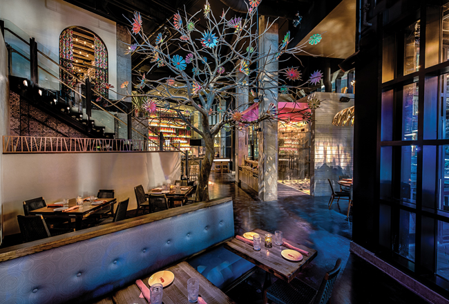
Top among the wow factors is the 19-foot Tree of Life, positioned on the main level just beyond the host stand. In keeping with the modern Mexican narrative, the tree’s design is subtle, abstract and artful.
“I wanted it very muted and stoic, almost like it’s flowing up from the concrete floor. I didn’t want a realistic or cheesy-looking tree — no green leaves, no canopy,” Reginbogin says. “I wanted a gray tree in winter — rustic and unfinished-looking. It’s made of steel and fiberglass and is adorned with 50 Oaxacan folk-art-style, hand-carved and painted wooden flowers. There are four different sizes of flowers and four styles, but each one has a distinct color treatment. And we have the tree very subtly lit with a light that filters through the flowers and branches and shifts slightly, creating a bit of movement in the dining room at night.”
The first big design element to be decided on, the Tree of Life set the tone for much of Mi Vida’s look and feel, from warm woods used for tables and banquettes to traditional Mexican folk-art colors used in its flowers — pink and blue, in particular. They’re used consistently and strategically throughout.
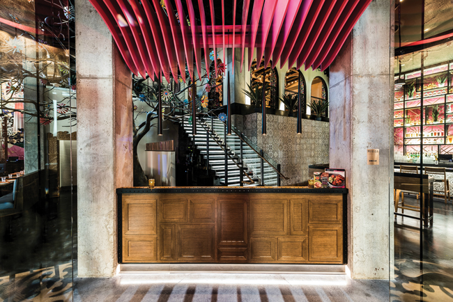
On the first floor, for instance, the same pink stands out in a ceiling feature above the host stand. Created from wooden slats, it was inspired by and is meant to evoke lava flowing from a Mexican volcano. While the color is bold, the design intent is subtle.
“Most people wouldn’t pick up on the idea behind that 3-D pink wave,” Reginbogin says. “It’s a minor detail, but it pays homage to the rich, volcanic history of Mexico and to the beginning of life, which leads to the tree of life.”
 Softly lit pink wallpaper behind rose gold metal grid work on the main level’s back bar add color and interest to the otherwise muted space.
Pink also carries through in strategically lit wallpaper — matched to the same Pantone hue — on the back bar and again on restroom doors. And the same shades of pink and blue seen in the tree’s flowers are used in a main dining room feature wall sporting painted tin butterflies set against charred, magenta-stained wood.
Those colors pop again in a digital overlay mural depicting a modern Mexican woman in a floral dress that covers an adjacent wall. A masculine version of the mural featuring a sombrero-clad Mexican man covers the same wall in the third-floor dining room.
Pink takes a subtler and slightly more contemporary turn in the team’s choice of rose gold metal used in dividing screens between booths on the first floor and across the room in a decorative metal grid positioned over the main back-bar wall.
“For the screens, we created a sort of different and interesting pattern, which also hides some up-lighting that gives a bit of ambient light in there,” Tracz says. “That’s also echoed in the magenta-tinted wood wall that’s on the side of the dining room and again in the pink wood slats that make up the wave at the entrance.”
While such strategic color play is essential to adding sparkle and vibrancy to the Mi Vida experience, color in general is used with restraint. Those very intentional pops stand out against a largely muted base palette. Natural wood tones, raw concrete, black, white and gray dominate in the space and help to create a timeless aesthetic, while small but important touches, such as a custom-patterned band that borders the black concrete bar top, black-and-white Mexican tiles, and a wooden arch framing the main floor’s restroom vestibule entrance, lend warmth and character.
 A ceiling treatment made of pink painted wood slats positioned above the host stand pays subtle homage to Mexico’s volcanic landscape and evokes the flow of lava.
Finding Inspiration in History
Guests who work their way upstairs also work their way back, at least loosely via design experience, into Mexico’s past. The Hacienda Room on the mezzanine level channels Spanish colonialism, while the top-floor bar, dining room and private dining areas reach farther back to the Mayans and Aztecs for design inspiration.
Here again, the KNEAD Hospitality and Studio //3877 teams tread carefully to select materials, finishes and decor that would carry each period’s narrative conceptually versus literally.
The semiprivate Hacienda Room sits behind a series of large arched openings with ornate wrought-iron balcony details. Through the arches, diners enjoy views of the Potomac River beyond and the first floor and Tree of Life below.
The Hacienda Room’s far side opens to a small indoor garden planted with agaves. “At night, we have candles there, and it’s a pebble-stone floor, so it feels very much indoor-outdoor,” Reginbogin notes.
To further the Spanish colonial narrative, the design team chose traditional wide-plank wood flooring, plaster walls, arched wood ceiling treatments and period-inspired furnishings. Long fabric drapes framing each of the archways introduce the Mexican floral folk-art patterns and colors used elsewhere, adding intimacy and vibrancy to the room while providing design consistency.
Modernism again comes into play on Mi Vida’s top floor but in historically inspired ways. Here, the design narrative introduces more pre-colonial Aztec and Mayan influences, both architecturally and via decor.
 The focal point of the top-floor bar is a colorful, abstract floral wallpaper that flows up from the back bar and onto the ceiling toward the doors to the veranda.
“For the top floor, we didn’t have as much height as on the first floor, so we used ceiling elements and ceiling materials to articulate different areas,” Tracz says. “The bar there, in particular, is a focal point. It has this really colorful wallpaper that’s an abstraction of Mexican florals on the back bar. But it flows up and into a more geometric pattern and wraps over the ceiling, creating a very cool place to hang out. It really draws people to the bar and visually takes you from the bar on one side of the room to the veranda that opens off it on the other.”
Textures and patterns evoking Mayan and Aztec motifs can be seen on the bar front, on the wood cutout dining-room ceiling and in the breezeway that separates the bar from the dining area’s concrete block wall. They’re seen as well in the glass wall that can be opened or closed as needed for events in the private dining room, also called the Cactus Room for its artistic black-and-white, cactus-motif wallcovering. When not in use for private events, the 40-seat Cactus Room can be opened and used for additional bar-area seating.
“It all plays together visually,” Reginbogin says. “As on the other levels, it’s Mexico, but it’s not in-your-face Mexico. That’s what we were going for. And the configuration of spaces gives us a lot of flexibility, particularly with having a second kitchen on the top floor. That gives us the ability to do private events there without putting strain on the main kitchen. Ultimately, this is a great-looking restaurant, but that’s kind of irrelevant if it doesn’t operate well. It’s big, it’s high-volume and we knew it had to be as much if not more about function as form. I think we succeeded on both.”
Project Team
- Owner: KNEAD Hospitality + Design Chef & Partner: Roberto Santibañez
- Architecture & Design: Studio //3877
- The top-floor dining room incorporates pre-colonial Aztec and Mayan motifs and imagery in its wood cutout ceiling, wall mural and concrete breezeway block wall. Images courtesy of Rey Lopez
Snapshot
- Opened: February 2018
- Location: Washington, D.C., District Wharf
- Concept: Authentic, modern Mexican
- Total size: 11,000 square feet including patios
- No. of seats: 350+
- Average per-person check: $45 dinner; $25 lunch (plus tax and gratuity)
- Property features: Prime corner location, window walls on three sides, two stories plus mezzanine, three patios, two bars, two kitchens, semiprivate and private dining rooms
- Design highlights: 19-foot Tree of Life, distinct narrative on each level, neutral base with bold pops of color, folk-art-inspired decor elements, Mexican tile, raw and polished concrete, custom decorative wall coverings
- Build-out: 10 months
 Mi Vida Furniture Plans Level 1
 Mi Vida Furniture Plans Level 2
 Mi Vida Furniture Plans Mezz Level
