Located in Kimpton Hotel Monaco Chicago, Fisk & Co. is a mussels-and-beer concept that combines a unique spin on nautical design with industrial elements inspired by a hat factory that occupied the space in the 1920s.
The restaurant was designed by OZ ArchitectureZ Architecture out of Denver, Colo. According to Abigail Plonkey, director of brand experience with Oz, the designers set out to avoid the standard surf and beach-themed elements found at many seafood restaurants in favor of another inspiration.
“We looked at the mussel as our muse. How can we deconstruct that to develop the drivers of the design and the brand and the whole experience? We thought about the mussel itself, where it comes from, how it’s harvested, the look of the mussel: It’s hard on the outside and has a bright surprise on the inside.”

The bar, says Plonkey, is the restaurant’s “hub and heart and soul. We really wanted people to feel comfortable sitting all around the bar and over to the raw bar area.”
Here, the most striking mussel-inspired element can be seen on the bar’s face, Instead of being covered with standard tile or plain millwork, it is clad in scalloped white porcelain tiles. Another nautical element is the custom-made netting hanging against a partition, a recurring element in the restaurant that recalls how mussels are harvested, says Plonkey.
Other elements in the bar hit Fisk & Co’s hat factory roots. To hold the liquor bottles, the designers had a fabricator make custom metal shelving, while the tufted leather chairs are a slight nod to the hats themselves.

Move past the bar and you’ll immediately come to the restaurant’s main dining room. Here, the mussel influenced many of the design choices, particularly the color scheme. The dark green wainscoting, for instance, was inspired by the color of mussels. The banquette leather, meanwhile, “is this beautiful rich, butter ochre color that represents the inside of the mussel. It felt like a surprise. It’s very unexpected for a space like this,” Plonkey says.

Another nautical twist can be found in the chandelier in the upper dining area: Made with clear glass bottles in a metal frame, it plays on the idea of a message in a bottle, says Plonkey. The room’s other fixtures are more industrial inspired, including the black hanging pendants and the angular fixtures attached to the walls.

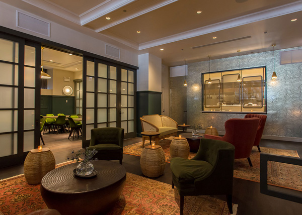
Separated from the dining room by another net partition and a few steps down is the parlor area. This, says Plonkey, is designed to be a “plush and comfortable” space. “We’ve got rich leathers and soft velvet. Those are custom chairs we had made. We wanted to curate that like a living room, so with the details of the lights and the books and all the accessories, we wanted it to feel like home,” Plonkey says.

The parlor also sits next to Fisk & Co.’s kitchen. Instead of hiding it or completely opening it up, the designers placed three windows partially covered with screens that give guests a glimpse into the space. This approach, says Plonkey, helps bring some energy into the space while not overwhelming it with the sights, sounds and smells of a professional kitchen. The screens also keep light from the kitchen from throwing off the room’s lighting design and provides at private events some privacy.

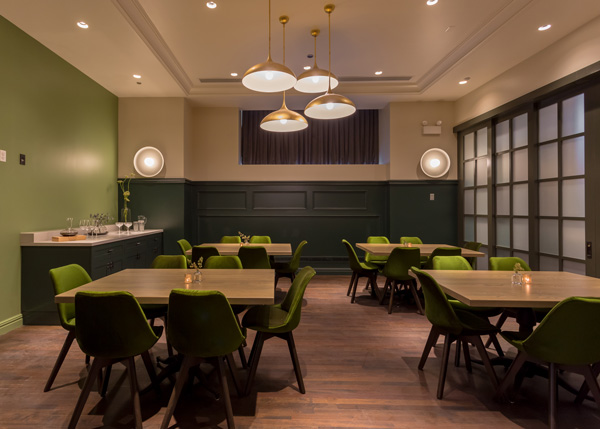
Private events are a big part of the hotel’s plan for the space. The private dining area is adjacent to the parlor and accessible through a set of sliding doors. For large enough events, the doors can be opened completely, creating a two-room area for parties to lounge, drink and eat.
“Our question was how to make this not feel like your typical banquet space. Kimpton wanted to be able to use it for meetings, private events, receptions, get-togethers. We extended our concept and brought the casual atmosphere into this space,” says Plonkey.
With so many possible uses, the private dining room itself was designed to be flexible. The tables were specified so they could be rearranged for different seating configurations. An AV system allows for business presentations, and a recessed area along one wall was designed to fit a mobile bar.
Along with these practical considers the space follows the restaurant’s nautical/mussel inspiration with dark green wainscoting, velvety green chairs that seem to change color as they catch the light, and a green tile mosaic wall reminiscent of pebbles on a beach.
For more on hotel restaurants, see: Hotel Restaurants Shine.
