Based in Minneapolis, Fig + Farro describes itself as a global vegetarian comfort food restaurant.
Its owners, Michelle Courtright and Thomas Dambrine, selected this menu style for one main reason: Animal agriculture produces more greenhouse gases than all forms of transportation on the planet combined. Serving satisfying plant-based meals can help guests reduce their carbon emissions, one meal at a time.
With sustainability at the heart of Fig + Farro, it was given a design to match, says the restaurant’s creative director, Ellen Hughes. “The design was meant to be very sustainable, repurposed, reused. Almost everything in here I found in the community. Every piece has a unique story.”

In keeping with the idea of comfort food, the restaurant focuses on communal dining, with plenty of distinct spaces that feel like different rooms in a home.

One of the restaurant’s more formal spaces is the blue room. While the design approach gives the restaurant a pieced-together feel, Hughes tried to find and install common threads to tie the space together. “I was cognizant about there being some sort of standardizing object. The chairs are mostly the same and the stools are, too,” Hughes says
The blue room also shows how deeply committed Fig + Farro is to its reused, sustainable design philosophy. Its maroon banquette was actually leftover from the space’s previous occupant, while the rug, hole and all, was gifted to the operation by a local rug dealer.

In addition to inheriting some banquette seating, Fig + Farro kept the bar from the previous occupant. The space is decorated with plants to reinforce the vegetarian menu. Instead of refinishing the pillars, Hughes chose to keep them raw, which included leaving some old wallpaper untouched. This recognizes the previous occupant and is in line with the lived-in feel of the restaurant.

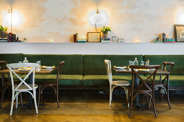
Another lived-in section includes a different section of banquette seating. The cushions in this space were custom upholstered and intentionally overstuffed to feel like couches in someone’s home. The walls, meanwhile, were partially covered in a coat of plaster of Paris. This, says Hughes, is reminiscent of buildings in Morocco — a nod to the “global” in “global vegetarian.”

One of the less formal spaces in Fig + Farrow is the Peacock Room, so named because of the space’s wallpaper. In this pillow-filled space, guests sit on the floor for a different, fun dining experience, Hughes says. “A lot of big parties love to go in there. It’s cozy, its private and a little bit secluded.
The table in the Peacock Room wasn’t designed for floor seating. Instead, Hughes simply sawed off its legs, which she then converted to candleholders in another area of the restaurant.

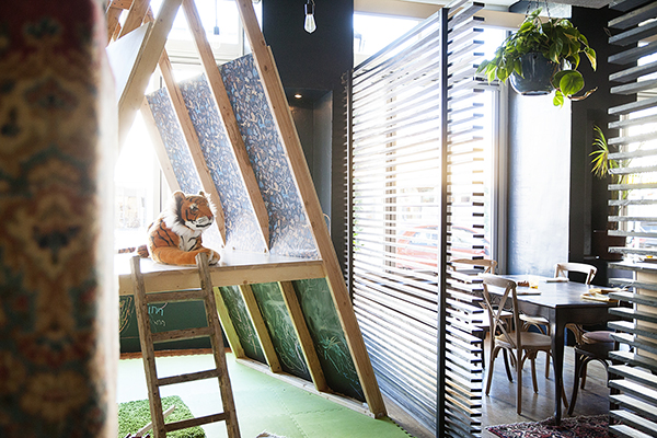
Fig + Farro also has spaces that are dedicated to activities other than dining. One is the Treehouse Room, a place where the children of diners (or even staff) can play. The room offers activities like drawing, coloring and crafts, while sections of wall are covered with chalkboard.
In addition, the restaurant offers a retail space, which it uses to further educate guests on global warming and sustainable eating. Offerings include vegetarian cookbooks and local vegetarian goods like lemon preserves and mushroom jerky.
“The crates were found at a farm in the middle of nowhere,” says Hughes. “They’re old apple boxes. It was very intentional to create a worn-in, cozy feel.”

