Successful projects display beauty and brains.
 Gemini Bar 555 Credit Erick Leinberg for 555 International
Before tucking beautiful images of newly designed projects into their portfolios and moving on, perhaps every designer should be required to work a few busy shifts in the restaurants that they’ve designed. It could be a real learning experience.
When functionality and creative design come together, the end result is a beautiful thing. Designers who manage to hit the sweet spot for functionality as well as aesthetics make true magic for clients. That’s because no matter how great a restaurant looks, it’s how the space actually functions that directly impacts operational success, from simple capacity to guest comfort and safety, from FF&E lifecycles to the ability of the staff to provide great food and service smoothly and efficiently.
“When you have a real, serious commercial business that has to deal with food in, food out, where do we store everything, how is it loaded in, loaded out, where is it prepped, how do guests get to the restrooms without running into staff loaded down with trays and all of those sorts of things, function absolutely has to be carefully considered,” says James Geier, founder and president of 555 International, a Chicago-based design, development and fabrication firm. “It’s not just painting a bunch of pretty pictures that your client then ultimately has to make work. Yes, our projects have to be great-looking, but they also have to be functional. We’re solving problems and making it easier for the owner to operate. Many designers don’t know enough about restaurant operations to even care about things like service flow and work stations. But if you get those things wrong, you’ll have significant functional problems. Even owners sometimes don’t know it when they’re looking at somebody’s 2-D plan and trying to find a way to squeeze in another two-top. But after the fact, when they’re open and operating and things aren’t working like they should, they’ll know, and their business will suffer for it.”
Tanya Spaulding, principal at Shea, a full-service design and branding firm headquartered in Minneapolis, agrees that function has to be considered as much as, if not more than, form — particularly for restaurant projects. “Restaurants require a very different strategy than, say, hotel lobbies or retail spaces,” she says. “In restaurants, every square foot of space needs to serve a purpose and perform well.”
Discussions of functionality absolutely must happen at the very beginning of every restaurant project, Spaulding cautions. When they don’t, the design team can inadvertently wind up creating barriers for the operator and the restaurant staff.
“Building in functionality before we even start talking about aesthetics is critical,” Spaulding says. “It starts with considering the space needs and discussing the brand, creating a brand strategy, talking about differentiation and how the concept fits within the competitive set. And we create a design and a brand foundation simultaneously so that we really understand everything that needs to go into that design in order for that brand to succeed. We never want to design it first and then try to fit in all of those things. The key to success is to not fall in love with how it should look without first establishing how it needs to operate as a business.”
Designers really do have a lot of control over the number, type and severity of barriers that staff members face just trying to do their jobs, Spaulding adds. Eliminating or reducing those requires a lot of discussion and modeling — in 3-D, even if it’s just a wire-frame model — from a project’s beginning to make sure the client knows exactly what they are getting and so that they have the opportunity to provide input at the right stages before things go too far.
“If we create barriers, ultimately the quality and speed of service that restaurant is equipped to provide suffer and so will its profitability,” Spaulding says.
And there is no set formula for getting it right. Every restaurant project is a from-scratch proposition: Each concept is its own animal, every owner brings in individual preferences, and every space presents unique opportunities and challenges.
That being said, both Spaulding and Geier agree that among the toughest “functional by design” challenges that restaurant designers consistently face is creating service areas that look great and enhance the ability of staff to do what they need to do — quietly, efficiently and with a minimum of frustration — during the course of a shift.
“Designers often forget to incorporate service stations on the floor or close by so servers have access to what they need and a place to put things,” Geier says. “They put in chairs and tables and cram as many in as they can. They think about open kitchens and bar areas, but all too often, they don’t think about service functions that really have to happen close to the actual point of service. Those very functional necessities have to be allowed for and integrated into the design. You can’t just disregard them because you’re pushed for space.”
While functionality of such areas is critical to staff’s ability to provide smooth, seamless service, their design is also increasingly important, Spaulding notes. Over the past few years, transparency into all aspects of previously behind-the-scenes functions at restaurants has increased, creating both an opportunity and a requirement for designers to get creative with service stations.
“They’re critical to get right. They have to look good, be well organized and fit the brand,” Spaulding says. “You can’t eliminate or ignore one or the other of those requirements.”
Inspired Ideas
Certainly, functional design solutions can be big ideas — and a focus on big-picture functionality is paramount as every project gets underway. But in tight restaurant spaces with a million moving pieces, it’s often the seemingly little things — the great ideas for solving very specific problems in creative, design-forward ways — that make all the difference.
See detailed examples on the following pages.
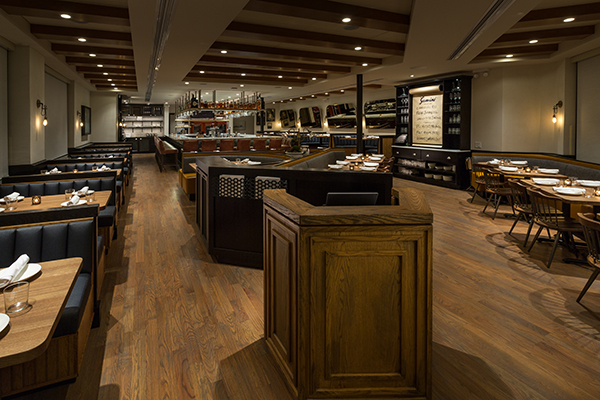
Gemini, Chicago
Designer: 555 International
Highlights: Space-saving seating, service stations
 Gemini Dining photos courtesy of Erick Leinberg for 555 International
Eight years after opening Gemini Bistro in Chicago’s Lincoln Park neighborhood, owners Ryan O’Donnell and Pauly Graves felt both the space and the concept were due for a refresh. They brought in James Geier and his team at 555 International to lead the redesign effort and assist with concept reprogramming. That included dropping Bistro from the name, expanding the bar and reconfiguring seating for better space utilization. It also included giving the formerly dark, traditional restaurant a brighter, more modern aesthetic without sacrificing its comfortable neighborhood vibe. The building’s unique shape — somewhat triangular, as it sits on a corner lot flanked by two diagonal streets — made creative space utilization paramount.
 Gemini Dining1 555 Credit Erick Leinberg
Seating: “It’s a uniquely shaped building, so you can’t just fit what you want into some areas,” Geier says. “We went around and around on the best approach to seating and settled on a combination of booths and loose table seating in the main dining area.”
The arrangement includes a cluster in the center of the room, positioned behind the host stand. It’s comprised of a U-shaped booth with seating for six flanked by two angled banquettes. To provide some separation between that center cluster of seating and the entry/host stand area, 555 fabricated a cabinetry-style millwork half wall that includes built-in storage recepticles for menus and other hosting materials.
While the design works visually and helps to maximize seating capacity, flow was a major consideration. “We had to be very conscious of leaving enough space for traffic in the aisles to the left and right,” Geier says. “We did a lot of testing to make sure guests, staff and food could move in and out smoothly once people were seated at those banquettes.”
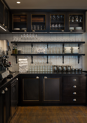 Service Stations: Gemini has two designated service stations that aesthetically play off the concept’s original bistro roots. The larger of the two is positioned along the back wall of the dining room, near the bar and hallway to the restrooms.
“It’s beautiful and gives the staff their own area, visible through open shelving to the dining room but out of the way of general guest traffic,” Geier says. “The cabinetry has woven wire mesh door inserts, coffered details, and the whole area, upper and lower, features great materials. It could be a butler’s pantry in a beautiful home, so you don’t mind walking by it, but it’s also highly functional and well organized to ensure that staff has easy access to everything they need.”
A second, smaller service station is positioned in the main dining room along an angled wall. It, too, cleverly marries form and function. “There’s an interesting junction point between the angled wall and the flat wall, and it’s a point that we knew could be too congested for seating,” Geier says. “We felt it was the perfect place for a piece of millwork — not a full service or bus station but a simple, hutch-style piece where servers can pick up water glasses, flatware, napkins or B&B plates right on the floor.”
Built into that hutch is a center rod that holds a large, bistro-style butcher paper roll that’s used for communicating menu specials. “As we thought about what to put there, it seemed an excellent place for that type of messaging opportunity,” Geier says. “It’s highly visible, looks great and makes it easy for the chef to change out the specials from day to day.”
Bonus web content
Gemini Bar 555 Credit Erick Leinberg for 555 International
FBD Bar: One of the biggest changes and design challenges in the Gemini space was expanding the bar from the previous straight-line along the back wall of the restaurant to a larger, engaging, peninsula bar. “We didn’t have the width of space to do it properly and we couldn’t have a traditional back bar, which we really needed for bottle storage and glassware, etc.” says Geier.
To get maximum functionality out of the new, marble-topped bar, the designers suspended shelving and glass racks from the ceiling above it. At the back side only, those shelving units extend all the way down to the bar, creating a service bar/drink pick-up area and also providing a screen to restroom and kitchen traffic behind it. On the bar side of that back shelving unit, a large TV is positioned. “It’s strategically placed so it’s not really visible from the dining room, but you can see it if you’re at the bar and there’s a big game on or something,” Geier notes. “If not, they just keep it off so TV isn’t a part of the experience.”
Bellecour, Wayzata, Minnesota
Designer: Shea
Highlights: Glass wine room, service stations, larder shelf
 Bellecour Private Dining/Wine Room. Photo courtesy of Eliesa Johnson
Bellecour, a French-inspired bistro and bakery by Chef Gavin Kaysen and the team behind the James Beard Award-winning Spoon and Stable restaurant in Minneapolis, opened in March of this year. Taking over a location in suburban Wayzata that had housed the Blue Point restaurant for three decades, Kaysen worked with Shea to transform the 5,800-square-foot space into a versatile, all-day operation.
Wine Room: Challenged to provide ample wine storage and some separation between Bellecour’s main dining area and an area designated for semi-private dining, Shea created a large glass wine room that accomplishes both objectives while at the same time providing a visually striking design element. “You could almost argue that it’s a kind of service station as it’s designed to be highly functional,” Spaulding notes.
“Gavin wanted a wine visual, but we didn’t have enough room to do a pretty wine display and also have sufficient storage behind closed doors,” Spaulding explains. “We decided to create a larger wine room and use it as a functional part of the design. Wine rooms aren’t a unique concept, but it’s often difficult to get one right in the middle of the space. This solution created a feature that is very visual, gives them the separation that they needed, and is easy for servers and bartenders to access and find what they need.”
 Bellecour 23 Shea Credit Eliesa Johnson
Service Stations: Two custom-designed service stations created for the Bellecour project are not just popular with service staff — their positions at either end of the long, rectangular dining room saves them valuable steps — they’re also a hit with guests. Spaulding says several have inquired about where they might get a similar piece for their homes. “They do have a residential furniture feel to them, which fits the overall brand and design of the restaurant,” she says. “That’s central to every service station we design. They look great, but they also give the staff easy access to whatever they need so they don’t spend so much time walking back and forth for glasses, wine, water, etc.”
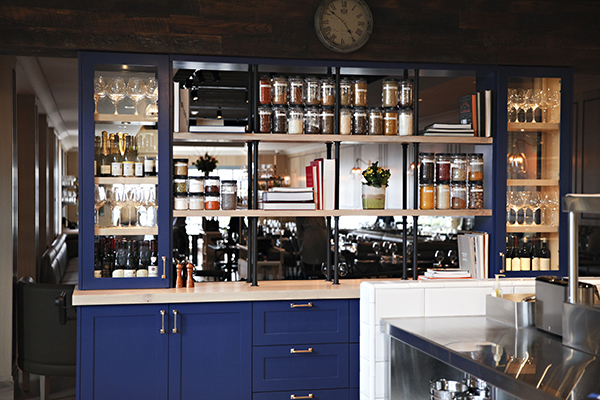 Bellecour Larder Shelf 2 Eliesa Johnson
Larder Shelf: Also in the residential design vein, Shea provided a sort of visual screen between the dining room and the open kitchen with a brightly painted larder shelf. “It almost feels like a sideboard in someone’s home,” Spaulding says. Stocked with a colorful selection of wines, spices and cookbooks by Kaysen’s mentor chefs, friends and investors, including Daniel Boulud and Thomas Keller, the larder provides separation but also transparency. Guests get views into the kitchen, and the chefs can see into the dining room. A bonus feature: The unit’s bottom cabinets provide additional and much-needed storage.
Mezcalito, San Francisco
Designer/Owner: Andalé Management Group
Highlight: Mezcal lockers
 Mezcalito photos courtesy of Andale Restaurant Group
When San Francisco-based Andalé Management Group (AMG) decided to launch a new concept in the city’s Russian Hill neighborhood, they set out to celebrate mezcal, the traditional agave-based Mexican spirit, along with tequilas and a host of craft cocktails, wines and beers. A diverse menu of small plates featuring Oaxacan specialties provides sustenance, but Mezcalito caters especially to the cocktail crowd. The refurbished 2,200-square-foot space, which opened last September, has a variety of elevated seating styles and a casual, industrial-meets-contemporary, South-of-the-border style. According to AMG President Pedro Alvarez, it’s designed to welcome, educate and nurture a whole new group of mezcal aficionados.
 To that end, a key design feature, and one that plays an integral branding role, is a set of 30 lockers built into the wall near the far end of the bar. Mezcalito promotes its locker program to regular customers, who are invited to purchase their own favorite bottles of mezcal and store them in a locker for their personal use.
“The program gets people who either already love mezcal or who are just discovering it excited to buy a bottle, especially small-batch, craft mezcals, and keep it here,” Alvarez says. “They get a key with a number on it that they just present to the server when they come in. We sell them the bottle but don’t charge other fees for the program. And there are other perks that members of the locker program get, such as priority seating if there’s a waiting list and advance email notices of special tasting events.”
Most of Mezcalito’s lockers are deep enough to hold multiple bottles and all are lit from beneath, adding to the wall’s design impact. “This was another way of generating interest in our brand, and the lockers are just visually interesting,” Alvarez adds. “Customers ask questions about them, which gives servers an opportunity to promote the program and talk about our
mezcal expertise.”
Catalyst Café, Cambridge, Massachusetts
Designer: Phase Zero Design
Highlight: Induction countertop
 Catalyst Cafe photos courtesy of Joseph Ferraro
 When Chef William Kevel was developing Catalyst Café, the new fast-casual sibling to his Catalyst restaurant in Cambridge, Mass., he knew the space would need to function well from early morning through early evening. Design partner Phase Zero Design and consulting firm FaO Hospitality collaborated with an equipment manufacturer to come up with a solution that’s both highly functional and a sophisticated design element — an induction system that’s built into the front counter’s millwork.
“We looked for the most efficient way to utilize the service counter for the changing food offerings throughout the day,” says Julie Nelligan, an interior designer with Phase Zero. “We were able to integrate an induction system in the millwork design of the entire counter. It’s a ceramic-based countertop that uses magnetic technology to allow induction warmers to heat service pieces but not the countertop itself.”
Not only does the counter look sleek, but it also reflects a signature light fixture that hangs above. It also allows one seamless surface to display non-heated items, such as morning baked goods, and maintains the temperature of large Dutch ovens used to serve soups and stews later in the day.
Bonus Web Content
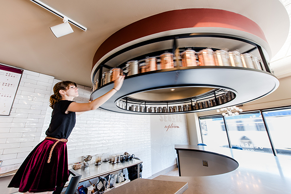
Sencha Tea Bar, Minneapolis
Designer: Shea
Highlight: Rotating tea rack
 Sencha photos courtesy of Travis Anderson
With tea beginning to rival coffee as the basis for specialty concepts, Minneapolis-based Sencha Tea Bar sought stronger competitive positioning and prepped for expansion with a recent rebranding and reimaging effort. “We created a new brand identity for them but our solution for the physical design was not to emulate coffee bars, where you just order at the counter, get your drink and walk away or go sit down. Rather, we decided to create an actual tea bar so customers can sit and taste and learn about teas and engage with the server behind the counter, almost like you would at a cocktail bar,” says Spaulding.
 Sencha 2 Shea Credit Travis Anderson
The bar was designed in a circular shape and placed toward the front of the store to maximize visibility both from outside and as customers enter. And to manage the concept’s need to both display and store a wide variety of teas, the team created a circular overhead tea rack. “It rotates and holds their entire inventory of tea. When a staff member is engaging with a guest, all they have to do is step up, reach up and rotate the rack to find what they want,” Spaulding says. “So it’s a great for storage, it’s a great organizational tool, and a great visual at the same time.”